TL;DR: The Essential® UI Kit for React offers over 120 pre-built, customizable, and responsive blocks, compatible with Tailwind CSS and Bootstrap 5.3. It simplifies UI development, enabling faster and more efficient application creation.
We are pleased to unveil Syncfusion’s latest creation: the Essential® UI Kit for React! Crafted specifically for React developers, this all-encompassing kit offers an innovative method to expedite UI design and development.
Equipped with pre-constructed, reusable, customizable, and responsive blocks, the kit simplifies the creation of sleek, functional, and consistent user interfaces. By removing the necessity of building interfaces from the ground up, developers can concentrate on adding features and enhancing functionality.
Whether you’re developing your first React app or managing intricate enterprise solutions, the Essential® UI Kit for React enables you to build apps more quickly, intelligently, and efficiently.
The UI Kit offers over 120 pre-built blocks, including authentication forms, headers, sidebars, footers, grids, list views, tile views, email templates, and chat modules. These adaptable blocks cater to various use cases and provide a robust foundation for developing dynamic, feature-rich web apps.
It supports popular CSS frameworks like Tailwind CSS and Bootstrap 5.3, offering flexibility in styling and layout design. This enables developers to efficiently incorporate and tailor the blocks to meet their app’s requirements without extensive modifications, thereby improving design consistency and accelerating development.
Each block is crafted to align with React’s architecture and best practices, ensuring seamless integration into both new and existing projects. With access to a public Gallery and GitHub repository, developers can easily review and incorporate the code, minimizing the learning curve.
A notable feature is the complete customizability of each block. Developers can adjust elements such as the company name and logo, content, dimensions, layouts, and other styles to ensure the blocks align perfectly with their app’s branding and design guidelines.
All blocks are optimized for responsiveness, ensuring a seamless user experience across desktops, tablets, and mobile devices. Regardless of screen size, the UI Kit ensures your app appears and functions flawlessly on every platform.
Utilizing the pre-built blocks removes the necessity of designing user interfaces from the ground up, thereby cutting down development time. This approach enables teams to deploy apps more swiftly, accelerating their time-to-market.
By adopting ready-made blocks, developers can concentrate on developing app logic and delivering distinctive features. This concentration boosts efficiency and encourages innovation within development teams.
React blocks’ modular design ensures blocks are reusable across various applications or within different parts of a single application. This method simplifies development and enhances maintainability.
Despite being pre-designed, these blocks offer extensive customization options, granting developers complete control over their app’s appearance and functionality without adding unnecessary complexity.
A consistent set of reusable blocks allows developers to scale apps effortlessly while ensuring that long-term maintenance is straightforward, even as apps expand in size and complexity.
Create scalable corporate solutions utilizing blocks that provide uniform UI design across multiple modules and processes.
Quickly build dashboards with blocks, offering decision-makers immediate access to real-time, essential data.
Use the UI kit’s customizable blocks to create visually appealing product displays, shopping carts, and checkout processes.
Easily design and customize webpages—from landing pages to complex layouts—by leveraging pre-built blocks to achieve a consistent and professional appearance.
Suppose you’re assigned to create a sales dashboard module. By leveraging the Essential® UI Kit for React, you can efficiently compile key components—such as the header, sidebar, data grid, pager, and footer—without starting from scratch. Choose and incorporate the pre-designed blocks to save time, resulting in a responsive, professional sales dashboard ready for deployment.
Here’s a step-by-step guide to the process.
Structure the layout by positioning the header at the top, the bottom footer, and the right sidebar. Using basic HTML DOM elements, place the primary data grid and pager in the center.
Refer to the following image.
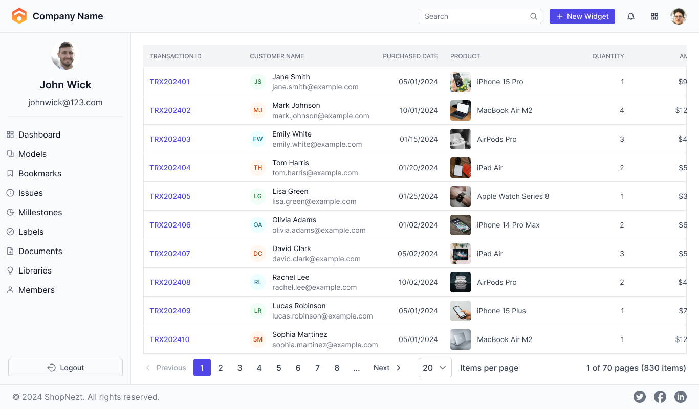
After setting up the layout, copy and paste the code for the header, footer, sidebar, data grid, and pager code directly from the demo in our gallery, or download the free source code from the GitHub repository. This will provide you with a basic framework.
Refer to the following image.
Note: For more details, refer to building your first React app with blocks documentation.
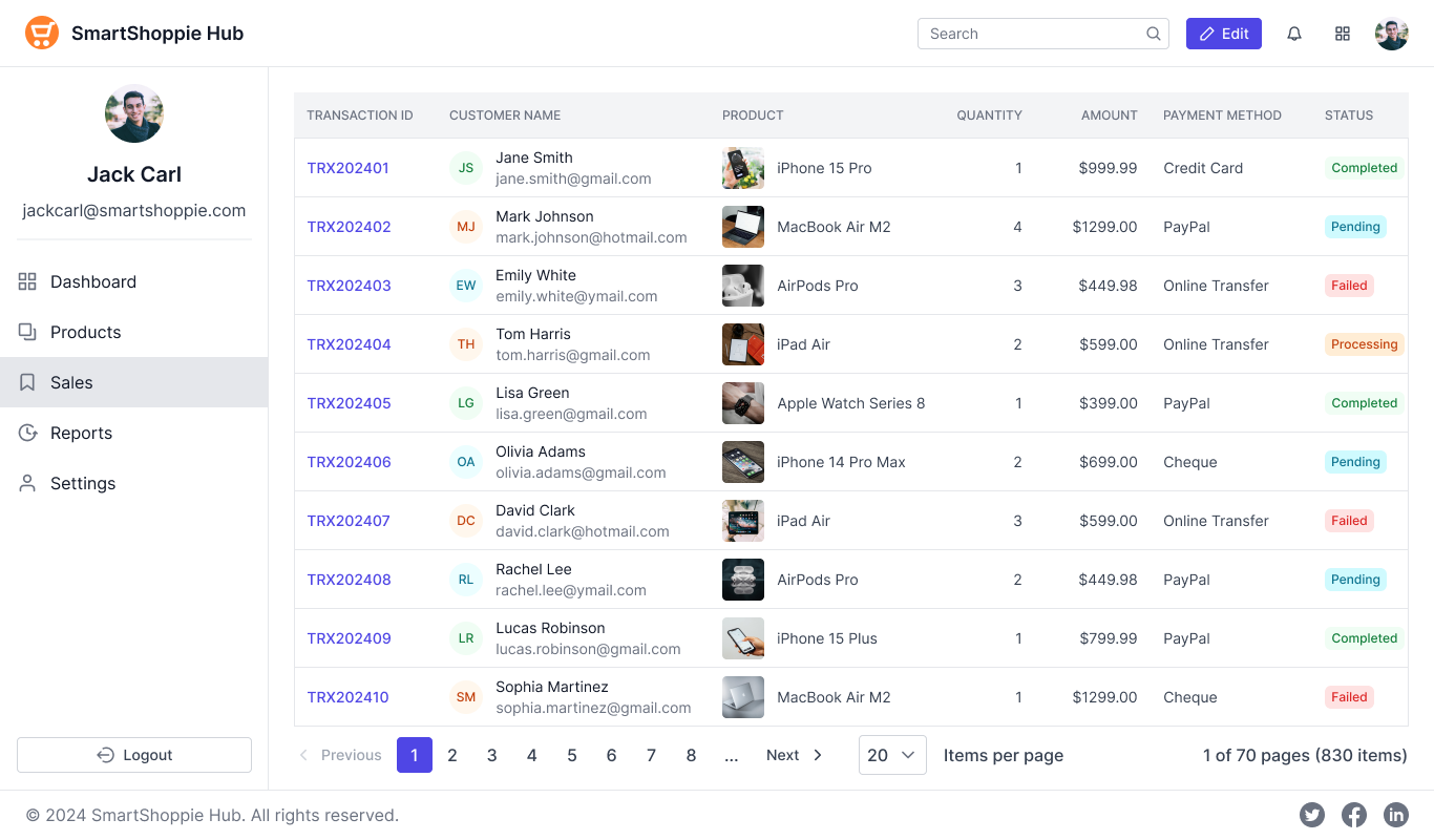
The copied code serves as a template. Now, make the following minor customizations to tailor it to your needs:
With these straightforward and quick modifications, the sales dashboard module is ready to go!
Refer to the following image.
Thank you for exploring this blog post! Syncfusion’s Essential® UI Kit for React is a transformative tool for React developers. It offers a collection of pre-designed, reusable, customizable, and responsive blocks, streamlining UI development, reducing time to market, and boosting productivity. Whether you’re developing small-scale projects or large enterprise apps, this UI kit provides a carefully curated set of blocks to help you build consistent, high-quality user interfaces efficiently.
If you’re an existing customer, you can download the latest version of Essential Studio® from the License and Downloads page. For those new to Syncfusion, try our 30-day free trial to explore all our features.
If you have questions, contact us through our support forum, support portal, or feedback portal. As always, we are happy to assist you!