
Howdy! I will never stop saying how much I love building UI in Xamarin.Forms and for today’s post that’s exactly what we are going to do. This time we’ll be building a drink menu UI in Xamarin.Forms obtained from a Dribble design that you can see here.
First of all, it’s important to keep in mind some things that will help us to get our final design:
Sometimes the most difficult decision is how to start. It’s probable that at some point in your life as a developer, you’ll hear people say things like, “I just don’t know how to start. I know how to use the layouts, but I don’t know how to apply them to a UI.”
Well, just for this and other similar reasons, it is important to be clear about the order in which we will do our development. In the long run, it saves us time, and helps us feel more secure and not get overwhelmed while developing an UI.
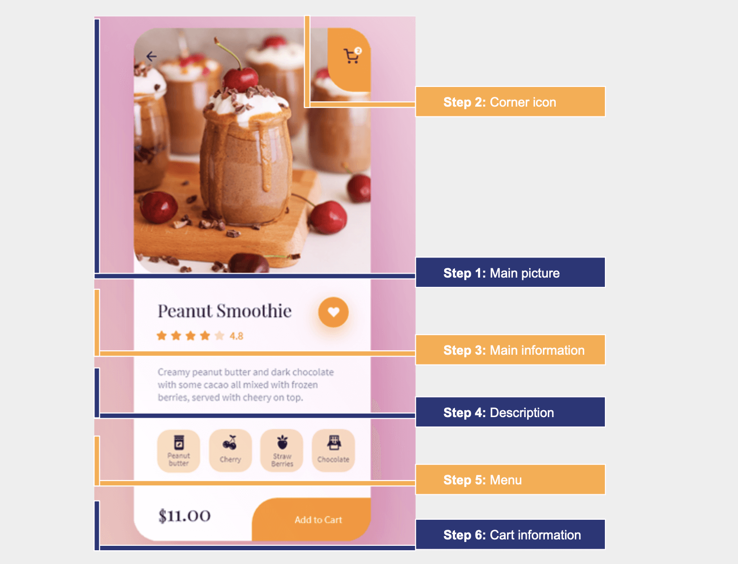
In the following image, we have an analysis of the design, dividing it into the order we will be explaining and developing it.


Before starting to develop the UI, we have to work with everything necessary to build the main structure of the project. Let’s do it now!
Main layout structure: This is the layout that will contain our design. In this case, we will use the DataGrid as a main layout. If you aren’t familiar with the DataGrid structure, you can refer to this article.
<!-- Main structure-->
<Grid RowDefinitions="Auto,Auto,Auto,Auto,Auto,*" ColumnDefinitions="*,Auto">
   <!-- You must write here what is explained from the step number 1 -->
</Grid>

<script src="https://gist.github.com/LeomarisReyes/fb1dc3e2841aa162af143e05309d74ed.js"></script>
Color as a resource: In your App.xaml, let’s create a resource for the colors that we will be using in our design. It will help us have clean and organized code. If we want to change a color, we just have to do it in one resource!
<Application.Resources>
         <Color x:Key="Branding">#fe9a0f</Color>
         <Color x:Key="SecundaryBranding">#fddcbe</Color>
 </Application.Resources>

<script src="https://gist.github.com/LeomarisReyes/fd47d3ab274cbd1377f21a92935032f8.js"></script>
PancakeView: Add this NuGet package to all your projects.
xmlns:PanCake="clr-namespace:Xamarin.Forms.PancakeView;assembly=Xamarin.Forms.PancakeView"

<script src="https://gist.github.com/LeomarisReyes/547c6ed59469f70a492216acd8a16486.js"></script>
After implementing all the steps explained, let’s continue with the main picture!
Follow the below steps to render the drink UI component in Xamarin.Forms:
Here, we just need to add an image. It must be perfectly square. You should not worry if it has rounded corners, for this we will use PancakeView.
<!-- Main image-->
                <PanCake:PancakeView CornerRadius="0,0,70,0" Grid.Row="0"
                 Grid.Column="0" Grid.ColumnSpan="2" IsClippedToBounds="true">
                       <Image Source="Dessert" VerticalOptions="Start" Aspect="AspectFill"
                         HeightRequest="{OnPlatform Android='260', iOS='395'}"/>
                </PanCake:PancakeView>
<!-- You must add here what is explained in the next step -->

<script src="https://gist.github.com/LeomarisReyes/e1183918b7969dd6a1f07b62a153d5fe.js"></script> In this section, it’s important to detail the components that are needed:
<!-- Corner icon-->
  <!-- Corner left rounded wall-->
     <PanCake:PancakeView  Grid.Row="0" Grid.Column="0" Grid.ColumnSpan="2"
        Grid.RowSpan="2" HorizontalOptions="End" VerticalOptions="Start"
         WidthRequest="85" CornerRadius="0,0,50,0" HeightRequest="120">
             <Button Grid.Row="0" ImageSource="ShoppingCart"
               BackgroundColor="{StaticResource Branding}" />
     </PanCake:PancakeView>
  <!--Counter button-->
      <Button Grid.Row="0" Grid.Column="1" BackgroundColor="White"
        HorizontalOptions="End" TranslationY="42" TranslationX="-19"
        VerticalOptions="Start" TextColor="{StaticResource Branding}" FontSize="10"
        Text="2" HeightRequest="20" WidthRequest="20" CornerRadius="10"/>
<!-- You must add here what is explained in the next step -->

<script src="https://gist.github.com/LeomarisReyes/0f24e30f3b25117303ab50ccd1a41a0a.js"></script>
To replicate the main information, we need three components, which we will be developing one by one.
Refer to the following code example to render the title for the drink item.
<!-- Main information-->
    <!--Dessert name-->
              <Label Grid.Column="0" Grid.ColumnSpan="2" Grid.Row="1"
               Text="Peanut Smoothie" Padding="35,20,0,0"  FontAttributes="Bold"
               FontSize="29"/>
<!-- You must add here what is explained in the next step -->

<script src="https://gist.github.com/LeomarisReyes/6ed561c1f5a55eef4ded394dd5b9ea5b.js"></script> To get the rounded button, you just have to add the WidthRequest and HeightRequest properties with the same value. Then, add the CornerRadius property with half of the value we added previously. You can read more information about this topic here.
<!--Rounded button-->
               <PanCake:PancakeView  Grid.Row="1" Grid.Column="1"
               Grid.RowSpan="2" Padding="0,0,40,0">
                   <Button VerticalOptions="Center" ImageSource="Heart"
                   HorizontalOptions="End" BackgroundColor="{StaticResource Branding}"
                   WidthRequest="56" HeightRequest="56" CornerRadius="28"/>
               </PanCake:PancakeView>
<!-- You must add here what is explained in the next step -->

<script src="https://gist.github.com/LeomarisReyes/3b458417a0caa123fe42dbf4beab712d.js"></script> To create this, we will be using the Syncfusion Xamarin Rating control.
Add the Syncfusion.Xamarin.SfRating NuGet package to all your projects. (You can read more information about it in the control documentation.)
xmlns:rating="clr-namespace:Syncfusion.SfRating.XForms;assembly=Syncfusion.SfRating.XForms"

<script src="https://gist.github.com/LeomarisReyes/8be59dbe544c774b3467ea2f6f009bb0.js"></script>
As an additional step on iOS, add the following line in your AppDelegate.cs file after the LoadApplication method.
Syncfusion.SfRating.XForms.iOS.SfRatingRenderer.Init();

<script src="https://gist.github.com/LeomarisReyes/f00dc200fa7222fae28c881b06a160c0.js"></script>
Note: You don’t need this for Android.
Then, do the code implementation.
<!--Star component-->
<rating:SfRating Grid.Column="0" Grid.Row="2" x:Name="sfRating"  ItemCount="5" Value="5" ReadOnly="true" ItemSize="25" HeightRequest="35" HorizontalOptions="StartAndExpand" Margin="30,0,0,0"/>
<Label Grid.Column="1" Grid.Row="2" Text="4.8" HorizontalOptions="Start" FontAttributes="Bold" TextColor="#fe9a0f" FontSize="18" Padding="20,0,0,0"/>
<!-- You must add here what is explained in the next step -->

<script src="https://gist.github.com/LeomarisReyes/9fbd90f021bcc6590b1060d1e5f9c971.js"></script>
In this part, we are going to add a description label.
 <!-- Description -->
<Label Grid.Row="3" Grid.Column="0" Grid.ColumnSpan="2" FontSize="20" Margin="35,5,30,0" Text="Creamy peanut butter and frozen and dark chocolate with some cacao all mixed with frozen, berries, served with cherry on top." TextColor="Silver"/>
<!-- You must add here what is explained in the next step -->

<script src="https://gist.github.com/LeomarisReyes/cea59b3be011b8c4800070e9e29460a5.js"></script> Now, we are going to use a control that I really love! CollectionView allows us to show a list of information in both vertical and horizontal modes. We are using the horizontal mode. If you want to know more about this control, you can refer to this Xamarin blog.
Code implementation
<!-- Menu-->
<CollectionView Grid.Row="4" Grid.Column="0" Grid.ColumnSpan="2"
                                ItemsSource="{Binding menu}"
                                Margin="35,20,30,20"
                                HeightRequest="90"
                                VerticalOptions="FillAndExpand"
                                HorizontalScrollBarVisibility="Never"
                                ItemsLayout="HorizontalList">
                             <CollectionView.ItemTemplate>
                                   <DataTemplate>
                                       <StackLayout Padding="0,0,15,0">
                                           <Frame HeightRequest="46" WidthRequest="35"
                                            HasShadow="False" BackgroundColor="{StaticResource
                                            SecundaryBranding}" CornerRadius="23">
                                               <Grid RowDefinitions="Auto,Auto"
                                                VerticalOptions="StartAndExpand">
                                                    <Image Grid.Row="0" HeightRequest="{OnPlatform
                                                      Android='16',iOS='30'}" Source="{Binding Icon}"/>
                                                    <Label Grid.Row="1" Text="{Binding Name}"
                                                     FontSize="10" HorizontalTextAlignment="Center"/>
                                               </Grid>
                                           </Frame>
                                       </StackLayout>
                                   </DataTemplate>
                            </CollectionView.ItemTemplate>
                </CollectionView>
<!-- You must add here what is explained in the next step -->

<script src="https://gist.github.com/LeomarisReyes/8deea0dfab91a44099f576af37ce30b6.js"></script> Finally, let’s build the cart information part. For this, we need to add a label with the price and an Add to cart button at the bottom.
Note: The Add to cart button has an upper left rounded corner. This is why you also see PancakeView in this code.
Code implementation
 <!-- Cart information-->
 <!-- Price-->
 <Label Grid.Row="5" Grid.Column="0" Text="$12.00" Padding="45,0,0,25" FontSize="20" FontAttributes="Bold" VerticalOptions="End"/>
            <!--Add to Cart button-->
                <PanCake:PancakeView Grid.Row="5" Grid.Column="1"
                 CornerRadius="50,0,0,0" IsClippedToBounds="true" HeightRequest="75"
                 VerticalOptions="End">
                     <Button BackgroundColor="{StaticResource Branding}"
                      TextColor="White" Text="Add to cart" FontSize="22"
                      FontAttributes="Bold" WidthRequest="220"/>
                </PanCake:PancakeView>

<script src="https://gist.github.com/LeomarisReyes/33feeab9939a7ca6f94c942abde5eb61.js"></script>
After executing these code examples, we will get output like in the following screenshots.
Reference:
To see the complete code structure, see this Github repository.
https://github.com/SyncfusionExamples/FoodDrinkUIApp
I hope you have understood everything well and that you are encouraged to create one by yourself from scratch. Remember that the more you practice, the better you will develop!
See you next time! Thanks for reading!
Syncfusion Xamarin offers over 150 UI controls, from basic editors to powerful, advanced controls like DataGrid, Charts, ListView, and RTE. Try them out and leave your comments below.
You can also contact us through our support forum, Direct-Trac, or feedback portal. We are always happy to assist you!