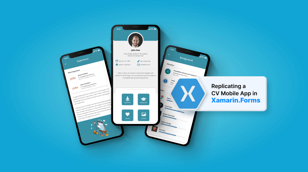

In this article, we’ll see how to replicate a CV mobile app in Xamarin.Forms based on this Dribbble design.
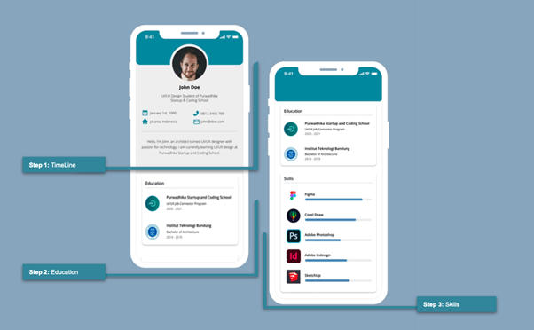
We are going to develop the sections of this UI in steps, as shown in this image.


Note: We will make some modifications to the original UI to get the most out of the controls with which we will work.
Let’s code!
Let’s start by organizing the main layout of the page. I am going to use a DataGrid control.
Refer to the following code.
<!--Main layout-->
 <Grid RowDefinitions="Auto,Auto,Auto,Auto,Auto,Auto,Auto,Auto">
   <!-- Here you must add the code blocks explained in steps 1, 2, and 3.-->
 </Grid>
Then, add the following background color to your content page.
BackgroundColor="#f0f0f0"
For better understanding, we will divide this step up to delve into each part.
This is the blue bar that you can see above the profile picture. The visual trick here is to hide the two top borders. We can hide them with a negative value in the Margin property (in this case, the Top value).
Margin= “0, – 50.0.0”
Now, let’s see the complete code implementation.
<!--Timeline Color Bar-->
  <Frame Grid.Row="0" BackgroundColor="{StaticResource MainColor}" HeightRequest="100" CornerRadius="20" HasShadow="False Margin="0,-50,0,0"/>

<!-- You must write here what is explained in the next code block --> Use the Syncfusion Xamarin.Forms Avatar View control to design the profile picture.
First, add the Syncfusion.Xamarin.Core NuGet package.
Then, add the Syncfusion.XForms.AvatarView namespace in your XAML file.
xmlns:sfavatar="clr-namespace:Syncfusion.XForms.AvatarView;assembly=Syncfusion.Core.XForms"
On iOS, go to your AppDelegate.cs file. Add the following code after Xamarin.Forms initialization.
Syncfusion.XForms.iOS.Core.SfAvatarViewRenderer.Init();
That’s it! Now, you can start using the Syncfusion Xamarin.Forms AvatarView control in your XAML file.
<!--Rounded image - SfAvatarView Syncfusion Control-->
  <sfavatar:SfAvatarView Grid.Row="1" BorderWidth="0" ContentType="Custom" ImageSource="Profile" HorizontalOptions="Center" VerticalOptions="Start" WidthRequest="140" HeightRequest="140"  CornerRadius="70"  Margin="0,-65,0,0" />

<!-- You must write here what is explained in the next code block -->
Refer to the following code example to render the Name details.
<!--Name-->
  <Label Grid.Row="2" Text="John Doe" FontAttributes="Bold" HorizontalOptions="Center" FontSize="22" Margin="0,10,0,0"/>

<!-- You must write here what is explained in the next code block -->
Here, I used an intermediate grid to place the contact details.
<Grid Grid.Row="4" RowDefinitions="*,*" ColumnDefinitions="Auto,Auto,Auto,Auto" HorizontalOptions="Center"  Padding="0,25" RowSpacing="20" ColumnSpacing="10">
 <Image Grid.Row="0" Grid.Column="0" Source="Calendar" HeightRequest="14"/>
 <Label Grid.Row="0" Grid.Column="1" Text="January 1st, 1990" FontSize="14" FontAttributes="Bold" TextColor="#a7a7a7"/>

 <Image Grid.Row="0" Grid.Column="2" Source="Phone" HeightRequest="14"/>
 <Label Grid.Row="0" Grid.Column="3" Text="0812 3456 789" FontSize="14" FontAttributes="Bold" TextColor="#a7a7a7"/>

 <Image Grid.Row="1" Grid.Column="0" Source="Home" HeightRequest="14"/>
 <Label Grid.Row="1" Grid.Column="1" Text="Jarkarta, Indonesia" FontSize="14" FontAttributes="Bold" TextColor="#a7a7a7"/>

 <Image Grid.Row="1" Grid.Column="2" Source="Email" HeightRequest="14"/>
 <Label Grid.Row="1" Grid.Column="3" Text="john@doe.com" FontSize="14" FontAttributes="Bold" TextColor="#a7a7a7"/>
</Grid>

<!-- You must write here what is explained in the next code block -->
Finally, let’s add the dividing line (for this, we will use a BoxView) and the contact description text.
<!--Line and descripcion-->
 <BoxView Grid.Row="5" HorizontalOptions="FillAndExpand" HeightRequest="1" Color="Silver" Margin="20,0"/>
 <Label Grid.Row="6" FontSize="14" FontAttributes="Bold" TextColor="#a7a7a7"  Margin="20" LineHeight="1.2" HorizontalTextAlignment="Center" Text="Hello! I'm John, an architect-turned-UI/UX designer with a passion for technology. I am currently learning UI/UX design at Purwadhika School"/>

<!-- You must write here what is explained in the next code block -->
With these, we completed the first step of our UI!
Let’s render the education details. Use a CollectionView to design the education list and the Syncfusion Xamarin.Forms Avatar View control to design the rounded images for them.
Refer to the following code example.
<!-- Education-->
 <Frame Grid.Row="8" HasShadow="False" Margin="25,0" CornerRadius="20" BackgroundColor="White">
  <StackLayout>
   <!-- Education title-->
   <Label Text="Education" FontSize="15" FontAttributes="Bold" Margin="0,0,0,10"/>
   <!-- Divisor line-->
   <BoxView HorizontalOptions="FillAndExpand" HeightRequest="1" Color="Silver" Margin="0,0,0,10" />

   <CollectionView ItemsSource="{Binding EducationCollection}"
                   HeightRequest="170"
                   VerticalScrollBarVisibility="Never">
    <CollectionView.ItemTemplate>
     <DataTemplate>
      <Grid RowDefinitions="Auto,Auto,Auto" ColumnDefinitions="Auto,*" Padding="0,0,0,30" >
       <sfavatar:SfAvatarView Grid.Row="0" Grid.Column="0" Grid.RowSpan="3" BorderWidth="0" Margin="0,0,10,0"
                              ContentType="Custom" ImageSource="{Binding Picture}" HorizontalOptions="Center" VerticalOptions="Start" WidthRequest="50" HeightRequest="50" CornerRadius="25" />
         <Label Grid.Row="0" Grid.Column="1" Text="{Binding Title}" FontAttributes="Bold" FontSize="14"/>
         <Label Grid.Row="1" Grid.Column="1" Text="{Binding Description}" FontSize="13"/>
         <Label Grid.Row="2" Grid.Column="1" Text="{Binding Years}" FontSize="13"/>
      </Grid>
     </DataTemplate>
    </CollectionView.ItemTemplate>
   </CollectionView>
  </StackLayout>
 </Frame>

<!-- You must write here what is explained in the next code block --> We will continue using the CollectionView for the skills list. We are going to add the following elements:
Let’s see how to do it in code!
<!--Skills-->
 <Frame Grid.Row="9" HasShadow="False" Margin="20,30" CornerRadius="20" BackgroundColor="White">
  <StackLayout>
   <Label Text="Skills" FontSize="15" FontAttributes="Bold" Margin="0,0,0,10"/>
  <BoxView HorizontalOptions="FillAndExpand" HeightRequest="1" Color="Silver" />

  <CollectionView ItemsSource="{Binding SkillsCollection}"
                  HeightRequest="300"
                  VerticalScrollBarVisibility="Never">
   <CollectionView.ItemTemplate>
    <DataTemplate>
      <Grid RowDefinitions="Auto,Auto" ColumnDefinitions="Auto,*" Padding="0,0,0,30">
       <Image Grid.Row="0" Grid.Column="0" Grid.RowSpan="3" Margin="0,0,10,0" Source="{Binding Picture}"
                           VerticalOptions="Start" WidthRequest="50" HeightRequest="50" />
        <Label Grid.Row="0" Grid.Column="1" Text="{Binding Title}" FontAttributes="Bold" FontSize="14"/>
        <ProgressBar Grid.Row="1" Grid.Column="1" Progress="{Binding Percentage}" ProgressColor="Blue"/>
      </Grid>
     </DataTemplate>
    </CollectionView.ItemTemplate>
   </CollectionView>
  </StackLayout>
 </Frame>
And our UI is done! As the screens shown are for iOS, now I’ll show you the screens on Android so you can see both platforms.
To see the complete code structure of this project, refer to our CV Mobile App in Xamarin.Forms demo on GitHub.
Thanks for reading! In this blog, we have seen how to replicate a CV mobile app using Syncfusion Xamarin.Forms UI controls. Try out the steps in this blog post and leave your feedback in the comments section below!
You can enjoy over 150 UI controls, from basic editors to powerful, advanced controls like Charts, ListView, and Rich Text Editor in our Syncfusion’s Xamarin suite. Use them to build elite apps!
For questions, you can contact us through our support forum, support portal, or feedback portal. We are always happy to assist you!