TL;DR: Let’s see how to use the new .NET MAUI Toolbar control to enhance user interaction in cross-platform apps. This versatile toolbar supports customizable icons, labels, and commands, offering a seamless user experience. Key features include flexible orientation, overflow support, tooltips, and an overlay mode for quick access. We also cover step-by-step integration, including NuGet installation, item configuration, and UI customization.
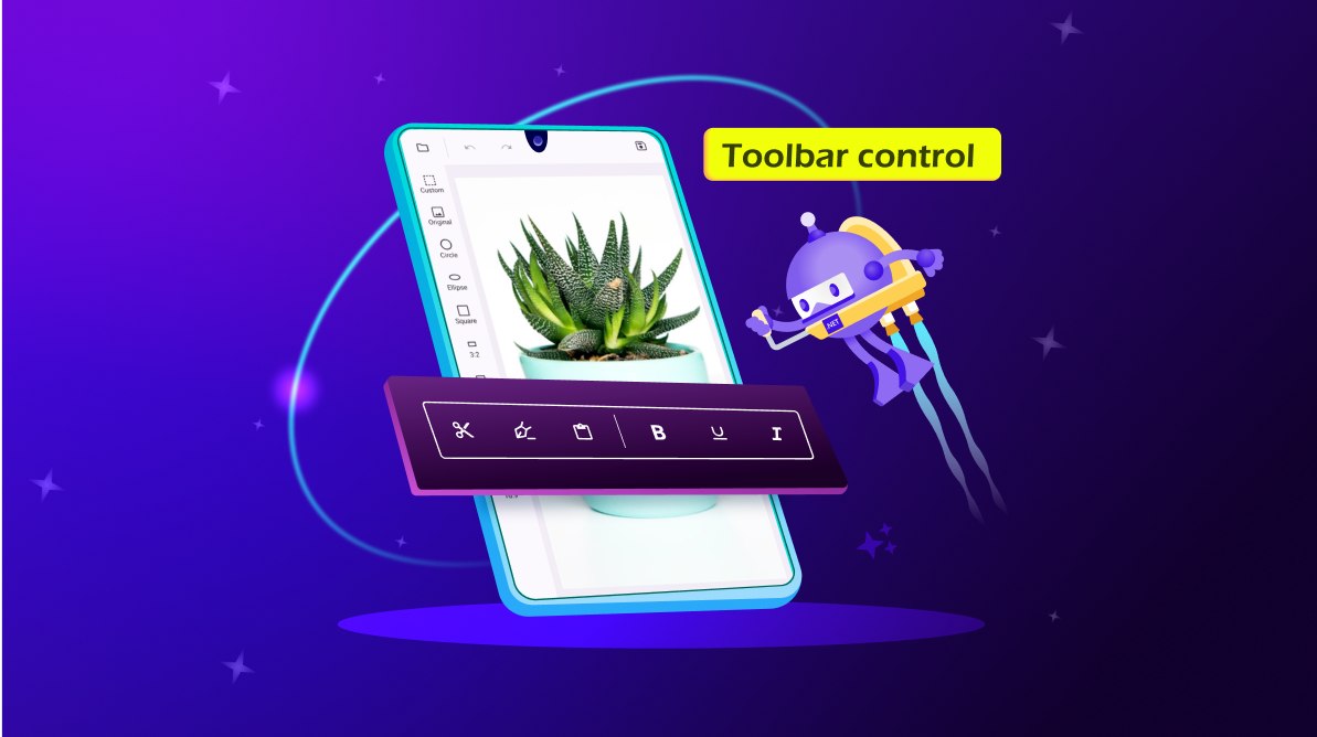
We are excited to introduce the new Syncfusion .NET MAUI Toolbar control in our latest release, 2025 Volume 1!
In today’s digital world, ensuring smooth user interaction with apps is crucial, whether it’s an image editor, word editor, or any other type of application. The Toolbar is an essential component for offering a smooth and intuitive user experience. It allows us to easily execute specific actions through various toolbar items, making our app more interactive and user-friendly. Its features enable developers to create a tailored interface that aligns with their app’s themes and user preferences.
Refer to the following image.
Let’s explore the key features of the .NET MAUI Toolbar control!
The Toolbar control’s versatile toolbar items are central to its functionality. These toolbar items can be customized to include:
Ensuring smooth interaction is crucial for any app. The Toolbar control supports the following user interaction features:
Flexibility in layout is crucial for accommodating different screen sizes and orientations. The Toolbar control supports:
The .NET MAUI Toolbar control offers the following features to keep the interface clean while managing many toolbar items. This will organize and streamline the items, ensuring users can interact smoothly without feeling overwhelmed by clutter.
This feature provides a floating toolbar that remains easily accessible, ensuring users can quickly interact with essential tools without disrupting their workflow.
Tooltips display additional information on hover or long-press actions, helping us understand a tool’s functionality without cluttering the interface.
The Toolbar control offers customization options that make it easy to adapt to different aesthetic preferences and system themes. Users can adjust icon and label colors to seamlessly match both light and dark themes, ensuring a visually consistent appearance throughout the app.
Refer to the following images.
We’ve seen some of the key features of the .NET MAUI Toolbar control. Now, let’s see how to integrate it into your app.
First, we must set up the Syncfusion core handler in the MauiProgram.cs file to use the .NET MAUI controls.
using Syncfusion.Maui.Core.Hosting;

...

builder
    .UseMauiApp<App>()
    .ConfigureSyncfusionCore();
MainPage.xaml
xmlns:toolbar="clr-namespace:Syncfusion.Maui.Toolbar;assembly=Syncfusion.Maui.Toolbar"

...

<VerticalStackLayout>
    <toolbar:SfToolbar />
</VerticalStackLayout>
MainPage.xaml
<VerticalStackLayout>
<toolbar:SfToolbar x:Name="Toolbar" HeightRequest="56">
<toolbar:SfToolbar.Items>
<toolbar:SfToolbarItem Name="Bold"
ToolTipText="Bold">
<toolbar:SfToolbarItem.Icon>
<FontImageSource Glyph=""
FontFamily="MauiMaterialAssets" />
</toolbar:SfToolbarItem.Icon>
</toolbar:SfToolbarItem>
<toolbar:SfToolbarItem Name="Underline"
ToolTipText="Underline">
<toolbar:SfToolbarItem.Icon>
<FontImageSource Glyph=""
FontFamily="MauiMaterialAssets" />
</toolbar:SfToolbarItem.Icon>
</toolbar:SfToolbarItem>
<toolbar:SfToolbarItem Name="Italic"
ToolTipText="Italic">
<toolbar:SfToolbarItem.Icon>
<FontImageSource Glyph=""
FontFamily="MauiMaterialAssets" />
</toolbar:SfToolbarItem.Icon>
</toolbar:SfToolbarItem>
<toolbar:SfToolbarItem Name="AlignLeft"
ToolTipText="Align-Left">
<toolbar:SfToolbarItem.Icon>
<FontImageSource Glyph=""
FontFamily="MauiMaterialAssets" />
</toolbar:SfToolbarItem.Icon>
</toolbar:SfToolbarItem>
<toolbar:SfToolbarItem Name="AlignRight"
ToolTipText="Align-Right">
<toolbar:SfToolbarItem.Icon>
<FontImageSource Glyph=""
FontFamily="MauiMaterialAssets" />
</toolbar:SfToolbarItem.Icon>
</toolbar:SfToolbarItem>
<toolbar:SfToolbarItem Name="AlignCenter"
ToolTipText="Align-Center">
<toolbar:SfToolbarItem.Icon>
<FontImageSource Glyph=""
FontFamily="MauiMaterialAssets" />
</toolbar:SfToolbarItem.Icon>
</toolbar:SfToolbarItem>
<toolbar:SfToolbarItem Name="AlignJustify"
ToolTipText="Align-Justify">
<toolbar:SfToolbarItem.Icon>
<FontImageSource Glyph=""
FontFamily="MauiMaterialAssets" />
</toolbar:SfToolbarItem.Icon>
</toolbar:SfToolbarItem>
</toolbar:SfToolbar.Items>
</toolbar:SfToolbar>
</VerticalStackLayout>
Refer to the following output image.
Note: Refer to the documentation to add the MauiMaterialAssets custom font to the Toolbar.
For more details, refer to the .NET MAUI Toolbar GitHub demo.
Thanks for reading! In this blog, we explored the features of the new Syncfusion .NET MAUI Toolbar control and its customization options. This control is available in our 2025 Volume 1 release. For more details, check out the .NET MAUI Toolbar documentation.
For our existing Syncfusion customers, the newest version of Essential Studio is available from the license and downloads page. If you are not a customer, try our 30-day free trial to check out these new features.
If you have questions, contact us through our support forums, feedback portal, or support portal. We are always happy to assist you!


