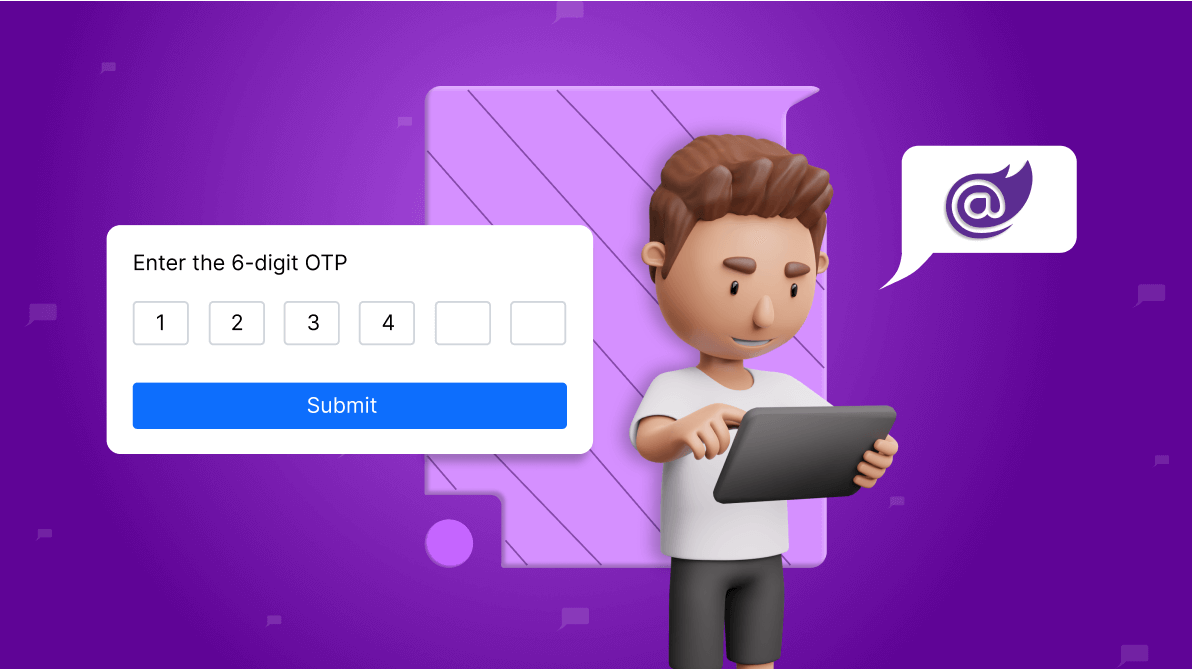
TL;DR: The new Syncfusion Blazor OTP Input component enhances app security with customizable OTP entry, making it ideal for authentication and transactions. Let’s explore its user-friendly features in detail!
We’re thrilled to introduce the new Syncfusion Blazor OTP Input component as part of our Essential Studio® 2024 Volume 2 release.
The Blazor OTP Input is a form component designed to streamline the process of entering one-time passwords (OTP) during multi-factor authentication. It offers extensive customization options, making it adaptable to various application needs. Features include configurable input types, adjustable input lengths, multiple styling modes, customizable placeholders and separators, and more.
Let’s explore the new Blazor OTP Input component in detail!
The Blazor OTP Input component is well-suited for various apps:
The key features of the OTP Input component are as follows:
The Blazor OTP Input component supports three input types:
In the following code example, the Type property is used to define the input type, accepting values from the OtpInputType enumeration.
@rendermode InteractiveServer

@using Syncfusion.Blazor.Inputs

<div class="otp-input-component">
    <div>
        <label>Number type</label>
        <SfOtpInput Value="1234"></SfOtpInput>
    </div>
    <div>
        <label>Text type</label>
        <SfOtpInput Type="OtpInputType.Text" Value="ab12"></SfOtpInput>
    </div>
    <div>
        <label>Password type</label>
        <SfOtpInput Type="OtpInputType.Password" Value="ab12"></SfOtpInput>
    </div>
</div>

<style>
    .otp-input-component {
        width: 250px;
        display: flex;
        flex-direction: column;
        gap: 20px;
    }
</style>
Refer to the following image.
Note: For more details, refer to the input types of Blazor OTP Input component documentation.
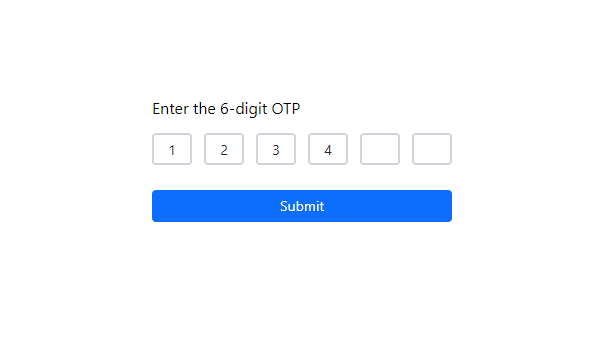
The Blazor OTP Input component offers flexibility to define the number of input fields, making it adaptable to various OTP length requirements. Whether you need a standard 6-digit OTP or a different length, the input length can be easily adjusted to meet your specific app requirements.
In the following example, the Length property is set to 8 to define the number of input fields.
@rendermode InteractiveServer

@using Syncfusion.Blazor.Inputs

<div class="otp-input-component" style="width: 400px;">
    <SfOtpInput Length=8 Value="12345678"></SfOtpInput>
</div>
Refer to the following image.
Note: For more details, refer to setting the input length of Blazor OTP Input component documentation.
Customize the appearance of the Blazor OTP Input component with various styling modes to suit your app’s visual design:
In the following code example, we set the StylingMode property to specify the desired styling mode using the OtpInputStyle enumeration.
@rendermode InteractiveServer

@using Syncfusion.Blazor.Inputs

<input type="radio" checked="@(_inputStyle == OtpInputStyle.Outlined)"
       name="InputStyle" title="InputStyle:Outlined" @onchange="@(() => _inputStyle = OtpInputStyle.Outlined)" />
<label>Outlined</label>

<input type="radio" checked="@(_inputStyle == OtpInputStyle.Filled)"
       name="InputStyle" title="InputStyle:Filled" @onchange="@(() => _inputStyle = OtpInputStyle.Filled)" />
<label>Filled</label>

<input type="radio" checked="@(_inputStyle == OtpInputStyle.Underlined)"
       name="InputStyle" title="InputStyle:Underlined" @onchange="@(() => _inputStyle = OtpInputStyle.Underlined)" />
<label>Underlined</label>

<br />
<br />

<div class="otp-input-component" style="width: 400px;">
    <SfOtpInput StylingMode="@_inputStyle" Length=6 Value="123456"></SfOtpInput>
</div>

@code {
    private OtpInputStyle _inputStyle = OtpInputStyle.Outlined;
}
Refer to the following image.
Note: For more details, refer to the styling modes in the Blazor OTP Input component documentation.
Enhance user guidance and visual clarity with customizable placeholders and separators in the Blazor OTP Input component.
Refer to the following code example.
@rendermode InteractiveServer

@using Syncfusion.Blazor.Inputs

<div class="otp-input-component">
    <div>
        <label>Placeholders</label>
        <br /><br />
        <SfOtpInput Placeholder="#" Length="5"></SfOtpInput>
    </div>
    <div>
        <SfOtpInput Placeholder="#OTP#" Length="5"></SfOtpInput>
    </div>
    <div>
        <label>Separators</label>
        <br /><br />
        <SfOtpInput Separator="/" Length="6"></SfOtpInput>
    </div>
    <div>
        <SfOtpInput Separator="/" Length="6" CssClass="custom-otpinput"></SfOtpInput>
    </div>
</div>

<style>
    .otp-input-component {
        width: 275px;
        display: flex;
        flex-direction: column;
        gap: 20px;
    }
    .custom-otpinput span.e-otp-separator:nth-of-type(odd) {
        display: none;
    }
</style>
Refer to the following image.
Note: For more details, refer to the placeholders and separators in the Blazor OTP Input component documentation.
The Blazor OTP Input component enables you to set validation states, indicating success, warning, or error based on input validation. This component supports predefined styles that can be applied using the CssClass property:
In the following code example, the CssClass property is used to set the validation state using these e-classes.
@rendermode InteractiveServer

@using Syncfusion.Blazor.Inputs

<div class="otp-input-component">
    <div>
        <label>Success state</label>
        <SfOtpInput CssClass="e-success"></SfOtpInput>
    </div>
    <div>
        <label>Error state</label>
        <SfOtpInput CssClass="e-error"></SfOtpInput>
    </div>
    <div>
        <label>Warning state</label>
        <SfOtpInput CssClass="e-warning"></SfOtpInput>
    </div>
</div>

<style>
    .otp-input-component {
        width: 250px;
        display: flex;
        flex-direction: column;
        gap: 20px;
    }
</style>
Refer to the following image.
Note: For more details, refer to the validation states in the Blazor OTP Input component documentation.
With the Blazor OTP Input component, you can easily customize its appearance, including rounded fields and styling for each field. It offers extensive flexibility and control over the OTP Input presentation, ensuring seamless integration into your app’s design.
The following code example demonstrates how to create a rounded OTP Input and customize the styling of each input field, handling both filled and empty states using the CssClass property.
@rendermode InteractiveServer

@using Syncfusion.Blazor.Inputs


<div class="otp-input-component">
    <div>
        <label>Rounded OTP Input</label>
        <SfOtpInput CssClass="rounded-otp-input"></SfOtpInput>
    </div>
    <div>
        <label>Input field styling</label>
        <SfOtpInput CssClass="input-field-styles" Placeholder=" "></SfOtpInput>
    </div>
</div>

<style>
    .otp-input-component {
        width: 250px;
        display: flex;
        flex-direction: column;
        gap: 20px;
    }

    .rounded-otp-input.e-otpinput .e-otp-input-field {
        border-radius: 50%;
        height: 50px;
        background-color: grey;
        color: white;
        font-size: 25px;
    }

    .rounded-otp-input.e-otpinput .e-otp-input-field.e-input.e-otp-input-focus {
        border-radius: 50%;
    }

    .input-field-styles.e-otpinput .e-otp-input-field {
        height: 50px;
        background-color: lightgray;
        font-size: 25px;
        border-radius: 0;
        border-color: transparent;
    }

    .input-field-styles.e-otpinput .e-otp-input-field:not(:placeholder-shown) {
        background-color: #88d0e7;
        border-color: transparent;
    }

    .input-field-styles.e-otpinput .e-otp-input-field.e-input.e-otp-input-focus {
        border-radius: 0;
        border-color: lightsalmon;
        border-width: 2px;
        box-shadow: none;
    }
</style>
Refer to the following image.
For more details, refer to our Blazor OTP Input component demos and documentation.
The OTP Input component is also available on the following platforms.
| Platform | Live Demo | Documentation |
Thanks for reading! In this blog, we have seen the features of the new Syncfusion Blazor OTP Input component that rolled out in our 2024 Volume 2 release. These features are also listed on our Release Notes and the What’s New pages. Try out the component and share your feedback as comments on this blog.
You can also reach us through our support forums, support portal, or feedback portal. Our team is always ready to assist you!


