
 Prince Oliver
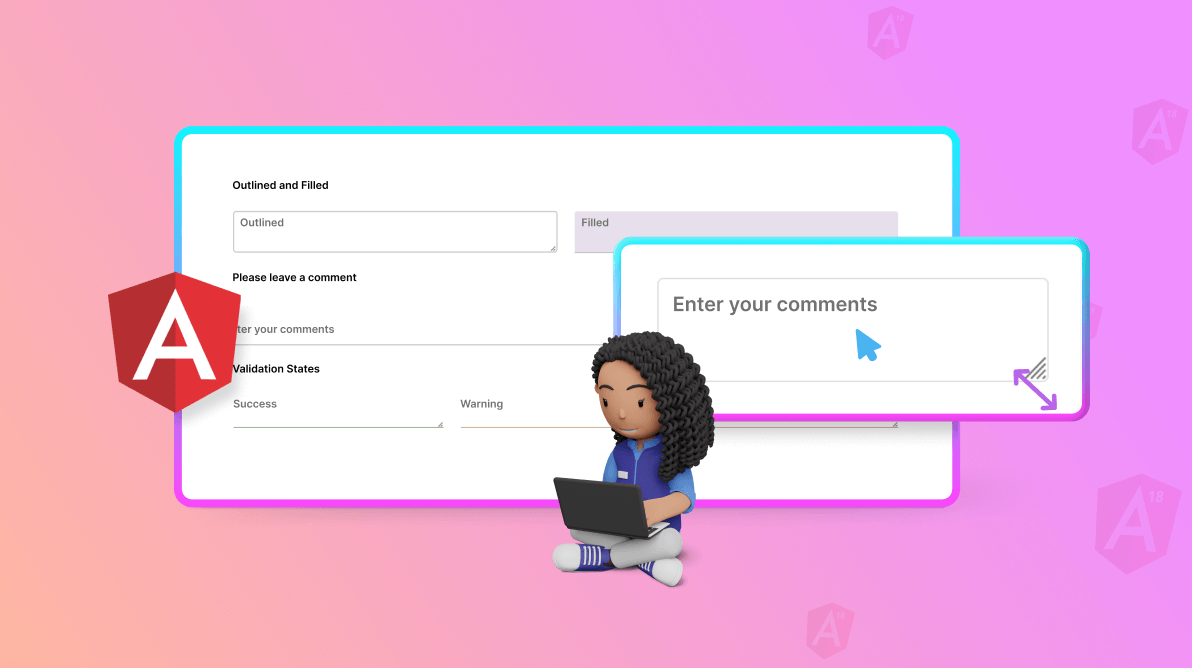
TLDR: The new Syncfusion Angular TextArea component, available in the 2024 Volume 2 release, enhances the multiline text input experience with features like resizing, floating labels, and extensive customization options. Explore its robust features and learn the steps to get started with it.
We’re thrilled to unveil the new Angular TextArea component in the 2024 volume 2 release.
It is a robust and flexible user interface element designed to enhance multiline text input. It offers a wide range of features and customization options, enabling developers to create rich, interactive text areas for their web apps. This component supports advanced functionalities, including character count limits, resizing, placeholder text, and custom styling, making it an essential tool for improving user experience and boosting productivity in web development.
Refer to the following image.
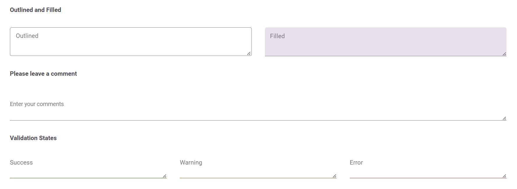
Key features
The Angular TextArea component offers a variety of features designed to enhance user experience and provide extensive customization options. With these, you can seamlessly input and edit multiline text content.
Resizable text areas
The Angular TextArea component can be resized vertically, horizontally, or in both directions by selecting the corresponding resize mode option.
Floating label
The Angular TextArea intelligently floats the placeholder text based on the specified floating label type option. When users start typing, the label transitions elegantly above the text area. This provides users with clear guidance about the required input and enhances usability.
Customization options
Developers have complete control over the TextArea component’s appearance and behavior. They can customize the number of rows and columns, specify the maximum length of input, turn the text area on or off, and apply custom CSS styles to match the look and feel of their app.
Rows and columns
Easily customize the dimensions of your text area by specifying the desired number of rows and columns so that it fits seamlessly into any application layout.
Maximum length
You can also define the maximum number of characters users can input in the TextArea.
Accessibility and compatibility
Accessibility is a top priority in modern web development. The Angular TextArea component is designed with accessibility in mind. It ensures that users with disabilities can navigate and interact with the text area using assistive technologies such as screen readers and keyboard shortcuts. Additionally, the component is compatible with all major web browsers, ensuring a seamless experience for users across different platforms.
Seamless integration
The TextArea component seamlessly integrates with other components and frameworks, making it easy to incorporate into existing web apps.
Getting started with Angular TextArea component
We’ve explored the user-friendly features of the Angular TextArea component. Let’s see how to integrate it into your app.
- First, refer to the Getting started with Angular TextArea component documentation.
- Include the necessary EJ2 scripts and stylesheets in your project.
- Then, add the Angular TextArea component to your HTML markup.
- You can then configure the component properties and customize its appearance and behavior according to your requirements. Refer to the following code example.
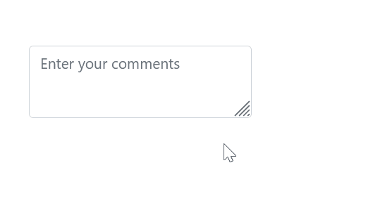
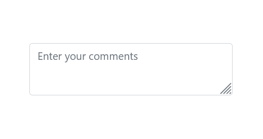
[app.component.ts]import { Component } from ‘@angular/core’; @Component({ selector: 'app-root', // Specifies the template string for the TextArea component. Template: `<div><ejs-textarea id='default' placeholder='Enter your comments' floatLabelType='Auto' resizeMode='Both' ></ejs-textarea></div>` }) export class AppComponent { constructor() { } }Refer to the following image.

Integrating TextArea component in Angular app

Conclusion
Thanks for reading! The Angular TextArea component is a powerful tool for enhancing multiline text input in web apps. Its advanced features, customization options, and seamless integration empower developers to create rich and interactive text areas that provide an exceptional user experience. Whether you’re building a simple form or a complex text editing app, the Angular TextArea component has you covered.
Ready to take your multiline text input to the next level? Try out the Angular TextArea component today and see the difference it can make in your web apps!
For a detailed overview of this release’s exciting updates, we invite you to visit our Release Notes and What’s New pages.
For our existing customers, the new version of Essential Studio® is now available on the License and Downloads page. If you’re new to Syncfusion, sign up for a 30-day free trial to try our controls yourself.
If you have any questions, you can reach us through our support forum, support portal, or feedback portal. We’re always happy to assist you!
 No spam, just valuable updates.