TL;DR: Explore how to create a .NET MAUI Radar Chart to visualize wind directions in major cities! Get insights on data preparation, chart configuration, and customization for a powerful data visualization tool. Check out the full guide on our GitHub!
Welcome to the Chart of the Week blog series!
Today, we’ll use a radar chart to visualize wind direction patterns in major cities worldwide. To design the radar chart, we’ll use the Syncfusion .NET MAUI Polar Charts, which allows us to create both polar and radar charts.
A radar chart is also known as a spider chart, web chart, or star chart. It is a powerful visualization tool for multi-dimensional data and is commonly used to showcase complex relationships between multiple variables. It plots data points on a polar coordinate system, with each point representing a single data set. This type of chart is beneficial for comparing multiple categories or dimensions, making it an excellent choice for analyzing wind direction patterns.
When visualizing data with many categories, the legend can become crowded and difficult to read. Wrapping the legend items ensures that all categories are clearly displayed, making the chart easier to understand and interpret.
Hence, we can use the radar chart wrapped with legend support to visualize the wind direction in cities around the world, comparing the patterns and strengths of different wind directions in each location. With this, we can better understand the complex relationships between wind patterns. This will also help us in urban planning and make better decisions that benefit the environment and the public.
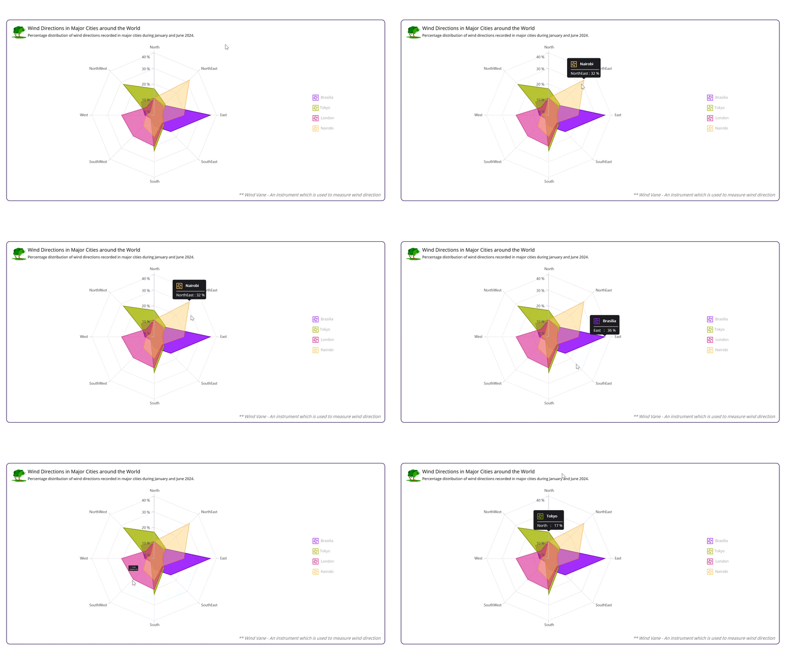
The following image demonstrates the chart that we intend to construct.

Step 1: Collecting the wind direction data
For this chart, we’ll use wind direction data from four cities: Brasilia, Tokyo, London, and Nairobi. We’ll collect the data for each city and store them in a list of ClimateData objects.Step 2: Preparing data for the chart
Let’s define the ClimateData class with the following properties:- Direction: Stores the wind direction (e.g., North, South, East, West).
- DirectionShortForm: Stores the abbreviated form of the wind direction (e.g., N, NE, E, SE).
- Brasilia, Tokyo, London, Nairobi: The wind speed values for each city.
- SolidColorBrush: Sets chart series color to the tooltip.
public class ClimateData
{
    public string? Direction { get; set; }
    public string? DirectionShortForm { get; set; }
    public double Brasilia { get; set; }
    public double Tokyo { get; set; }
    public double London { get; set; }
    public double Nairobi { get; set; }
    public Brush? SolidColorBrush { get; set; }
}
Then, define a ViewModel class that encapsulates the climate data and provides a convenient way to access it in the view. This class is used to hold the climate data for four cities: Brasilia, Tokyo, London, and Nairobi, using the following properties:
- BrasiliaData: A list of ClimateData objects containing the wind direction data for Brasilia (Capital of Brazil).
- TokyoData: A list of ClimateData objects containing the wind direction data for Tokyo (Capital of Japan).
- LondonData: A list of ClimateData objects containing the wind direction data for London (Capital of the United Kingdom).
- NairobiData: A list of ClimateData objects containing the wind direction data for Nairobi (Capital of Kenya).
public class ViewModel
{
    public List<ClimateData> BrasiliaData { get; set; }
    public List<ClimateData> TokyoData { get; set; }
    public List<ClimateData> LondonData { get; set; }
    public List<ClimateData> NairobiData { get; set; }

    public ViewModel()
    {
        BrasiliaData = new List<ClimateData>
        {
            new() { Direction = "North", DirectionShortForm = "N", Brasilia = 11 },
            new() { Direction = "NorthEast", DirectionShortForm = "NE", Brasilia = 9 },
            new() { Direction = "East", DirectionShortForm = "E", Brasilia = 36 },
            new() { Direction = "SouthEast", DirectionShortForm = "SE", Brasilia = 15 },
            new() { Direction = "South", DirectionShortForm = "S", Brasilia = 7 },
            new() { Direction = "SouthWest", DirectionShortForm = "SW", Brasilia = 3 },
            new() { Direction = "West", DirectionShortForm = "W", Brasilia = 6 },
            new() { Direction = "NorthWest", DirectionShortForm = "NW", Brasilia = 12 }
        };

        var brasiliaBrush = new SolidColorBrush(Color.FromArgb("#A32FFF"));
        BrasiliaData.ForEach(data => data.SolidColorBrush = brasiliaBrush);

        TokyoData = new List<ClimateData>
        {
            new() { Direction = "North", DirectionShortForm = "N", Tokyo = 17 },
            new() { Direction = "NorthEast", DirectionShortForm = "NE", Tokyo = 10 },
            new() { Direction = "East", DirectionShortForm = "E", Tokyo = 5 },
            new() { Direction = "SouthEast", DirectionShortForm = "SE", Tokyo = 9 },
            new() { Direction = "South", DirectionShortForm = "S", Tokyo = 23 },
            new() { Direction = "SouthWest", DirectionShortForm = "SW", Tokyo = 3 },
            new() { Direction = "West", DirectionShortForm = "W", Tokyo = 4 },
            new() { Direction = "NorthWest", DirectionShortForm = "NW", Tokyo = 28 }
        };

        var tokyoBrush = new SolidColorBrush(Color.FromArgb("#A4B500"));
        TokyoData.ForEach(data => data.SolidColorBrush = tokyoBrush);

        LondonData = new List<ClimateData>
        {
            new() { Direction = "North", DirectionShortForm = "N", London = 11 },
            new() { Direction = "NorthEast", DirectionShortForm = "NE", London = 8 },
            new() { Direction = "East", DirectionShortForm = "E", London = 6 },
            new() { Direction = "SouthEast", DirectionShortForm = "SE", London = 8 },
            new() { Direction = "South", DirectionShortForm = "S", London = 20 },
            new() { Direction = "SouthWest", DirectionShortForm = "SW", London = 19 },
            new() { Direction = "West", DirectionShortForm = "W", London = 21 },
            new() { Direction = "NorthWest", DirectionShortForm = "NW", London = 7 }
        };

        var londonBrush = new SolidColorBrush(Color.FromArgb("#D82591"));
        LondonData.ForEach(data => data.SolidColorBrush = londonBrush);

        NairobiData = new List<ClimateData>
        {
            new() { Direction = "North", DirectionShortForm = "N", Nairobi = 11 },
            new() { Direction = "NorthEast", DirectionShortForm = "NE", Nairobi = 32 },
            new() { Direction = "East", DirectionShortForm = "E", Nairobi = 19 },
            new() { Direction = "SouthEast", DirectionShortForm = "SE", Nairobi = 7 },
            new() { Direction = "South", DirectionShortForm = "S", Nairobi = 14 },
            new() { Direction = "SouthWest", DirectionShortForm = "SW", Nairobi = 10 },
            new() { Direction = "West", DirectionShortForm = "W", Nairobi = 5 },
            new() { Direction = "NorthWest", DirectionShortForm = "NW", Nairobi = 3 }
        };

        var nairobiBrush = new SolidColorBrush(Color.FromArgb("#FFCA61"));
        NairobiData.ForEach(data => data.SolidColorBrush = nairobiBrush);
    }
}
Step 3: Configure the Syncfusion .NET MAUI Polar Charts
As we said in the beginning, to display the radar chart, we are going to use the Syncfusion .NET MAUI Polar Charts (SfPolarChart) control. This control is a powerful charting component that allows us to create both polar and radar charts. Set the primary axis of the polar chart to be a CategoryAxis. This means that the x-axis values will be categorical labels rather than numerical values. In our case, the category labels will be the wind directions (North, South, East, West). The secondary axis of the polar chart is set to be a NumericalAxis. This means that the y-axis values will be numerical values representing the wind speed. We can replicate the radar chart design by setting the GridLineType property to Polygon on the SfPolarChart. Refer to the following code example.<chart:SfPolarChart GridLineType="Polygon">
<chart:SfPolarChart.PrimaryAxis>
<chart:CategoryAxis/>
</chart:SfPolarChart.PrimaryAxis>
<chart:SfPolarChart.SecondaryAxis>
<chart:NumericalAxis/>
</chart:SfPolarChart.SecondaryAxis>
</chart:SfPolarChart>
Step 4: Binding data to the chart
Now that we have set up our radar chart, it’s time to add the series to bind the wind direction data for each city. Here, we’ll create four PolarAreaSeries objects, each representing a different city: Brasilia, Tokyo, London, and Nairobi. We’ll use the ItemsSource property to bind the series to our ClimateData objects and the XBindingPath property to specify the category axis (in this case, the wind direction). We’ll bind each PolarAreaSeries to a different set of data: BrasiliaData, TokyoData, LondonData, and NairobiData. The XBindingPath property is set to DirectionShortForm for Android and iOS devices and Direction for default devices (Windows and macOS). This ensures that the x-axis labels are displayed correctly across different platforms. The YBindingPath property is set to the corresponding city name (Brasilia, Tokyo, London, or Nairobi) to display the y-axis values (Wind speed). Refer to the following code example.<chart:SfPolarChart>
…….
<chart:PolarAreaSeries ItemsSource="{Binding BrasiliaData}"
XBindingPath="{OnPlatform Android=DirectionShortForm, iOS=DirectionShortForm, Default=Direction}"
YBindingPath="Brasilia"/>
<chart:PolarAreaSeries ItemsSource="{Binding TokyoData}"
XBindingPath="{OnPlatform Android=DirectionShortForm, iOS=DirectionShortForm, Default=Direction}"
YBindingPath="Tokyo"/>
<chart:PolarAreaSeries ItemsSource="{Binding LondonData}"
XBindingPath="{OnPlatform Android=DirectionShortForm, iOS=DirectionShortForm, Default=Direction}"
YBindingPath="London"/>
<chart:PolarAreaSeries ItemsSource="{Binding NairobiData}"
XBindingPath="{OnPlatform Android=DirectionShortForm, iOS=DirectionShortForm, Default=Direction}"
YBindingPath="Nairobi"/>
……..
</chart:SfPolarChart>
Step 5: Customizing the chart appearance
The appearance of a chart can greatly impact its usability and aesthetic appeal. Let’s see how to customize the title, legend, and series appearance in our radar chart.Customizing the chart title
The chart’s title plays a crucial role in providing context to the data being displayed. We can use the Title property of the SfPolarChart to set the title for our chart. In this example, we’ll use a Grid layout to place the custom title with an image and description. We’ll also use the FontSize property to set the font size of the labels based on the platform. Refer to the following code example.<chart:SfPolarChart.Title>
<Grid>
<Grid.ColumnDefinitions>
<ColumnDefinition Width="50"/>
<ColumnDefinition Width="*"/>
</Grid.ColumnDefinitions>
<Image Grid.Column="0" Source="tree.png"/>
<Grid Grid.Column="1" Margin="3,0,0,0" RowSpacing="2">
<Grid.RowDefinitions>
<RowDefinition/>
<RowDefinition/>
</Grid.RowDefinitions>
<Label Text="Wind Directions in Major Cities around the World"
FontSize="{OnPlatform Android=12,iOS=12,Default=16}"
Grid.Row="0"/>
<Label Text="Percentage distribution of wind directions recorded in major cities during January and June 2024."
FontSize="{OnPlatform Android=8,iOS=8,Default=12}"
Grid.Row="1"/>
</Grid>
</Grid>
</chart:SfPolarChart.Title>
Customizing the chart axis
Axis customization is a crucial aspect of data visualization, especially when working with radar charts. We can use the primary and secondary axes in the radar chart to display the labels and data points, respectively. Customizing these axes can significantly impact the readability, clarity, and overall effectiveness of the chart. We’ll customize the secondary axis using the following properties:- Interval: To set the interval between tick marks on the axis. In this case, it’s set to 10 for Windows and macOS and 15 for Android and iOS devices.
- LabelStyle: To set the axis labels to display percentage values with no decimal places.
- FontSize: To set the font size for the axis label as 10 for both Android and iOS devices.
<chart:SfPolarChart>
........

<chart:SfPolarChart.PrimaryAxis>
     <chart:CategoryAxis/>
</chart:SfPolarChart.PrimaryAxis>

<chart:SfPolarChart.SecondaryAxis>
     <chart:NumericalAxis Interval="{OnPlatform Android=15,iOS=15,Default=10}">
         <chart:NumericalAxis.LabelStyle>
             <chart:ChartAxisLabelStyle LabelFormat="0' %" FontSize="{OnPlatform Android=10,iOS=10}"/>
         </chart:NumericalAxis.LabelStyle>
     </chart:NumericalAxis>
</chart:SfPolarChart.SecondaryAxis>

........
</chart:SfPolarChart>
Customizing the chart legend
The legend is essential to any chart, as it helps users understand what each series represents. We can customize the legend by setting its Placement, ItemsLayout, and ItemTemplate properties. The ItemsLayout property allows you to define how individual legend items need to be arranged within the legend. Refer to the following code example.<chart:SfPolarChart.Legend>
<local:LegendExt Placement="{OnPlatform
Android=Bottom,iOS=Bottom, Default=Right}">
<local:LegendExt.ItemsLayout>
<FlexLayout WidthRequest="220"
Wrap="Wrap"
Margin="50,0,0,0"
HorizontalOptions="CenterAndExpand"
IsEnabled="{OnPlatform Android=True,
iOS=True,Default=False}"/>
</local:LegendExt.ItemsLayout>
<chart:ChartLegend.ItemTemplate>
<DataTemplate>
<Grid ColumnDefinitions="4*,6*"
Margin="{OnPlatform WinUI='0,0,100,0',MacCatalyst='0,0,100,0'}">
<Path Grid.Column="0"
Data="{StaticResource radarIcon}" Fill="{Binding Item.Fill}">
<Path.RenderTransform>
<ScaleTransform ScaleX="0.6" ScaleY="0.6"/>
</Path.RenderTransform>
</Path>
<Label Grid.Column="1"
Margin="{OnPlatform Android='-4,0,10,2',
iOS='-4,0,0,2', Default='-2,0,0,2'}"
Text="{Binding Item.Label}" TextColor="Black" FontSize="12"/>
</Grid>
</DataTemplate>
</chart:ChartLegend.ItemTemplate>
</local:LegendExt>
</chart:SfPolarChart.Legend>
In the above code example, we’ve used the LegendExt control to customize the legend’s placement and ItemsLayout. We’ve also used a custom ItemTemplate to define how each series should be represented in the legend.
Note: For more details about the legend wrapping and its customization, refer to the knowledge base article: How to align the chart legend items in .NET MAUI Circular Charts?.
Customizing the series appearance
In the previous section, we’ve customized the chart title and legend. Now, let’s focus on customizing the series in our radar chart. Here, we’ll customize the chart series using the Opacity, Fill, and Stroke properties.<chart:PolarAreaSeries Opacity="1" Fill="#A32FFF" Stroke="#7112b7"/> <chart:PolarAreaSeries Opacity="0.8" Fill="#A4B500" Stroke="#778506"/> <chart:PolarAreaSeries Opacity="0.6” Fill="#D82591" Stroke="#bd1977"/> <chart:PolarAreaSeries Opacity="0.4" Fill="#FFCA61" Stroke="#f98707"/>By customizing these properties, we can create a visually appealing and meaningful representation of our data in the radar chart.
Enabling tooltip with ItemTemplate
Tooltips provide additional information about a specific data point when the user hovers over it. Here, we’ll create a custom tooltip template that includes an icon, a label with the city name, a separator, and another label for wind direction with the percentage value. To do so, create a custom DataTemplate called TooltipTemplate to display tooltips. Then, set the EnableTooltip property to True on the PolarAreaSeries element to enable tooltips for this series.<chart:SfPolarChart>
<chart:SfPolarChart.Resources>
<ResourceDictionary>
<DataTemplate x:Key="TooltipTemplate">
<VerticalStackLayout Padding="3,3,3,3">
<HorizontalStackLayout>
<Path Data="{StaticResource radarIcon}"
HorizontalOptions="Start"
Fill="{Binding Item, Converter={StaticResource fillConvertor}}">
<Path.RenderTransform>
<ScaleTransform ScaleX="0.6" ScaleY="0.6" />
</Path.RenderTransform>
</Path>
<Label Text="{Binding Item, Converter={StaticResource CountryConvertor}}"
TextColor="White" HorizontalOptions="Center"
FontAttributes="Bold" FontSize="12" Margin="-3,0,7,0"/>
</HorizontalStackLayout>
<BoxView HeightRequest="2.5" HorizontalOptions="FillAndExpand"
Color="Gray" Margin="0,-7,0,2"/>
<HorizontalStackLayout>
<Label Text="{Binding Item, Converter={StaticResource stringConvertor}, StringFormat='{0} %'}" FontSize="12" TextColor="White"/>
</HorizontalStackLayout>
</VerticalStackLayout>
</DataTemplate>
</ResourceDictionary>
</chart:SfPolarChart.Resources>
<chart:PolarAreaSeries EnableTooltip="True"
TooltipTemplate="{StaticResource TooltipTemplate}"/>
</chart:SfPolarChart>
By following these steps, we can create a stunning radar chart with rich visualizations and engaging interactions, making it an effective tool for data analysis and visualization.
GitHub reference
For more details, refer to creating a .NET MAUI Radar Chart to visualize wind directions of major cities GitHub demo.
Supercharge your cross-platform apps with Syncfusion's robust .NET MAUI controls.
Try It Free

