TL;DR: Let’s visualize the distribution of atomic weights in the periodic table using Syncfusion’s .NET MAUI Histogram Chart. We’ll guide you through gathering and binding data to the chart and customizing the elements, such as title, series, axis, and tooltips, for better visualization.
Welcome to the Chart of the Week blog series!
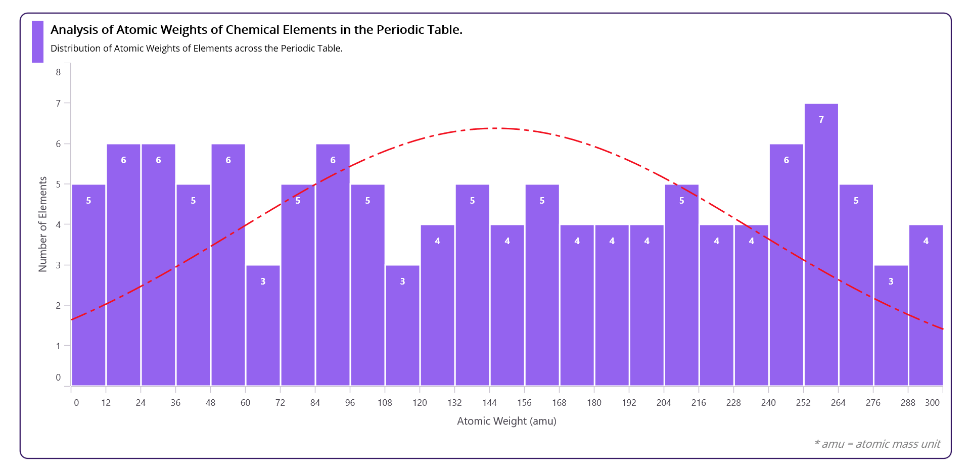
Today, we will visualize the distribution of atomic weights across the elements in the periodic table using the Syncfusion .NET MAUI Histogram Chart.
The periodic table, structured in a tabular format, categorizes chemical elements based on their atomic number, electron configuration, and recurring chemical characteristics. It is a foundational instrument in chemistry, facilitating comprehension of element relationships and anticipating their behaviors.
Elements, in the context of the periodic table, refer to the fundamental substances that make up all matter. Each element is represented by a unique symbol, usually derived from its name, and organized in rows and columns within the periodic table.
The following image demonstrates the chart that we intend to construct.
 Let’s explore the steps to visualize and understand the distribution of atomic weights across the elements in the periodic table using the Syncfusion .NET MAUI Histogram Chart.
Step 1: Gathering the Periodic table data
Before we create the Histogram Chart, let’s gather the periodic table data from Data Explorer. You can also download the data in CSV format.
Step 2: Populate the data for the chart
Let’s create the Model class with the AtomicNumber and AtomicWeight properties.
Refer to the following code example.
public class Model
{
    public int AtomicNumber {  get; set; }
    public double AtomicWeight {  get; set; }

    public Model(int atomicNumber, double atomicWeight)
    {
        AtomicNumber = atomicNumber;
        AtomicWeight = atomicWeight;
    }
}
The ViewModel class will generate the data collection. The CSV data, containing information about the elements’ atomic numbers and weights, will be assigned to the ElementData property using the ReadCSV method.
public class ViewModel: INotifyPropertyChanged
{
        List<Model> elementsData;
        public event PropertyChangedEventHandler? PropertyChanged;

        public List<Model> ElementsData
        {
            get { return elementsData; }
            set
            {
                elementsData = value;
                NotifyPropertyChanged();
            }
        }


        public ViewModel()
        {
            ElementsData = ReadCSV();
        }

        private List<Model> ReadCSV()
        {
            Assembly executingAssembly = typeof(App).GetTypeInfo().Assembly;
            Stream inputStream = executingAssembly.GetManifestResourceStream("PeriodicTableElements.Resources.Raw.Table.csv");

            string? line;
            List<string> lines = new List<string>();

            using StreamReader reader = new StreamReader(inputStream);
            while ((line = reader.ReadLine()) != null)
            {
                lines.Add(line);
            }

            List<Model> elementDetails = new();

            foreach (string line1 in lines)
            {
                string[] data = line1.Split(',');
                elementDetails.Add(new Model(
                     int.Parse(data[0]),
                     double.Parse(data[3])));
            }

            return (elementDetails);
        }

        private void NotifyPropertyChanged([CallerMemberName] string propertyName = "")
        {
            PropertyChanged?.Invoke(this, new PropertyChangedEventArgs(propertyName));
        }
}
Step 3: Configuring .NET MAUI Cartesian Charts
Let’s configure the .NET MAUI Cartesian Charts control using this documentation.
Refer to the following code example.
<chart:SfCartesianChart>

 <!—Initialize the x-axis for chart-->
 <chart:SfCartesianChart.XAxes>
  <chart:NumericalAxis/>
 </chart:SfCartesianChart.XAxes>

 < —!--Initialize the y-axis for chart-->
 <chart:SfCartesianChart.YAxes>
  <chart:NumericalAxis/>
 </chart:SfCartesianChart.YAxes>

</chart:SfCartesianChart>
Step 4: Binding the Periodic table data to the .NET MAUI Histogram Chart
Let’s bind the Periodic table data to Syncfusion’s HistogramSeries.
Refer to the following code example.
<chart:HistogramSeries  ItemsSource="{Binding ElementsData}"
                        XBindingPath="AtomicWeight"
                        YBindingPath="AtomicNumber"
                        HistogramInterval="12"
                        x:Name="histogramSeries">
</chart:HistogramSeries >
Here, we’ve bound the ElementsData collection from the ViewModel to the ItemSource property and set the HistogramInterval property values as 12. The XBindingPath and YBindingPath properties are bound to the AtomicWeight and AtomicNumber properties, respectively.
Step 5: Customizing the appearance of the chart
Let’s customize the appearance of the .NET MAUI Histogram Chart to boost its visual effect.
Adding chart title
Adding a title to the chart improves its readability and helps users understand its content. Refer to the following code example to add a chart title.
<chart:SfCartesianChart.Title>
 <Grid HeightRequest="{OnPlatform Android=35,Default=55,iOS=35}">
  <Grid.ColumnDefinitions>
   <ColumnDefinition Width="20"></ColumnDefinition>
   <ColumnDefinition Width="Auto"></ColumnDefinition>
  </Grid.ColumnDefinitions>
  <BoxView  BackgroundColor="#9463ef"
            Grid.Column="0" Margin="5,0,0,0" >
  </BoxView>

  <VerticalStackLayout Grid.Column="1" Margin="10,0,0,0">
   <Label Text="Analysis of Atomic Weights of
          Chemical  Elements in the Periodic Table."
          FontSize="{OnPlatform Android=12,Default=16,iOS=12}"
          FontAttributes="Bold" >
   </Label>
   <Label  Text="Distribution of Atomic Weights of Elements across the Periodic
           Table."
           FontSize="{OnPlatform Android=10,Default=12,iOS=12}"
           Margin="0,5,0,0">
   </Label>
  </VerticalStackLayout>
 </Grid>
</chart:SfCartesianChart.Title>
Customizing the Histogram series
Here, we will enhance the series appearance using the Fill, Stroke, and StrokeWidth properties and customize the curve with the CurveStyle property.
Refer to the following code example.
<chart:HistogramSeries Stroke="White" StrokeWidth="2" Fill=" #9463ef" >
 <chart:HistogramSeries.CurveStyle>
  <chart:ChartLineStyle  Stroke=" #f21120" StrokeWidth="2"
                         StrokeDashArray="{OnPlatform  Android='6,3,1', iOS='6,3,1',
                         Default='12,3,3,3'}" >
  </chart:ChartLineStyle>
 </chart:HistogramSeries.CurveStyle>
</chart:HistogramSeries>
Axis customization
Now, we’ll enhance the appearance of the chart axis line by initializing it with the following properties:
- Maximum and Minimum to set value limits,
- Interval for spacing between tick marks,
- ShowMajorGridLines for grid line visibility and
- Title for a descriptive axis label.
Refer to the following code example.
<chart:SfCartesianChart.XAxes>
 <chart:NumericalAxis Minimum="0" Interval="12" ShowMajorGridLines="False">
  <chart:NumericalAxis.Title>
   <chart:ChartAxisTitle Text="Atomic Weight (amu)"></chart:ChartAxisTitle>
  </chart:NumericalAxis.Title>
 </chart:NumericalAxis>
</chart:SfCartesianChart.XAxes>

<chart:SfCartesianChart.YAxes>
 <chart:NumericalAxis Minimum="0" Maximum="8" Interval="1" ShowMajorGridLines="False" >
  <chart:NumericalAxis.Title>
   <chart:ChartAxisTitle Text="Number of Elements"></chart:ChartAxisTitle>
  </chart:NumericalAxis.Title>
 </chart:NumericalAxis>
</chart:SfCartesianChart.YAxes>
Step 6: Adding interaction
Now, enable and customize tooltips in your series to enhance data visualization and provide additional insights.
Refer to the following code example.
< chart:SfCartesianChart>
. . .
<chart:HistogramSeries EnableTooltip="True">
<chart:HistogramSeries.TooltipTemplate>
<DataTemplate>
<VerticalStackLayout Padding="3,3,3,3" >
<HorizontalStackLayout>
<Path HorizontalOptions="Start"
Data="{StaticResource starGeometry}"
Stroke="White" StrokeThickness="1" Fill="#9463ef">
<Path.RenderTransform>
<ScaleTransform ScaleX="0.6" ScaleY="0.6"/>
</Path.RenderTransform>
</Path>
<Label Text="Atomic Weight" TextColor="White"
HorizontalOptions="Center" FontAttributes="Bold" FontSize="14.8"/>
</HorizontalStackLayout>
<BoxView HeightRequest="2.5" HorizontalOptions="FillAndExpand"
Color="Gray" Margin="0,-2,0,2"/>
<HorizontalStackLayout Spacing="4">
<Label HorizontalOptions="Start"
Text="Range (at. wt.)     : "
FontAttributes="Bold"
FontSize="12.8" TextColor="White"></Label>
<Label Text="{Binding Item,Converter={StaticResource labelConverter},ConverterParameter = 20}"
TextColor="White" FontAttributes="Bold" FontSize="12.8"/>
</HorizontalStackLayout>
<HorizontalStackLayout Spacing="4">
<Label HorizontalOptions="Start" Text="No. of Elements  : "
FontAttributes="Bold" FontSize="12.8" TextColor="White"></Label>
<Label Text="{Binding Item,Converter={StaticResource ValueConverter}}"
TextColor="White" FontAttributes="Bold" FontSize="12.8"/>
</HorizontalStackLayout>
</VerticalStackLayout>
</DataTemplate>
</chart:HistogramSeries.TooltipTemplate>
</chart:HistogramSeries >
</chart:SfCartesianChart>
After executing the previous code examples, the output will resemble the following image.

GitHub reference
For more details, refer to the project on GitHub.
Conclusion
Thanks for reading! In this blog, we have explored how to visualize the distribution of the atomic weight of elements in the periodic table using the Syncfusion .NET MAUI Histogram Chart. Please follow the steps outlined in this blog and share your thoughts in the comments below.
The existing customers can download the latest version of Essential Studio® from the License and Downloads page. If you are new, try our 30-day free trial to explore our incredible features.
You can also contact us via our support forum, support portal, or feedback portal. We are always happy to help you!
