
 Vimala Thirumalai Kumar
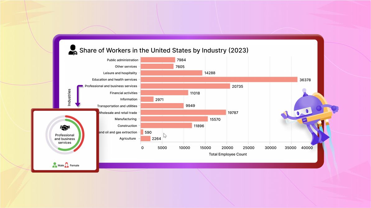
TL;DR: Let’s create a Drill-Down Chart using Syncfusion .NET MAUI Charts. First, we’ll gather workforce distribution data across U.S. industries. Then, we’ll configure the Bar and Radial Bar Charts with drill-down functionality for interactive exploration. We’ll also customize series, palettes, labels and more elements to enhance data analysis and presentation.
Welcome to the Chart of the Week blog series!
Today, we’ll create a .NET MAUI Drill-Down Chart using the Syncfusion .NET MAUI Cartesian Charts and Circular Charts.
Drill-down support in charts allows users to explore data at different levels of detail by interacting with specific chart elements, such as segments in a bar chart. This functionality facilitates navigation from a high-level overview to more detailed data visualizations, enhancing data analysis and presentation.
In our scenario, a bar chart is initially displayed. Clicking on a segment shows its details in a radial bar chart. Here, we’ll visualize the workforce distribution across industries in the United States using our drill-down chart.
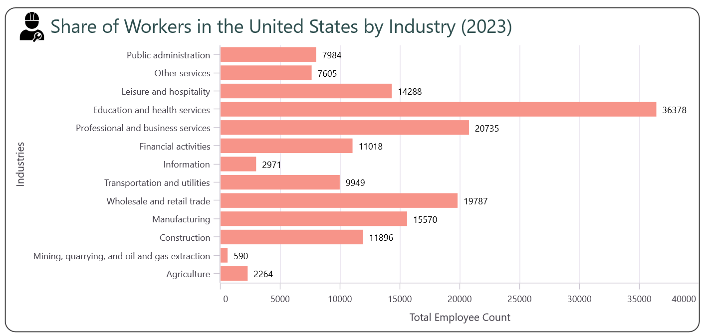
The following image provides a clear visualization of workforce distribution across industries in the US for 2023.
Let’s get started!
Step 1: Gathering data from the source
Let’s gather data from the annual report on the percentage distribution of employed persons by industry of work for the year 2023 in the United States.
Step 2: Preparing the data for the chart
Start by creating a model for representing the percentage data of the workers categorized by industry.
public class DataModel
{
   public string Industry { get; set; } = string.Empty;
   public double Percent {get; set;}
   public double Male {get; set;}
   public double Female {get; set;}
   public DataModel(string industry, double percent, double male, double female)
   {
       Industry = industry;
       Percent = percent;
       Male = male;
      Female = female;
  }
}
Next, create a ViewModel to hold a collection of data on the industrial distribution of workers.
public class DataViewModel
{
  public ObservableCollection<DataModel> DataCollection {get; set; }

  public DataViewModel()
  {
     DataCollection = new ObservableCollection<DataModel>
     {
        new DataModel("Agriculture", 2264,  1601, 663),
        new DataModel("Mining, quarrying, and oil and gas extraction", 590, 500, 90),
        new DataModel("Construction",  11896, 10610, 1287),
        new DataModel("Manufacturing", 15570,  10971, 4599),
        new DataModel("Wholesale and retail trade", 19787, 10877, 8910),
        new DataModel("Transportation and utilities", 9949, 7530, 2420),
        new DataModel("Information", 2971,  1833,  1138),
        new DataModel("Financial activities", 11018, 5384, 5634),
        new DataModel("Professional and business services", 20735, 11980, 8756),
        new DataModel("Education and health services", 36378,  9322, 27056),
        new DataModel("Leisure and hospitality", 14288, 7027, 7261),
        new DataModel("Other services", 7605,  3551,  4055),
        new DataModel("Public administration", 7984,  4313,  3670),
     };
  }
}
Step 3: Configure the Syncfusion .NET MAUI Charts
Let’s configure the Syncfusion .NET MAUI Cartesian Charts control using this documentation. We use the x-axis as the CategoryAxis to update the industry field and the y-axis as the NumericalAxis to update the employee count.
Refer to the following code example.
<?xml version="1.0" encoding="utf-8" ?>
<ContentPage xmlns:chart="clr-namespace:Syncfusion.Maui.Charts;assembly=Syncfusion.Maui.Charts">
  <chart:SfCartesianChart>
     <chart:SfCartesianChart.XAxes>
        <chart:CategoryAxis/>
     </chart:SfCartesianChart.XAxes>

     <chart:SfCartesianChart.YAxes>
        <chart:NumericalAxis/>
     </chart:SfCartesianChart.YAxes>
     …
   </chart:SfCartesianChart>
</ContentPage>
Step 4: Binding data to the .NET MAUI Bar Chart
To design a bar chart, we’ll use the Syncfusion ColumnSeries instances and transpose it. The Column Chart is the supported chart type in the Syncfusion .NET MAUI Cartesian Charts. Make sure to configure the DataViewModel class to bind its properties to the chart’s BindingContext.
Refer to the following code example. Here, in the ColumnSeries, the ItemSource, XBindingPath, and YBindingPath properties are bound to the DataCollection, Industry, and Percent properties, respectively.
<?xml version="1.0" encoding="utf-8" ?>
<ContentPage xmlns:chart="clr-namespace:Syncfusion.Maui.Charts;assembly=Syncfusion.Maui.Charts" >
   <chart:SfCartesianChart IsTransposed="True">
     <chart:SfCartesianChart.BindingContext>
        <local:DataViewModel />
     </chart:SfCartesianChart.BindingContext>

     <chart:ColumnSeries x:Name="series" Fill="#f79489" ItemsSource="{Binding DataCollection}" XBindingPath="Industry" YBindingPath="Percent">
    <chart:SfCartesianChart>
</ContentPage>
Step 5: Customizing the .NET MAUI Bar (Primary) Chart
Let’s customize the .NET MAUI Bar Chart’s key features, including the title, series, data label, and interaction features, for better data visualization.
Customizing chart title
The chart’s Title provides quick information about the data being plotted in it. To add a title to the .NET MAUI Bar Chart, refer to the following code example.
<chart:SfCartesianChart.Title>
 <HorizontalStackLayout Margin="10, 5, 0, 5">
   <Image Source="worker.png" WidthRequest="50" HeightRequest="40" IsVisible="{OnPlatform Android=False, iOS=False}"/>
   <Label Text="Share of Workers in the United States by Industry (2023)" VerticalOptions="Center" TextColor="DarkSlateGray" FontSize="{OnPlatform Android=18, Default=25, iOS=Small}" FontFamily="Bold" />
 </HorizontalStackLayout>
</chart:SfCartesianChart.Title>
Customizing the chart axis
Let’s set descriptive axis titles to enhance chart readability.
<chart:SfCartesianChart.XAxes >
  <chart:CategoryAxis ShowMajorGridLines="False">
    <chart:CategoryAxis.Title>
      <chart:ChartAxisTitle Text="Industries" />
    </chart:CategoryAxis.Title>
  </chart:CategoryAxis>
</chart:SfCartesianChart.XAxes>

<chart:SfCartesianChart.YAxes>
 <chart:NumericalAxis x:Name="yAxis" >
   <chart:NumericalAxis.Title>
     <chart:ChartAxisTitle Text="Total Employee Count" />
   </chart:NumericalAxis.Title>
 </chart:NumericalAxis>
</chart:SfCartesianChart.YAxes>
Customizing the chart series appearance
The .NET MAUI Bar Chart offers the flexibility to customize the series’ fill color. Refer to the following code example.
<chart:ColumnSeries Fill="#f79489">
Customize chart data labels
We can display data labels in the Bar Chart by setting the ShowDataLables property to True. Further, we can customize the position of the data labels using the LabelPlacement property. The UseSeriesPalette property is used to set the data label background to match the interior (fill color) of the chart series. In our case, we don’t need the background for data labels, so the UseSeriesPalette property is set to false.
<chart:ColumnSeries ShowDataLabels="True">
  <chart:ColumnSeries.DataLabelSettings>
    <chart:CartesianDataLabelSettings UseSeriesPalette="False" LabelPlacement="Outer"/>
  </chart:ColumnSeries.DataLabelSettings>
</chart:ColumnSeries>
Step 6: Adding drill-down functionality in the Bar Chart
The drill-down functionality allows users to navigate from one chart to another when tapping on a segment. This functionality is achieved by using the SelectionChanging event in the .NET MAUI Charts.
For example, initially, we’ll display the distribution of workers categorized by industry in the .NET MAUI Bar Chart. When you tap on a particular segment on the Bar Chart, it will generate a new Radial Bar Chart to provide further detailed information.
To achieve this UI, we need to invoke the SelectionChanging event in the Bar Chart with generated data.
<chart:ColumnSeries.SelectionBehavior>
  <chart:DataPointSelectionBehavior SelectionChanging="DataPointSelectionBehavior_SelectionChanging"/>
</chart:ColumnSeries.SelectionBehavior>
The SelectionChanging event will be triggered when a user interacts with the chart by tapping on a particular segment of the Bar Chart. Refer to the following code example.
private void DataPointSelectionBehavior_SelectionChanging(object sender, ChartSelectionChangingEventArgs e)
{
    var series = sender as ColumnSeries;
    int selectedIndex = e.NewIndexes[0];

    if (series == null || series.ItemsSource is not IList items)
    {
       return;
    }

    //Get selected segment data.
    var selectedData = items[selectedIndex] as DataModel;

    if (selectedData != null)
    {
       // Navigate to the next page which represents the chart with details.
       Navigation.PushAsync(new SecondaryPage(selectedData));
       e.Cancel = true;
    }
}
Step 7: Populate selected segment data on the navigated page
To create the Bar Chart, we’ve already configured the Syncfusion .NET MAUI Cartesian Charts with the Syncfusion.Maui.Charts package. Both Syncfusion .NET MAUI Cartesian and Circular Charts are available in the Syncfusion.Maui.Charts package.
So, let’s directly create the .NET MAUI Radial Bar Chart (Chart type supported by Circular Charts) to display detailed information about the selected segment category. Add the category data to the DataViewModel.
public class Model
{
    public double AgricultureEmployee { get; set; }
    public double MiningEmployee { get; set; }
    public double ConstructionEmployee { get; set; }
    public double ManufacturingEmployee { get; set; }
    public double WholesaleEmployee { get; set; }
    public double TransportationEmployee { get; set; }
    public double InformationEmployee { get; set; }
    public double FinancialEmployee { get; set; }
    public double ProfessionalEmployee { get; set; }
    public double EducationEmployee { get; set; }
    public double LeisureEmployee { get; set; }
    public double OtherEmployee { get; set; }
    public double PublicEmployee { get; set; }
    public string? Gender { get; set; }
    public Geometry? Path { get; set; }

    public Model(string gender, double agricultureEmployee, double miningEmployee, double constructionEmployee, double manufacturingEmployee, double wholesaleEmployee, double transportEmployee, double informationEmployee, double financialEmployee, double professionalEmployee, double educationEmployee, double leisureEmployee, double otherEmployee, double publicEmployee, Geometry? path)
    {
        Gender = gender;
        AgricultureEmployee = agricultureEmployee;
        MiningEmployee = miningEmployee;
        ConstructionEmployee = constructionEmployee;
        ManufacturingEmployee = manufacturingEmployee;
        WholesaleEmployee = wholesaleEmployee;
        TransportationEmployee = transportEmployee;
        InformationEmployee = informationEmployee;
        FinancialEmployee = financialEmployee;
        ProfessionalEmployee = professionalEmployee;
        EducationEmployee = educationEmployee;
        LeisureEmployee = leisureEmployee;
        OtherEmployee = otherEmployee;
        PublicEmployee = publicEmployee;
        Path = path;
    }
}
public class DataViewModel
{
    public ObservableCollection<Model> EmployeeCollection { get; set; }

    public DataViewModel()
    {
        EmployeeCollection = new ObservableCollection<Model>
        {
            new Model("Male", 1601, 500, 10610, 10971, 10877, 7530, 1833, 5384, 11980, 9322, 7027, 3551, 4313, MalePath),
            new Model("Female", 663, 90, 1287, 4599, 8910, 2420, 1138, 5634, 8756, 27056, 7261, 4055, 3670, FemalePath),
        };
    }
}
Now, bind the data to the Radial Bar Chart on the navigated page using the ItemsSource, XBindingPath, and YBindingPath properties. Here, we’ll represent the Gender and Employee count data for each industry.
XAML
<chart:SfCircularChart>

 <chart:SfCircularChart.BindingContext>
   <local:DataViewModel x:Name="viewModel"/>
 </chart:SfCircularChart.BindingContext>

<chart:RadialBarSeries ItemsSource="{Binding EmployeeCollection}" XBindingPath="Gender">
C#
public partial class SecondaryPage : ContentPage
{
     public SecondaryPage(DataModel selectedData)
     {
         InitializeComponent();

         viewModel.Data = selectedData;
         var field = selectedData.Industry.Split(' ')[0].Replace(",", "");
         series.YBindingPath = field + "Employee";
     }
 }
Step 8: Customizing the .NET MAUI Radial Bar (Secondary) Chart
Let’s see how to customize the elements of the .NET MAUI Radial Bar Chart for enhanced readability and visualization.
Customize chart series
Let’s customize the chart’s series appearance to better suit our data presentation needs. The CapStyle property smooths the curves at the start and end of each bar. The Radius property adjusts the size of the Radial Bar Chart. The GapRatio sets the space between each segment, and the TrackFill property customizes the background area behind the radial bar segments.
<chart:RadialBarSeries CapStyle="BothCurve" GapRatio="0.4" TrackFill="#E7E0EC"
Radius="{OnPlatform Default=0.8, Android=1, iOS=1}" InnerRadius="0.6">
Adding image into the center view
The CenterView in the .NET Radial Bar Chart helps us to convey additional information about the chart. In this example, we’ve included an image related to the content in the center view of our Radial Bar Chart. The images were sourced from Metro Studio.
<chart:RadialBarSeries.CenterView>
    <StackLayout HeightRequest="{Binding CenterHoleSize, Converter={StaticResource dimension}}" WidthRequest="{Binding CenterHoleSize}" VerticalOptions="Center" HorizontalOptions="Center" Margin="{OnPlatform Default='0, -10, 0, 0', Android='0, 0, 0, 0', MacCatalyst='0, 30, 0, 0', iOS='0'}" >
      <Image Source="{Binding Source={x:Reference viewModel}, Path=ImageName}" WidthRequest="{OnPlatform Android=40, iOS=40, WinUI=60, MacCatalyst=80}" HeightRequest="{OnPlatform Android=40, iOS=40, WinUI=60, MacCatalyst=80}" />
      <Label x:Name="centerView" MaxLines="4" FontSize="{OnPlatform Android=12, iOS=12, MacCatalyst=20, WinUI=18}" VerticalOptions="Center" Margin="{OnPlatform Default='10, 4, 10, 0', MacCatalyst='0', Android='2, 0, -5, 0', iOS='0'}" HorizontalTextAlignment="Center" MaximumWidthRequest="{OnPlatform MacCatalyst=280, iOS=90}"/>
    </StackLayout>
</chart:RadialBarSeries.CenterView>
Palette: Making data pop with colors
Let’s customize the palette to use distinct colors for each category, making it easier to differentiate between them. Each segment of the Radial Bar Chart represents gender within each industry. This use of color coding helps in the quick visual identification and comparison of categories.
Refer to the following code example.
C#
public class DataViewModel
{
     public List<Brush> CustomBrushes {get; set;}
     public DataViewModel()
     {
        CustomBrushes = new List<Brush>()
        {
           new SolidColorBrush(Color.FromArgb("#67bd57")),
           new SolidColorBrush(Color.FromArgb("#e33d3d"))
        };
     }
}
XAML
<chart:RadialBarSeries PaletteBrushes="{Binding CustomBrushes}"/>
Adding legend: A quick reference guide
The legend helps us to provide information about the segments displayed in the Radial Bar Chart. It lists all the categories with their respective colors as icons, making it easy to interpret the data at a glance without needing to hover over each segment. Here, we have further customized the legend with the preferred template.
<chart:SfCircularChart.Legend>
  <chart:ChartLegend Placement="{OnPlatform Android=Bottom, Default=Bottom, iOS=Bottom}">
    <chart:ChartLegend.ItemTemplate>
      <DataTemplate>
        <HorizontalStackLayout Margin="0, 0, 0, 0">
          <Path Data="{Binding Item.Path}" WidthRequest="50" HeightRequest="50"  Fill="{Binding IconBrush,Converter={StaticResource brushToColor}}" Margin="5,0,0,0"/>
          <Label Text="{Binding Text}" FontSize="15" VerticalOptions="Center" TextColor="Black" VerticalTextAlignment="Center" Margin="-15, -10, 0, 0"/>
        </HorizontalStackLayout>
      </DataTemplate>
    </chart:ChartLegend.ItemTemplate>
  </chart:ChartLegend>
</chart:SfCircularChart.Legend>
Tooltip: Adding contextual information
The tooltip in the Radial Bar Chart provides additional context for each segment when hovered over. To enhance the user experience, we can customize the tooltip to display details such as the segment name, percentage value, and employee count of the category.
<chart:SfCircularChart.TooltipBehavior>
   <chart:ChartTooltipBehavior/>
</chart:SfCircularChart.TooltipBehavior>

<chart:RadialBarSeries EnableTooltip="True">
  <chart:RadialBarSeries.TooltipTemplate>
    <DataTemplate>
      <Grid>
        <Grid.ColumnDefinitions>
           <ColumnDefinition Width="Auto"/>
           <ColumnDefinition Width="*"/>
        </Grid.ColumnDefinitions>
        <Path Data="{Binding . , Converter={StaticResource tooltipTemplate}, ConverterParameter=image}" WidthRequest="50" HeightRequest="50" Margin="0, 10, 0, 0"  Fill="White" />
        <VerticalStackLayout Grid.Column="1" VerticalOptions="Center" Margin="{OnPlatform Default='0, -5, 0, 0', Android='0, -20, 0, 0'}">
           <Label Text="{Binding . , Converter={StaticResource tooltipTemplate}, ConverterParameter=yValue}" TextColor="White" LineBreakMode="NoWrap"/>
           <Label Text="{Binding . , Converter={StaticResource tooltipTemplate}, ConverterParameter=percent, StringFormat='{0}%'}" TextColor="White" LineBreakMode="NoWrap"/>
        </VerticalStackLayout>
      </Grid>
    </DataTemplate>
  </chart:RadialBarSeries.TooltipTemplate>
</chart:RadialBarSeries>
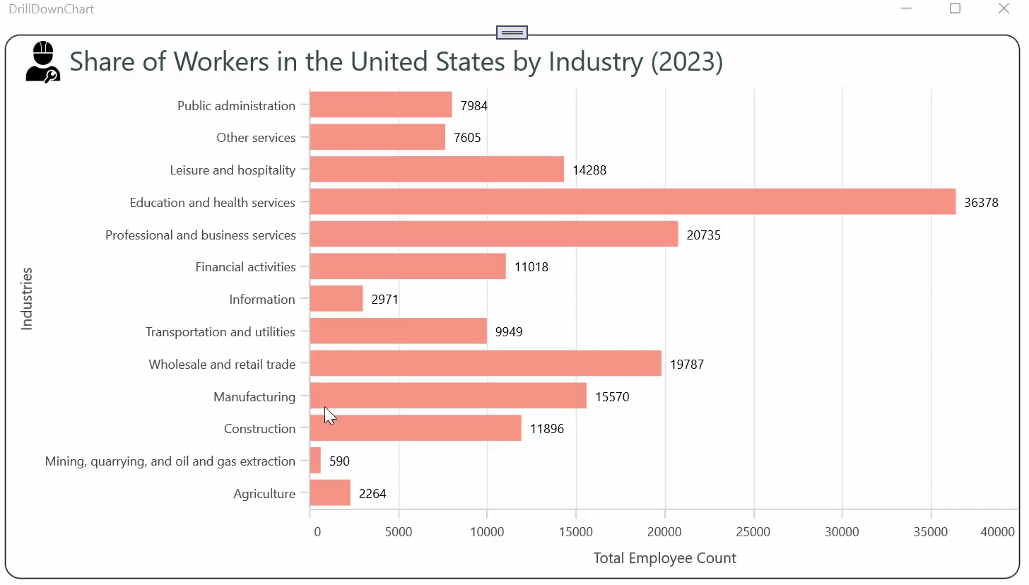
After executing the previous code examples, the output will look like the following image.

GitHub reference
For more details, refer to the .NET MAUI Drill-Down Chart to view U.S. workforce distribution by industry GitHub demo.
Conclusion
Thanks for reading! In this blog, we’ve seen how to create a .NET MAUI Drill-Down Chart to view U.S. workforce distribution by industry using the Syncfusion .NET MAUI Charts. We strongly encourage you to follow the steps outlined in this blog and share your feedback in the comments section below.
The existing customers can download the latest version of Essential Studio® from the License and Downloads page. If you are new, try our 30-day free trial to explore our incredible features.
If you require any assistance, please don’t hesitate to contact us via our support forum, support portal, or feedback portal. We are always eager to help you!


 No spam, just valuable updates.