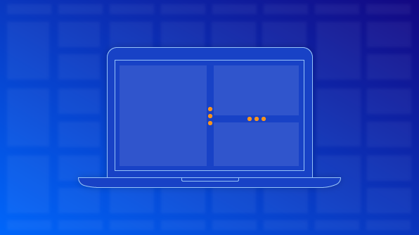

React Splitter component
We are happy to introduce the final version of the React Splitter component. The preview version of the React Splitter component was introduced with the 2018 Volume 4 release. Now, the official version of the Splitter has been improved with collapsible panes to enhance its use case in our 2019 Volume 1 release.
The React Splitter component is a layout component that supports all important features such as resizing, collapsing, and nesting panes. It is designed using a CSS3 flexbox to bring a properly structured layout to its panes. The component simplifies design layouts when an application has different and complex layouts.
In this blog post, we will summarize key features of the React Splitter component:
The Splitter component’s panes flow either from left to right or top to bottom. The Splitter renders its panes horizontally with default settings, but you can change its orientation to vertical using the ‘orientation’ property.
The following code example explains how to render a horizontal or vertical splitter.
import { PaneDirective, PanesDirective, SplitterComponent } from '@syncfusion/ej2-react-layouts';
import * as React from 'react';
import './App.css';

class Splitter extends React.Component {

public LeftPane(): JSX.Element {
return (
<div className='splitter-content'> <span > Left pane </span> </div>
)
}

public RightPane(): JSX.Element {
return (
<div className='splitter-content'> <span > Right pane </span> </div>
)
}

public TopPane(): JSX.Element {
return (
<div className='splitter-content'> <span > Top pane </span> </div>
)
}

public BottomPane(): JSX.Element {
return (
<div className='splitter-content'> <span > Bottom pane </span> </div>
)
}

public render() {
return (
<div className="App">

{/* Horizontal Splitter */}
<SplitterComponent id="horizontalSplitter" height="100px" width="50%" separatorSize={4}>
<PanesDirective>
<PaneDirective size="50%" min="60px" content={this.LeftPane} />
<PaneDirective content={this.RightPane} />
</PanesDirective>
</SplitterComponent>

{/* Vertical Splitter */}
<SplitterComponent id="verticalSplitter" height="200px" width="50%" separatorSize={4}
orientation="Vertical">
<PanesDirective>
<PaneDirective size='50%' min='60px' content={this.TopPane} />
<PaneDirective content={this.BottomPane} />
</PanesDirective>
</SplitterComponent>

</div>

);
}
}

export default Splitter;
You can adjust a pane’s width or height dynamically by resizing it horizontally or vertically using the resize gripper. The resize gripper is available in the middle of all the panes. If you want to disable the resize action for specific panes, use the pane settings.
The following code snippet shows how we can control resizing behavior in specific panes.
import { PaneDirective, PanesDirective, SplitterComponent } from '@syncfusion/ej2-react-layouts';
import * as React from 'react';
import './App.css';

class ResizePanes extends React.Component {

public Pane1(): JSX.Element {
return (
<div className='splitter-content'> <span> Pane 1 </span> </div>
)
}

public Pane2(): JSX.Element {
return (
<div className='splitter-content'> <span> Pane 2 </span> </div>
)
}

public Pane3(): JSX.Element {
return (
<div className='splitter-content'> <span> Pane 3 </span> </div>
)
}

public render() {
return (
<div className="App">
{/* Resizable Panes */}
<SplitterComponent id="ResizableSplitter" height="100px" width="50%" separatorSize={4}>
<PanesDirective>
<PaneDirective content={this.Pane1} />
<PaneDirective content={this.Pane2} />
<PaneDirective content={this.Pane3} resizable={false} />
</PanesDirective>
</SplitterComponent>
</div>
);
}
}

export default ResizePanes;
In the preview version of Splitter, you could only resize panes. Now, the Splitter is enhanced with collapsible support for them. You can dynamically expand or collapse the panes by interacting with related icons. A pane’s width or height automatically adjusts to accommodate the remaining space. In addition, there is an option to collapse the pane on component initialization itself.
The expand and collapse functionality of the Splitter component is explained in the following code block.
import { PaneDirective, PanesDirective, SplitterComponent } from '@syncfusion/ej2-react-layouts';
import * as React from 'react';
import './App.css';

class CollapsibleSplitter extends React.Component {

public Pane1(): JSX.Element {
return (
<div className='splitter-content'> <span> This pane has expand/collapse functionality </span> </div>
)
}

public Pane2(): JSX.Element {
return (
<div className='splitter-content'> <span> This pane with collapse state on init </span> </div>
)
}

public Pane3(): JSX.Element {
return (
<div className='splitter-content'> <span> This pane has not collapsible feature </span> </div>
)
}

public render() {
return (
<div className="App">
{/* Expand and Collapse Panes */}
<SplitterComponent id="CollapsibleSplitter" height="100px" width="70%" separatorSize={4}>
<PanesDirective>
<PaneDirective content={this.Pane1} collapsible={true} />
<PaneDirective content={this.Pane2} collapsible={true} collapsed={true} />
<PaneDirective content={this.Pane3} />
</PanesDirective>
</SplitterComponent>
</div>
);
}
}

export default CollapsibleSplitter;
You can nest a Splitter component within the panes of another Splitter component to create a complex layout. To create nested panes, render the Splitter as shown in the following code example.
import { PaneDirective, PanesDirective, SplitterComponent } from '@syncfusion/ej2-react-layouts';
import * as React from 'react';
import './App.css';

class NestedSplitter extends React.Component {

public NestPanes = () => {
return (<SplitterComponent id="NestedSplitter">
<PanesDirective>
<PaneDirective content={this.LeftPane} />
<PaneDirective content={this.MiddlePane} />
<PaneDirective content={this.RightPane} />
</PanesDirective>
</SplitterComponent>
)
}

public LeftPane(): JSX.Element {
return (
<div className='splitter-content'> <span> Left pane </span> </div>
)
}

public MiddlePane(): JSX.Element {
return (
<div className='splitter-content'> <span> Middle pane </span> </div>
)
}

public RightPane(): JSX.Element {
return (
<div className='splitter-content'> <span> Right pane </span> </div>
)
}

public BottomPane(): JSX.Element {
return (
<div className='splitter-content'> <span> Bottom pane </span> </div>
)
}

public render() {
return (
<div className="App">
{/* Nested Splitter */}
<SplitterComponent id="MainSplitter" orientation="Vertical" height="200px" width="70%" separatorSize={4}>
<PanesDirective>
<PaneDirective content={this.NestPanes} />
<PaneDirective content={this.BottomPane} />
</PanesDirective>
</SplitterComponent>

</div>
);
}
}

export default NestedSplitter;
Since the React Splitter is a layout container, you can load different types of content within panes, whether it be plain text, HTML content, or another React UI component.
The following code example demonstrates how to integrate other React UI components within the panes of a splitter.
import { PaneDirective, PanesDirective, SplitterComponent } from '@syncfusion/ej2-react-layouts';
import { AccordionComponent, AccordionItemDirective, AccordionItemsDirective } from '@syncfusion/ej2-react-navigations';
import * as React from 'react';
import './App.css';

export class AccordionIntegration extends React.Component {

public RightPane(): JSX.Element {
return (
<div className='splitter-content'> <span> Right pane to display the details. </span> </div>
)
}

public AccordionRender() {
return (
<div className='splitter-content'><span>Left pane with React UI Accordion component. </span>
<div>
<AccordionComponent>
<AccordionItemsDirective>
<AccordionItemDirective header="ASP.NET MVC" content="Content of pane 1" />
<AccordionItemDirective header="ASP.NET Core" content="Content of pane 2" />
<AccordionItemDirective header="JavaScript" content="Content of pane 3" />
</AccordionItemsDirective>
</AccordionComponent>
</div>
</div>
);
}

public render() {
this.AccordionRender = this.AccordionRender.bind(this);
return (
<div className="App">
<SplitterComponent id="AccordionUI" height="200px" width="70%" separatorSize={4}>
<PanesDirective>
<PaneDirective content={this.AccordionRender} />
<PaneDirective content={this.RightPane} />
</PanesDirective>
</SplitterComponent>
</div>
);
}
}

export default AccordionIntegration;
Note: Refer to our documentation page for more details on the React UI Accordion component and its properties.
Use the Splitter component to construct different layouts with flexible options such as an Outlook-style layout, code editor layout, or Windows Explorer-style layout. Now, let’s see how the React Splitter helps to render a code editor UI layout with the following code examples.
Step 1: Declare the panes with content.
import { PaneDirective, PanesDirective, SplitterComponent } from '@syncfusion/ej2-react-layouts';
import * as React from 'react';
import './App.css';
class App extends React.Component {
public LeftPane(): JSX.Element {
return (
<div className='splitter-content'>
<span><strong>HTML</strong> </span>
<p dangerouslySetInnerHTML={{ __html: "<!DOCTYPE html> <html> <body> <div id='custom-image'> <img src='src/albert.png'> <div> </body> </html>" }} />
</div>
)
}
public MiddlePane(): JSX.Element {
return (
<div className='splitter-content'>
<span><strong>CSS</strong> </span>
<p dangerouslySetInnerHTML={{ __html: "img { margin:0 auto; display:flex; height:70px; }" }} />
</div>
)
}
public RightPane(): JSX.Element {
return (
<div className='splitter-content'>
<span><strong>JavaScript</strong> </span>
<p dangerouslySetInnerHTML={{ __html: "var image = document.getElementById('custom-image');<br/>image.addEventListener('click', function()<br/> { }" }} /> </div>
)
}
public BottomPane(): JSX.Element {
return (
<div className='splitter-content'><strong>Preview of Sample</strong>
<div className="splitter-image">
<img className="img1" src="https://ej2.syncfusion.com/demos/src/listview/images/albert.png" />
</div>
</div>
)
}
}
export default App;
Step 2: Create the child (inner) splitter as shown in the following code example.
import { PaneDirective, PanesDirective, SplitterComponent } from '@syncfusion/ej2-react-layouts';
import * as React from 'react';
import './App.css';
class App extends React.Component {
public LeftPane(): JSX.Element {
return (
<div className='splitter-content'>
<span><strong>HTML</strong> </span>
<p dangerouslySetInnerHTML={{ __html: "<!DOCTYPE html> <html> <body> <div id='custom-image'> <img src='src/albert.png'> <div> </body> </html>" }} />
</div>
)
}
public MiddlePane(): JSX.Element {
return (
<div className='splitter-content'>
<span><strong>CSS</strong> </span>
<p dangerouslySetInnerHTML={{ __html: "img { margin:0 auto; display:flex; height:70px; }" }} />
</div>
)
}
public RightPane(): JSX.Element {
return (
<div className='splitter-content'>
<span><strong>JavaScript</strong> </span>
<p dangerouslySetInnerHTML={{ __html: "var image = document.getElementById('custom-image');<br/>image.addEventListener('click', function()<br/> { }" }} /> </div>
)
}
public BottomPane(): JSX.Element {
return (
<div className='splitter-content'><strong>Preview of Sample</strong>
<div className="splitter-image">
<img className="img1" src="https://ej2.syncfusion.com/demos/src/listview/images/albert.png" />
</div>
</div>
)
}
public NestPanes = () => {
return (<SplitterComponent id="NestedSplitter">
<PanesDirective>
<PaneDirective content={this.LeftPane} />
<PaneDirective content={this.MiddlePane} />
<PaneDirective content={this.RightPane} />
</PanesDirective>
</SplitterComponent>
)
}
}
export default App;
Step 3: Render the parent (main) splitter with following code example.
import { PaneDirective, PanesDirective, SplitterComponent } from '@syncfusion/ej2-react-layouts';
import * as React from 'react';
import './App.css';
class App extends React.Component {
public LeftPane(): JSX.Element {
return (
<div className='splitter-content'>
<span><strong>HTML</strong> </span>
<p dangerouslySetInnerHTML={{ __html: "<!DOCTYPE html> <html> <body> <div id='custom-image'> <img src='src/albert.png'> <div> </body> </html>" }} />
</div>
)
}
public MiddlePane(): JSX.Element {
return (
<div className='splitter-content'>
<span><strong>CSS</strong> </span>
<p dangerouslySetInnerHTML={{ __html: "img { margin:0 auto; display:flex; height:70px; }" }} />
</div>
)
}
public RightPane(): JSX.Element {
return (
<div className='splitter-content'>
<span><strong>JavaScript</strong> </span>
<p dangerouslySetInnerHTML={{ __html: "var image = document.getElementById('custom-image');<br/>image.addEventListener('click', function()<br/> { }" }} /> </div>
)
}
public BottomPane(): JSX.Element {
return (
<div className='splitter-content'><strong>Preview of Sample</strong>
<div className="splitter-image">
<img className="img1" src="https://ej2.syncfusion.com/demos/src/listview/images/albert.png" />
</div>
</div>
)
}
public NestPanes = () => {
return (<SplitterComponent id="NestedSplitter">
<PanesDirective>
<PaneDirective content={this.LeftPane} />
<PaneDirective content={this.MiddlePane} />
<PaneDirective content={this.RightPane} />
</PanesDirective>
</SplitterComponent>
)
}
public render() {
return (
<div className="App">
{/* Code Editor UI */}
<SplitterComponent id="MainSplitter" orientation="Vertical" height="300px" width="80%" separatorSize={4}>
<PanesDirective>
<PaneDirective content={this.NestPanes} />
<PaneDirective content={this.BottomPane} />
</PanesDirective>
</SplitterComponent>
</div>
);
}
}
export default App;
I hope you find this React Splitter component helpful to design your layout-related applications with simple configurations. We look forward to you trying this component and providing your feedback through this feedback portal. You can also contact us through our support forum or Direct-Trac.
You can explore our online demo and our documentation to learn more. You can check out the source for our React Splitter on GitHub, too, at https://github.com/syncfusion/ej2-react-ui-components. The component is also available for JavaScript, Angular, Vue, ASP.NET Core, and ASP.NET MVC.