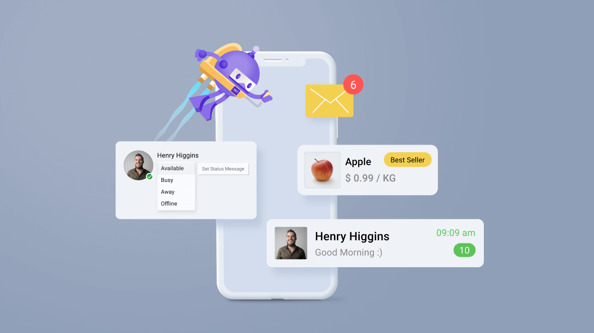

While creating applications like for social networking and e-commerce, you can’t ignore the importance of the alert notification UI. It plays a crucial role in notifying users that an app needs attention.
We at Syncfusion understand the need for a good notification control and have delivered one in our .NET MAUI suite.
In this blog, let’s see the use case scenarios for the alert notification UI and how to add it to your app using the Syncfusion .NET MAUI Badge View control.
There are many use case scenarios that require notifications to alert users. The following are some of them:
Let’s see how to create a simple UI for these four scenarios!
You can easily create the alert notification UI using the Syncfusion .NET MAUI Badge View control. It notifies the users of new or unread messages, status information, and so on. You can also easily integrate it with controls like ListView, Tab View, and other container controls.
First, let’s include an alert notification to display the unread messages count on a contact list in a messaging app.
Refer to the following code example.
<Grid BackgroundColor="White"
      VerticalOptions="Center"
      HorizontalOptions="Center"
      Padding="5"
      HeightRequest="60"
      WidthRequest="400">
 <badgeView:SfBadgeView BadgeText="10" >
  <badgeView:SfBadgeView.BadgeSettings>
    <badgeView:BadgeSettings Icon="None" Type="None" Position="BottomRight" BorderWidth="2" Stroke="White" Background="Green"/>
  </badgeView:SfBadgeView.BadgeSettings>
  <Grid ColumnDefinitions="50,15,*">
  <Image Source="selvaganapathyk.jpeg"
          WidthRequest="50"
          HeightRequest="50"/>
   <Grid Grid.Column="2"
         RowDefinitions="*,*"
         ColumnDefinitions="*,Auto">
     <Label Text="Selva Ganapathy Kathiresan" FontSize="16" TextColor="Black" FontAttributes="Bold" VerticalTextAlignment="Start"/>
     <Label Grid.Row="0" Grid.Column="1" TextColor="Green" FontSize="12" Text="09:09 am" VerticalTextAlignment="Start"/>
     <Label Grid.Row="1" Text="Good Morning :)" FontSize="14" TextColor="Gray"/>
   </Grid>
  </Grid>
 </badgeView:SfBadgeView>
</Grid> Most apps that show a profile picture will have an option to indicate the current online status of the contact. You can use our .NET MAUI Badge View control with its predefined icons to elegantly display an online status notification.
You can easily update the badge icon using the BadgeIcon property. Badge icons will be visible only when you do not set the badge text. The badge supports the following BadgeIcon types:
Let’s create a UI for the profile picture page, using the .NET MAUI Badge View component to hold the images and show the online status indication.
Refer to the following code.
<Grid BackgroundColor="White"
      VerticalOptions="Center"
      HorizontalOptions="Center"
      HeightRequest="105"
      WidthRequest="350"
      Padding="15"
      ColumnDefinitions="75,*">
 <badgeView:SfBadgeView >
  <badgeView:SfBadgeView.BadgeSettings>
   <badgeView:BadgeSettings x:Name="badgeSettings" Icon="Available" Position="BottomRight" Type="Success" BorderWidth="2" Stroke="White"/>
  </badgeView:SfBadgeView.BadgeSettings>
  <Frame CornerRadius="40">
   <Image Source="selvaganapathyk.jpeg"
          Margin="-20"
          WidthRequest="75"
          HeightRequest="75"/>
  </Frame>
 </badgeView:SfBadgeView>
 <StackLayout Margin="10,0,0,0" Orientation="Vertical"
              Grid.Column="1">
  <Label Text="Selva Ganapathy Kathiresan" FontSize="16" TextColor="Black"/>
  <Grid Margin="0,10,0,0" ColumnDefinitions="Auto,*">
   <Picker x:Name="iconPicker"/>
   <Entry Grid.Column="1" TextColor="Gray" FontSize="12" Placeholder="Set Status Message"/>
  </Grid>
 </StackLayout>
</Grid> Also, you can set an alert notification on an icon and an animated alert notification while receiving an update with the help of the .NET MAUI Badge View component.
You can enable or disable the badge text animation by setting Scale or None values to the BadgeAnimation property, respectively. We can see the animation once the badge text is changed.
Refer to the following code example.
<Grid BackgroundColor="White"
      VerticalOptions="Center"
      HorizontalOptions="Center"
      HeightRequest="75"
      WidthRequest="75">
 <badgeView:SfBadgeView x:Name="animationBadgeView" BadgeText="0">
  <badgeView:SfBadgeView.BadgeSettings>
    <badgeView:BadgeSettings Icon="None"
                             Animation="Scale"
                             Type="None"
                             BadgeAlignment="Center"
                             Position="BottomRight"
                             Background="Red"/>
  </badgeView:SfBadgeView.BadgeSettings>
  <Image Source="facebook.png"WidthRequest="75"
         HeightRequest="75"/>
 </badgeView:SfBadgeView>
</Grid> The .NET MAUI Badge View control also supports adding a tag for an element in an app. This will help you add a tag alert notification.
In the following code example, we will create an item UI for a shopping cart where we will mark the item with the tag Best Seller. This tag text alert notification will grab users’ attention.
<Grid BackgroundColor="White"
      VerticalOptions="Center"
      HorizontalOptions="Center"
      Padding="5"
      HeightRequest="60"
      WidthRequest="200">
 <badgeView:SfBadgeView BadgeText="Best Seller" >
  <badgeView:SfBadgeView.BadgeSettings>
   <badgeView:BadgeSettings Icon="None" Type="None" Position="TopRight" Background="Gold" TextColor="Black"/>
  </badgeView:SfBadgeView.BadgeSettings>
 <Grid ColumnDefinitions="50,15,*">
   <Image Source="apple.jpg"
          WidthRequest="50"
          HeightRequest="50"/>
   <Grid Grid.Column="2"
         RowDefinitions="*,*"
         ColumnDefinitions="*,Auto">
    <Label Text="Apple" FontSize="16" TextColor="Black" FontAttributes="Bold" VerticalTextAlignment="Start"/>
    <Label Grid.Row="1" Text="$ 0.99 / KG" FontSize="14" TextColor="Gray"/>
   </Grid>
  </Grid>
 </badgeView:SfBadgeView>
</Grid> Note: Badge icon and badge alignment features will be available in the .NET MAUI Badge View control in the 2022 Volume 1 release.
For more details, refer to the example for adding an alert notification UI in your .NET MAUI app.
Thanks for reading! In this blog, we have seen how to add alert notification UIs to your app using our Syncfusion .NET MAUI Badge View control. Along with the above scenarios, use the Badge View control to provide alert notifications for transactions, product availability, and more!
If you have any special requirements, please mention them in the comments section below!
Also, you can contact us through our support forum, support portal, or feedback portal. As always, we are happy to assist you!