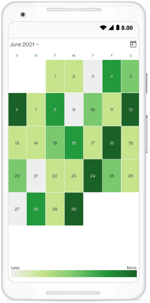

In this blog post, we are going to discuss how to design a heat map calendar and apply color for the different month cells based on a user’s mobile usage using the Flutter event Calendar widget.
A heat map is a data visualization technique that uses colors the way a bar graph uses height and width. To create a heat map calendar, we require data for a month’s dates. In our example, we are going to display the digital well-being data of a smartphone.
These days, smartphones have become essential, and our daily usage of smartphones is increasingly high. We are using mobile phones for 8 to 9 hours a day. So, to track a user’s mobile phone usage, we can use digital well-being data. The Syncfusion Flutter event Calendar, with its rich feature set, allows users to design a heatmap calendar using custom builder support.


Note: If you are new to the Calendar widget, please go through the Getting started with Flutter event Calendar documentation before proceeding.
First, get the required data (mobile usage in hours) and color to render. Then, render the background color to the corresponding UI. For demo purposes, we are providing some random data.
Refer to the following code example.
final List<int> _usageHours = <int>[ 1, 2, 3, 4, 5, 6, 7, 8, 9, 10, 11, 12, 13, 14, 15, 16, 17, 18, 19, 20, 21,  22, 23];
  final List<HeatMapData> _heatMapDataCollection = <HeatMapData>[];
  final Random random = Random();

  @override
  void initState() {
    _addHeatMapData();
    super.initState();
  }

  void _addHeatMapData() {
    for (int i = 0; i < 100; i++) {
      final int hour = random.nextInt(_usageHours.length);
      final Color color = _getMonthCellBackgroundColor(hour);
      _heatMapDataCollection.add(HeatMapData(hour, color));
    }
  }

  Color _getMonthCellBackgroundColor(int hour) {
    if(hour < 6){
      return _kLightGrey;
    }else if(hour < 11){
      return _kLightGreen;
    }else if(hour < 16){
      return _kMidGreen;
    }else if(hour < 21){
      return _kDarkGreen;
    }

    return _kDarkerGreen;
} In the Flutter event calendar, you can customize the presentation of data and its interaction using the builder support. Customize the calendar month cell to apply the background color related to the corresponding data in each cell using the monthCellBuilder property. Then, assign the data values to the corresponding UI.
Now, return the designed custom UI with the data in the monthCellBuilder callback.
Refer to the following code example.
/// Returns the calendar widget based on the properties passed.
  SfCalendar _getHeatMapCalendar(bool isMobilePlatform) {
    return SfCalendar(
        showNavigationArrow: !isMobilePlatform,
        view: CalendarView.month,
        monthCellBuilder: _monthCellBuilder,
        showDatePickerButton: true,
        maxDate: _maxDate,
        initialDisplayDate: DateTime.now().subtract(Duration(days: 100)),
        monthViewSettings: const MonthViewSettings(
          showTrailingAndLeadingDates: false,
        ));
  }

  /// Returns the cell  text color based on the cell background color.
  Color _getCellTextColor(Color backgroundColor) {
    if (backgroundColor == _kDarkGreen || backgroundColor == _kDarkerGreen) {
      return Colors.white;
    }

    return Colors.black;
  }

  /// Returns the builder for month cell.
  Widget _monthCellBuilder(
      BuildContext buildContext, MonthCellDetails details) {
     Color backgroundColor = _heatMapDataCollection[random.nextInt(100)].color;
     if(details.date.isAfter(_maxDate)){
       backgroundColor = Colors.transparent;
     }else if(isSameDate(details.date, _maxDate)){
       backgroundColor = _getMonthCellBackgroundColor(random.nextInt(_maxDate.hour));
     }
    final Color defaultColor = Colors.white;
    return Container(
      decoration: BoxDecoration(
          color: backgroundColor,
          border: Border.all(color: defaultColor, width: 0.5)),
      child: Center(
        child: Text(
          details.date.day.toString(),
          style: TextStyle(color: _getCellTextColor(backgroundColor)),
        ),
      ),
    );
  }
Now, the Calendar widget is completely configured. Run the sample to see the event calendar with heat map data.
For more information, refer to designing a heat map using the Flutter event Calendar demo.
Thanks for reading! In this blog post, we’ve seen how to design a heatmap calendar using the Flutter event Calendar. This widget is available in Android, iOS, web, Windows, Mac, and Linux platforms. With this heat map data visualization, you can easily understand the trends in data with different color patterns!
Also, you can check out our other Flutter project demos in this GitHub repository. Feel free to try out these demos and share your feedback or questions in the comments section.
Our Calendar component is also available in our Blazor, ASP.NET (Core, MVC), JavaScript, Angular, React, Vue, Xamarin, UWP, WinForms, WPF, and WinUI platforms. Use them to build astonishing applications!
For existing customers, the new version is available for download from the License and Downloads page. If you are not yet a Syncfusion customer, you can try our 30-day free trial to check out our available features.
You can contact us through our support forum, Direct-Trac, or feedback portal. We are always happy to assist you!