
 Leomaris Reyes
TL;DR: Learn how to create a modern gym subscription UI using .NET MAUI. This step-by-step guide shows you how to set up layouts with grids, add eye-catching gradients, and use the responsive Syncfusion .NET MAUI Button control.
Practicing is the best way to continue learning, improving, and strengthening our skills. In this article, we will develop a gym subscription UI step by step. Before converting the design to code, let’s analyze the parts and divide them into blocks to speed up development.
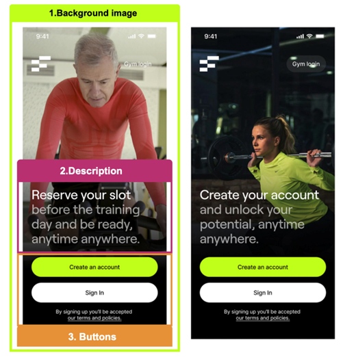
We’ll break down the creation of the UI into three steps, as illustrated by the following image.
Through the course of the process, we will learn to use:
- LinearGradientBrush: To apply a gradient to the main image, we will use a native .NET MAUI control called LinearGradientBrush.
- Syncfusion .NET MAUI Button: As you can see in the reference UI, it has two buttons. To design those buttons, we’ll use Syncfusion .NET MAUI Button control.

Main layout
The first step is to establish the main layout that will contain the entire design of our UI. Layouts help organize and group user interface controls in the app.
For this example, we will use the MainPage.xaml page included in the default project created by .NET MAUI. We will add a DataGrid layout with two columns and five rows.
Refer to the following code example.
<!-- Main layout-->
<Grid RowDefinitions="*,Auto,Auto,Auto,Auto" RowSpacing="15">
   <!-- Step 1: Add all the elements contained in the Background image block -->
   <!-- Step 2: Add all the elements contained in the Gradient block-->
   <!-- Step 3: Add all the elements contained in the Description block-->
   <!-- Step 4: Add all the elements contained in the Buttons block -->
</Grid>
Step 1: Adding a background image
In this first step, we will learn how to add a background image. Please place all the code for this step exactly in the comment of the previous code block that says “<!– Step 1: Add all the elements contained in the Background image block –>“.
<!-- Background image -->
<Image Grid.Row="0" Grid.RowSpan="4" Source="alice" Aspect="AspectFill"/>
<-- Add the following code block here -->
To display the complete background image, you only need this line! In the above code, the key properties that allow us to show the entire event on screen are:
- Grid.RowSpan=”4″: This spans all existing rows within our primary DataGrid.
- Aspect=”AspectFill”: This allows the image to fill the allocated screen space. There are different values that let us adjust our image’s appearance. For more details, refer to the article on Image Scaling in .NET MAUI.
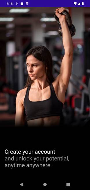
And finally, your code should give you a result like the following image.

Step 2: Adding gradient effect
The example we’re replicating includes a black gradient to highlight the readings and buttons on the image. To achieve this, we’ll add a VerticalStackLayout and use a LinearGradientBrush as its background. The gradient will start with a transparent color and transition to black. For more details, refer to the Linear gradient brushes.
Please add the following code exactly in place of the previous code that says “<!– Step 2: Add all the elements contained in the Gradient block–>“.
<VerticalStackLayout Grid.Row="0" Grid.RowSpan="4">
  <VerticalStackLayout.Background>
    <LinearGradientBrush EndPoint="0,1">
       <GradientStop Color="Transparent" Offset="0.6"/>
       <GradientStop Color="Black" Offset="0.7"/>
    </LinearGradientBrush>
  </VerticalStackLayout.Background>
</VerticalStackLayout>
<-- Add the following code block here -->
Finally, your code will produce a result similar to the following image. Don’t worry if you only see the gradient without the description above it. In the next step, you’ll learn how this setup allows the background image to remain visible while keeping the text readable.

Step 3: Adding description
In this section, we’ve some special text to add, and you will learn how to handle it. Note that in the description, there are two pieces of text with different styles. You have two options:
- Adding two labels, each with its respective characteristics (styles).
- Adding a single label and apply the corresponding styles to each part of the text.
Here, we’ll choose the second option so you can learn how to use FormattedText, which helps us optimize and save controls while achieving the same objective.
Please add the following code exactly in place of the previous code that says “<!– Step 3: Add all the elements contained in the Description block –>“.
<Label VerticalOptions="End" Grid.Row="0" FontSize="25" Margin="20,0">
<Label.FormattedText>
<FormattedString>
<Span Text="Create your account " TextColor="White"/>
<Span Text="and unlock your potential anytime, anywhere." TextColor="#a8a7a5"/>
</FormattedString>
</Label.FormattedText>
</Label>
<-- Add the following code block here -->
Tip: we use the combination to make a line break.
And finally, you will get a result like the following image.
Step 4: Designing the UI elements
Finally, let’s add the remaining part to complete our UI! It consists of three elements:
- A green button to create an account.
- A white button for login.
- Text with highlighted terms and conditions.
Please add the following code examples exactly in place of the previous code that says “<!– Step 4: Add all the elements contained in the Buttons block –>”.
Buttons: Green and white
Let’s start with the buttons. We’ll use the Syncfusion .NET MAUI Button control.
- First, add the Syncfusion.Maui.Buttons NuGet package.

- Navigate to your MauiProgram.cs file and register the handler. To do so, go to the CreateMauiApp method and add the following line of code after the line “.UseMauiApp<App>()“:
.ConfigureSyncfusionCore();
Note: Don’t forget to add the Syncfusion.Maui.Core.Hosting namespace.
- Now, in the Xaml file, add the following namespace:
xmlns:buttons="clr-namespace:Syncfusion.Maui.Buttons;assembly=Syncfusion.Maui.Buttons
- To add the Syncfusion .NET MAUI Button control to the app, use the alias “buttons” (from the namespace we added previously) and call the SfButton. Its properties are similar to the native button, making it easy to work with this control. The main difference is that while the native button uses the backgroundColor property for a colored background, this button uses the background property.
<buttons:SfButton Grid.Row="1" Text="Create an account"
                          	FontAttributes="Bold"
                          	TextColor="Black"
                          	Background="#bfff0c"
                          	Margin="20,0"
                          	CornerRadius="20"
                          	VerticalOptions="End"/>

<buttons:SfButton Grid.Row="2" Text="Sign In"
                          	FontAttributes="Bold"
                          	TextColor="Black"
                          	Background="White"
                          	Margin="20,0"
                          	CornerRadius="20"
                          	VerticalOptions="End"/>
<-- Add the following code block here -->
Text with highlighted terms and conditions
And finally, let’s add the highlighted text with terms and conditions.
<Label Grid.Row="3" HorizontalTextAlignment="Center" Margin="0,0,0,30">
<Label.FormattedText>
<FormattedString>
<Span Text="By signing up you'll be accepted " TextColor="White"/>
<Span Text="our terms and policies." TextDecorations="Underline" TextColor="White"/>
</FormattedString>
</Label.FormattedText>
</Label>
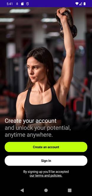
Once you apply the previously explained code, you should see a visual result like the following one.
GitHub reference
To see the complete code structure of this project, go to our Gym subscription UI in the .NET MAUI demo on GitHub.
Conclusion
Thanks for reading! Replicating a gym subscription UI in .NET MAUI is not only a great exercise for honing your UI development skills, but also an opportunity to delve deep into the capabilities of .NET MAUI, XAML, and various controls like the LinearGradientBrush and Syncfusion’s Button control. By breaking down the design into manageable blocks and tackling each step with precision, we’ve demonstrated how to transform a static design into a dynamic and user-friendly interface.
Remember, the key to mastering .NET MAUI lies in consistent practice and a willingness to experiment with different UI elements. Happy coding, and let your creativity lead the way to innovative and engaging user interfaces!
Build powerful cross-platform apps with Syncfusion’s .NET MAUI controls. From data visualization to file processing, get everything you need for responsive, high-performance app development!
The existing customers can download the latest version of Essential Studio® from the License and Downloads page. If you are new, try our 30-day free trial to explore our incredible features.
If you need assistance, please do not hesitate to contact us via our support forum, support portal, or feedback portal. We are always eager to help you!


 No spam, just valuable updates.