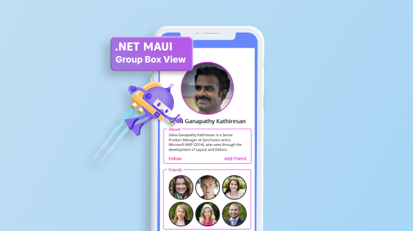

As a mobile developer, it is essential to prioritize the creation of a simple and uncluttered user interface that enhances the overall usability of the application. One way to achieve this is by grouping the UI elements based on their purpose and function. A group box view can be helpful in this regard, as they allow developers to group related UI elements with a frame UI.
In this blog, we will explore using group box views on the .NET MAUI platform to organize and simplify the UI of a mobile application. By utilizing group box views, developers can improve the usability and clarity of their applications for users.
A .NET MAUI group box view is a layout element in user interface design. It is a container that contains multiple controls within it. A .NET MAUI group box view aims to group related controls and provide a frame around them with an optional title.
A .NET MAUI group box view organizes and categorizes related controls, making it easier for users to comprehend the controls’ purpose and function. In user interfaces, .NET MAUI group boxes are widely used to group controls that perform similar functions, such as input fields for a form or buttons for controlling a particular component of the program. They can help reduce clutter and improve the overall usability of an interface.
In addition to providing a visual grouping for controls, a .NET MAUI group box view can also be used to enable or disable a group of controls at once, allowing users to easily control the functionality of the controls within the group box. Overall, a group box is a useful tool for organizing and categorizing controls in user interfaces, helping improve the usability and clarity of the interface for users.
You can create a .NET MAUI group box view with the features mentioned by using Syncfusion’s .NET MAUI Text Input Layout.
To create a group box view UI, you must configure the .NET MAUI Text Input Layout (SfTextInputLayout) control with a floating label. Follow these steps:
Step 1: The Syncfusion .NET MAUI controls are available on NuGet.org. To add .NET MAUI Text Input Layout to your project, open the NuGet package manager in Visual Studio, search for Syncfusion.Maui.Core, and then install it.
Step 2: In the MauiProgram.cs file, register the handler for Syncfusion Core.
using Microsoft.Maui;
using Microsoft.Maui.Hosting;
using Microsoft.Maui.Controls.Compatibility;
using Microsoft.Maui.Controls.Hosting;
using Microsoft.Maui.Controls.Xaml;
using Syncfusion.Maui.Core.Hosting;

namespace TextInputLayoutSample
{
  public static class MauiProgram
  {
     public static MauiApp CreateMauiApp()
     {
 var builder = MauiApp.CreateBuilder();
 builder
 .UseMauiApp<App>()
 .ConfigureSyncfusionCore()
 .ConfigureFonts(fonts =>
 {
     fonts.AddFont("OpenSans-Regular.ttf", "OpenSansRegular");
 });
 return builder.Build();
     }
  }
}
Step 3: Add the following namespace to add the .NET MAUI Text Input Layout.
xmlns:groupBoxView ="clr-namespace:Syncfusion.Maui.Core;assembly=Syncfusion.Maui.Core"
Step 4: Add the SfTextInputLayout control.
< groupBoxView:SfTextInputLayout/>
The code below defines a user interface for an application using the Syncfusion library’s SfTextInputLayout (for the group box view) and SfAvatarView components. The interface includes a SfAvatarView element for displaying a profile picture, a label for displaying a name, a SfTextInputLayout (for the group box view) segment with a text field and label for displaying information about the user, and two SfTextInputLayout elements with HorizontalStackLayout elements and SfAvatarView elements for displaying lists of friends. Some style properties are also applied to various elements, such as corner radius and stroke color.
<ContentPage xmlns="http://schemas.microsoft.com/dotnet/2021/maui"
               xmlns:x="http://schemas.microsoft.com/winfx/2009/xaml"
               xmlns:groupBoxView="clr-namespace:Syncfusion.Maui.Core;assembly=Syncfusion.Maui.Core"
               x:Class="GroupBoxViewApp.MainPage">
    <ScrollView>
        <VerticalStackLayout WidthRequest="310"
                             Padding="30,0"
                             VerticalOptions="Center">
            <groupBoxView:SfAvatarView ContentType="Custom"
                                       CornerRadius="75"
                                       Stroke="#ce04d1"
                                       ImageSource="selvaganapathy.png"
                                       WidthRequest="150"
                                       HeightRequest="150"/>
            <Label Text="Selva Ganapathy Kathiresan"
                   Margin="0,10"
                   FontSize="16"
                   FontAttributes="Bold"
                   HorizontalOptions="Center"/>
            <groupBoxView:SfTextInputLayout Hint="About"
                                            Stroke="#ce04d1"
                                            ContainerType="Outlined"
                                            ContainerBackground="White">
                <groupBoxView:SfTextInputLayout.HintLabelStyle>
                    <groupBoxView:LabelStyle TextColor="#d10489"/>
                </groupBoxView:SfTextInputLayout.HintLabelStyle>
                <VerticalStackLayout Margin="5">
                    <Label FontSize="10"
                           Text="Selva Ganapathy Kathiresan is a Senior Product Manager at Syncfusion and a Microsoft MVP (2014), who sees through the development of Layout and Editors."/>
                    <Grid ColumnDefinitions="Auto,*"
                          Margin="0,10,0,0">
                        <Label  Background="Transparent"
                                Text="Follow"
                                TextColor="#d10489"
                                FontSize="12"/>
                        <Label Grid.Column="1"
                               Background="Transparent"
                               HorizontalTextAlignment="End"
                               HorizontalOptions="End"
                               Text="Add Friend"
                               TextColor="#ce04d1"
                               FontSize="12"/>
                    </Grid>
                </VerticalStackLayout>
            </groupBoxView:SfTextInputLayout>
            <groupBoxView:SfTextInputLayout Hint="Friends" Padding="-10,0"
                                            Stroke="#ce04d1"
                                            ContainerType="Outlined"
                                            ContainerBackground="White">
                <groupBoxView:SfTextInputLayout.HintLabelStyle>
                    <groupBoxView:LabelStyle TextColor="#d10489"/>
                </groupBoxView:SfTextInputLayout.HintLabelStyle>
                <VerticalStackLayout>
                <HorizontalStackLayout BindableLayout.ItemsSource="{Binding GroupMembers}" >
                    <BindableLayout.ItemTemplate>
                        <DataTemplate>
                            <groupBoxView:SfAvatarView Margin="5,5,0,0"
                                                       HeightRequest="70"
                                                       WidthRequest="70"
                                                       CornerRadius="35"
                                                       ContentType="Custom"
                                                       ImageSource="{Binding Picture}"/>
                        </DataTemplate>
                    </BindableLayout.ItemTemplate>
                </HorizontalStackLayout>
                <HorizontalStackLayout BindableLayout.ItemsSource="{Binding GroupMembers1}" >
                    <BindableLayout.ItemTemplate>
                       <DataTemplate>
                          <groupBoxView:SfAvatarView Margin="5,5,0,0"
                                                    HeightRequest="70"
                                                    WidthRequest="70"
                                                    CornerRadius="35"
                                                    ContentType="Custom"
                                                    ImageSource="{Binding Picture}"/>
                        </DataTemplate>
                    </BindableLayout.ItemTemplate>
                </HorizontalStackLayout>
                <HorizontalStackLayout BindableLayout.ItemsSource="{Binding GroupMembers2}" >
                   <BindableLayout.ItemTemplate>
                     <DataTemplate>
                        <groupBoxView:SfAvatarView Margin="5,5,0,0"
                                                   HeightRequest="70"
                                                   WidthRequest="70"
                                                   CornerRadius="35"
                                                   ContentType="Custom"
                                                   ImageSource="{Binding Picture}"/>
                      </DataTemplate>
                   </BindableLayout.ItemTemplate>
                </HorizontalStackLayout>
            </VerticalStackLayout>
        </groupBoxView:SfTextInputLayout>
     </VerticalStackLayout>
   </ScrollView>
</ContentPage> For more information, refer to the .NET MAUI Group Box View project on GitHub.
Thank you for your time! This article showed how to use the Syncfusion .NET MAUI Text Input Layout control to construct a group box control in a .NET application. This control makes it simple to add a text field andto your interface and apply other style settings such as stroke color and corner radius. Overall, the Syncfusion.NET MAUI library offers a variety of valuable components for creating user interfaces and is worth checking out.
Are you already a Syncfusion user? You can download the product setup here. If you are not yet a Syncfusion user, you can download a 30-day free trial.
Please contact us via our support forum, support portal, or feedback portal, if you have any queries or issues. We are always happy to assist!