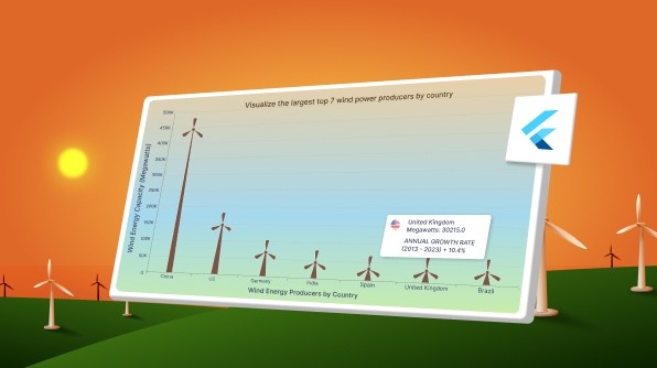
TL;DR: Let’s visualize the top 7 wind power producers using the Syncfusion Flutter Column Chart. Customize columns as windmills and add detailed tooltips, styled axes, and titles to highlight renewable energy leaders interactively.
Welcome to our Chart of the Week blog series!
Charts effectively simplify complex datasets by transforming them into visual representations. They play an essential role in various sectors, including business, education, and environmental studies, allowing users to explore data trends, comparisons, and relationships. Visualizations can uncover patterns that might remain hidden when dealing with raw data alone.
We’re excited to show you how to create a visually compelling Flutter Column Chart highlighting the top 7 largest wind power producers worldwide. Using the Syncfusion Flutter Charts library, we’ll walk you through building a custom column chart with interactive tooltips for enhanced clarity.
Column Chart
A Column Chart is a popular way to represent categorical data using vertical bars. It’s ideal for comparing values across different groups, like water usage per country.
Custom column series
The onCreateRenderer callback allows you to assign a custom series renderer to render unique shapes for each segment. This can be achieved by creating a custom renderer class, such as _CustomColumnSeriesRenderer, which extends ColumnSeriesRenderer. In this custom renderer, key methods include createSegment for defining segments based on data, customizeSegment for adjusting the appearance of each segment, and onPaint for managing the drawing on the series.
Custom tooltip
Tooltips enhance the chart’s interactivity by displaying additional data when users tap or hover over a column segment. Customizing the tooltip allows us to provide more context about windmill power producers, further engaging the audience. The Syncfusion Flutter Charts widget offers straightforward options to customize the tooltips through the tooltipBehavior property.
Let’s visualize the data of the top 7 largest wind power producers by country using the Syncfusion Flutter Column Chart!
Let’s get started!
Step 1: Gather the data
First, gather the data on the top 7 countries by total megawatts of installed wind turbine capacity as of 2023 from the Statistical Review of World Energy.
Step 2: Define and load data into the chart
Create a _WindEnergy class that includes properties for storing information about a country’s name, capacity in megawatts, and annual growth rate.
class _WindEnergy {
  _WindEnergy(this.country, this.megawatt, this.rate);
  final String country;
  final double megawatt;
  final String rate;
}
The following is the sample _windEnergyData list gathered from the report and used in the chart.
late List<_WindEnergy> _windEnergyData;

@override
void initState() {
  _windEnergyData = [
    _WindEnergy('China', 441895, '+19.1%'),
    _WindEnergy('US', 148020, '+9.4%'),
    _WindEnergy('Germany', 69459, '+7.6%'),
    _WindEnergy('India', 44736, '+9.3%'),
    _WindEnergy('Spain', 31028, '+3.1%'),
    _WindEnergy('United Kingdom', 30215, '+10.4%'),
    _WindEnergy('Brazil', 29135, '+29.5%'),
  ];
  super.initState();
}
Step 3: Building the Flutter Column Chart
Now, configure the Syncfusion Flutter Charts control by referring to this documentation. Axes in a chart define the scales along which the data is plotted. Customizing the axes can enhance the chart’s readability and visual appeal.
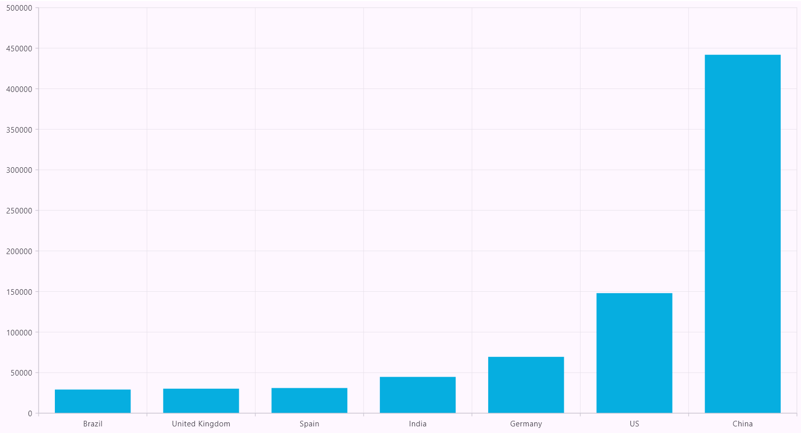
Here, we’ll create a ColumnSeries instance and bind the _windEnergyData list as the data source. We’ll map the country property of each data point to the x-axis and the megawatt property to the y-axis.
@override
Widget build(BuildContext context) {
  return Scaffold(
    body: SfCartesianChart(
      primaryXAxis: const CategoryAxis(),
      primaryYAxis: NumericAxis(),
      series: <CartesianSeries<_WindEnergy, String>>[
          ColumnSeries(
          dataSource: _windEnergyData,
          xValueMapper: (_WindEnergy data, int index) => data.country,
          yValueMapper: (_WindEnergy data, int index) => data.megawatt,
        ),
      ],
    ),
  );
}
Refer to the following image.
Step 4: Customize the axes’ appearance
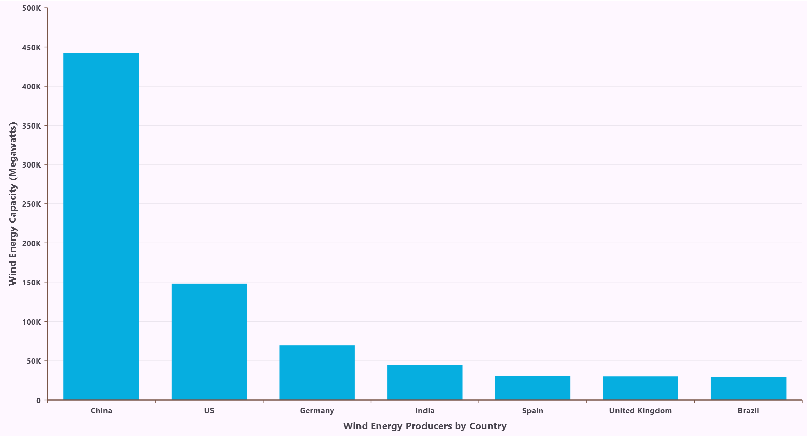
We’ll set the CategoryAxis as the primaryXAxis to represent countries. We’ll customize its appearance by removing the majorGridLines and adjusting the color and width of the majorTickLines and AxisLine. We’ll also customize the fontStyle and weight properties of the axis labels.
For the primaryYAxis, we’ll use a NumericAxis to represent megawatts. We’ll set the title of the y-axis to Megawatts and customize the fontStyle and weight properties of the axis labels. We’ll also adjust the color and width of the majorTickLines and AxisLine and remove the majorGridLines.
Additionally, you can customize the axis labels using the axisLabelFormatter callback to add MW(megawatt) after each value for better readability. Utilize the ChartAxisLabel class to adjust the text and style of the axis labels according to your needs.
primaryXAxis: const CategoryAxis(
  title: AxisTitle(
    text: 'Wind Energy Producers by Country',
    textStyle: TextStyle(fontWeight: FontWeight.bold),
  ),
  majorGridLines: MajorGridLines(width: 0),
  majorTickLines: MajorTickLines(color: Colors.brown),
  axisLine: AxisLine(color: Colors.brown, width: 2),
  labelStyle: TextStyle(fontWeight: FontWeight.bold),
),
primaryYAxis: NumericAxis(
  title: const AxisTitle(
    text: 'Wind Energy Capacity (Megawatts)',
    textStyle: TextStyle(fontWeight: FontWeight.bold),
  ),
  majorTickLines: const MajorTickLines(color: Colors.brown),
  axisLine: const AxisLine(color: Colors.brown, width: 2),
  labelStyle: const TextStyle(fontWeight: FontWeight.bold),
  axisLabelFormatter: (AxisLabelRenderDetails args) {
    double value = double.tryParse(args.text) ?? 0;
    String formattedText = _formatNumber(value);
      return ChartAxisLabel(formattedText, args.textStyle);
  },
),
Refer to the following image.
Step 5: Customize the chart title
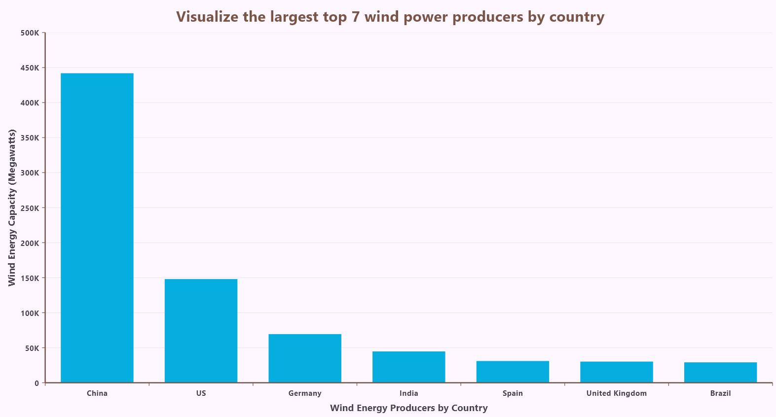
Let’s create a ChartTitle object and set the title text. We can also customize the font style, weight, color, and size of the title text by using the textStyle. Additionally, we can set the title’s background color.
Refer to the following code example.
title: const ChartTitle(
  backgroundColor: Colors.white,
  text: ' Visualize the largest top 7 wind power producers by country ',
  textStyle: TextStyle(
    fontWeight: FontWeight.bold,
    color: Colors.brown,
    fontSize: 20,
  ),
),
Refer to the following image.
Step 6: Create and configure a custom column series renderer
As we said earlier, the onCreateRenderer callback allows you to assign a custom series renderer to render unique shapes for each segment. This can be achieved by creating a custom renderer class, such as _CustomColumnSeriesRenderer, which extends ColumnSeriesRenderer.
In this custom renderer, key methods include,
- createSegment: Creates segments for series based on data points.
- customizeSegment: Customizes the appearance of each segment based on its index or specific case.
- onPaint: Paints the series according to customizations, including the previously customized segments.
Refer to the following code example.
ColumnSeries(
  ...
  onCreateRenderer: (ChartSeries<_WindEnergy, String> series) {
    return _ColumnSeriesRenderer();
  },
),
By creating this custom renderer, we can transform the default column segments into visually appealing windmills, enhancing the chart’s overall presentation.
To create the windmill-shaped columns, we’ll need to create a custom renderer for the column series. This renderer will override the default painting method and draw the custom shapes.
Here, we’ll create a custom segment class, _CustomColumnSegment, that extends the ColumnSegment class. Within this custom segment, we’ll define a Path object named bladesPath to store the path for drawing the windmill blades.
// Custom renderer for column series.
class _CustomColumnSeriesRenderer extends ColumnSeriesRenderer<_WindEnergy, String> {
  @override
  ColumnSegment<_WindEnergy, String> createSegment() => _ CustomColumnSegment ();
}

// Custom segment class to draw custom shapes.
class _ CustomColumnSegment extends ColumnSegment<_WindEnergy, String> {}
The windmill post’s dimensions are calculated relative to the segment rectangle. Its shape is a trapezoid, starting wide at the bottom and narrowing towards the top. The post is then drawn onto the canvas with a filled interior and a white outline, providing a visually appealing and structurally sound foundation for the windmill.
// Custom segment class to draw custom shapes.
class _CustomColumnSegment extends ColumnSegment<_WindEnergy, String> {
  Path postPath = Path();
  Path bladesPath = Path();

 void _reset() {
   bladesPath.reset();
   postPath.reset();
 }

@override
void onPaint(Canvas canvas) {
  _reset();
  if (segmentRect == null) {
    return;
  }

  final Paint bladeFillPaint = Paint()
      ..color = Colors.brown
      ..style = PaintingStyle.fill;
   final Paint bladeStrokePaint = Paint()
      ..color = Colors.white
      ..strokeWidth = 2
      ..style = PaintingStyle.stroke;

  final Paint postFillPaint = bladeFillPaint;
  final Paint postStrokePaint = bladeStrokePaint;
  final double bottom = segmentRect!.bottom;
  final double top = segmentRect!.top;
  final double centerX = segmentRect!.center.dx;
  final double centerY = top;
  final double postBaseWidth = segmentRect!.width * 0.2;
  final double postTopWidth = segmentRect!.width * 0.05;
  final double halfPostBaseWidth = postBaseWidth / 2;
  final double halfPostTopWidth = postTopWidth / 2;

  postPath = Path()
      ..moveTo(centerX - halfPostBaseWidth, bottom)
      ..lineTo(centerX + halfPostBaseWidth, bottom)
      ..lineTo(centerX + halfPostTopWidth, top)
      ..lineTo(centerX - halfPostTopWidth, top)
      ..close();

  canvas.drawPath(postPath, postFillPaint);
  canvas.drawPath(postPath, postStrokePaint);
}
Refer to the following image.
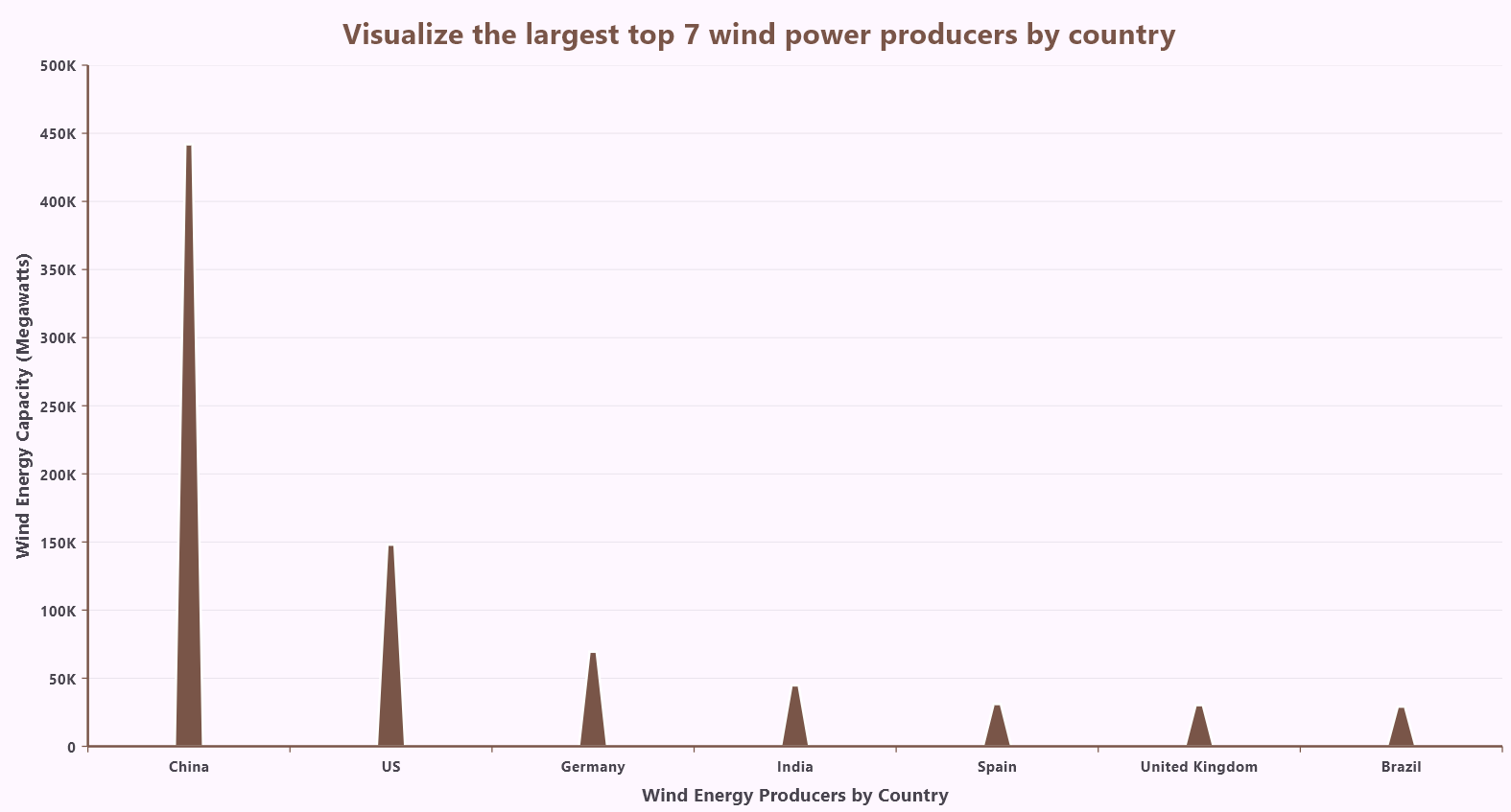
We draw three blades with varying lengths to create a visual hierarchy. Their curved shape, defined by curves, optimizes wind capture. The blades rotate realistically, simulating a spinning windmill. Finally, we’ll paint them with a brown fill and a white outline, adding depth and realism to the visualization.
Refer to the following code example.
// Custom painting method for drawing shapes.
@override
void onPaint(Canvas canvas) {
  _reset();

 // Maintained a minimum value of 30 and a maximum value of 40 as the default
 // blade length range. Using the column segment value, I calculate the blade
 // length by normalizing it within this range. The formula maps the value to
 // a specified blade length range, ensuring proportional scaling.
 // This approach dynamically adjusts blade sizes based on the segment value.
 // Map the megawatt value to the blade length range (adjusted for larger blades)
 const double minBladeLength = 30;
 const double maxBladeLength = 40;
 // Get minimum and maximum values from the data source.
 const double minValue = 29135;
 const double maxValue = 441895;

 // Add a dynamic adjustment based on the current segment index
 final double scalingFactor = 1 + (currentSegmentIndex * 0.1);
 const double lengthRange = maxBladeLength - minBladeLength;
 final double normalizedFactor = (y - minValue) / (maxValue - minValue);
 double bladeLength = normalizedFactor * lengthRange + minBladeLength;
 bladeLength *= scalingFactor; // Apply the scaling factor

 final Offset center = Offset(centerX, centerY);
 const double bladeWidth = 20;

 // Define the angles for the three blades in radians.
 double angle1 = 0;
 double angle2 = 120 * pi / 180;
 double angle3 = 240 * pi / 180;

 // Draw the first blade.
 _drawBlade(canvas, center, angle1, bladeLength, bladeWidth, fillPaint,
      strokePaint);

 // Draw the second blade.
 _drawBlade(canvas, center, angle2, bladeLength, bladeWidth, fillPaint,
     strokePaint);

 // Draw the third blade.
 _drawBlade(canvas, center, angle3, bladeLength, bladeWidth, fillPaint,
     strokePaint);

 // Draws a circle at the center of the windmill.
  canvas.drawCircle(center, 5, Paint()..color = Colors.brown);
}

// Helper method to draw each blade
void _drawBlade(Canvas canvas, Offset center, double angle, double bladeLength, double bladeWidth, Paint fillPaint, Paint strokePaint)
{
    Matrix4 transformMatrix = Matrix4.identity()
      ..translate(center.dx, center.dy)
      ..rotateZ(angle);

    final double halfWidth = bladeWidth / 2;
    final double quarterWidth = bladeWidth / 4;
    final Path bladePath = Path()
      ..moveTo(0, 0)
      ..cubicTo(
          quarterWidth, -bladeLength, halfWidth, -bladeLength, 0, -bladeLength)
      ..cubicTo(-quarterWidth, -bladeLength, -halfWidth, -bladeLength, 0, 0);

    _bladesPath.addPath(bladePath, Offset.zero,
        matrix4: transformMatrix.storage);

    // Draw the blade on the canvas
    canvas.drawPath(_bladesPath, fillPaint);
    canvas.drawPath(_bladesPath, strokePaint);
}
Refer to the following image.
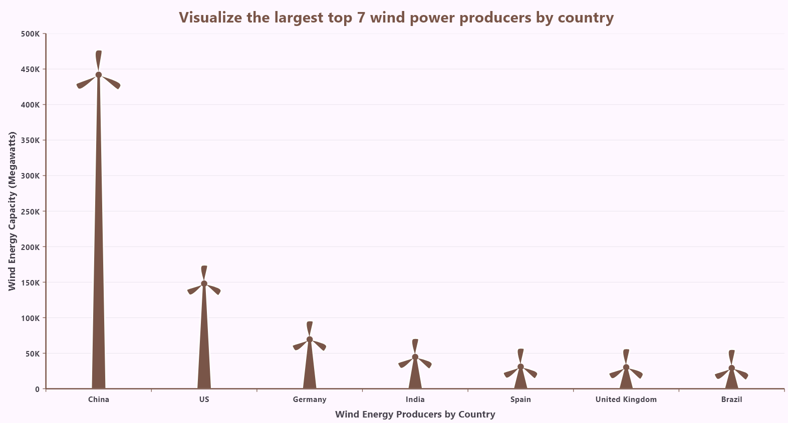
Step 7: Customize the tooltip appearance
Let’s customize the tooltip appearance to provide a more informative user experience. Now, the tooltip will appear not only when hovering over the segment rectangle but also when hovering directly over the windmill blades. This allows users to easily access detailed information about the blades’ associated data points.
@override
bool contains(Offset position) {
  return postPath.contains(position) || bladesPath.contains(position);
}
The chart’s TooltipBehavior has been customized to provide a more informative and visually appealing experience. When you hover over a data point, a tooltip will appear, displaying a country flag and its corresponding power output in Megawatts (MW) and annual growth rate (2013-2023) using the builder property.
SfCartesianChart(
    series: <CartesianSeries<_WindEnergy, String>>[
    …..
  tooltipBehavior: TooltipBehavior(
    enable: true,
    activationMode: ActivationMode.singleTap,
    color: Colors.brown,
    borderColor: Colors.brown,
    borderWidth: 10,
    builder: (dynamic data, dynamic point, dynamic series, int pointIndex,
    int seriesIndex) {
      return Container(
        color: Colors.white,
        child: Padding(
          padding: const EdgeInsets.all(10),
          child: Row(
            mainAxisSize: MainAxisSize.min,
            mainAxisAlignment: MainAxisAlignment.spaceEvenly,
            children: <Widget>[
              Column(
                mainAxisSize: MainAxisSize.min,
                mainAxisAlignment: MainAxisAlignment.spaceEvenly,
                children: [
                  SizedBox(
                    height: 30,
                    width: 35,
                    child: Image.asset(_countryImages(pointIndex)),
                  ),
                  const SizedBox(width: 30),
                ],
              ),
              Column(
                crossAxisAlignment: CrossAxisAlignment.start,
                mainAxisSize: MainAxisSize.min,
                mainAxisAlignment: MainAxisAlignment.spaceEvenly,
                children: [
                  Text(
                    '${data.country}',
                    style: const TextStyle(
                      fontSize: 12,
                      color: Colors.black,
                      fontWeight: FontWeight.bold,
                    ),
                  ),
                  Text(
                    'Megawatts: ${point.y.toString()}',
                    style: const TextStyle(
                      fontSize: 12,
                      color: Colors.black,
                      fontWeight: FontWeight.bold,
                    ),
                  ),
                  Text(
                    'ANNUAL GROWTH RATE\n(2013-2023) ${data.rate}',
                    style: const TextStyle(
                      fontSize: 12,
                      color: Colors.black,
                      fontWeight: FontWeight.bold,
                    ),
                  ),
                ],
              ),
            ],
          ),
        ),
      );
    },
  ),
),
Refer to the following image.
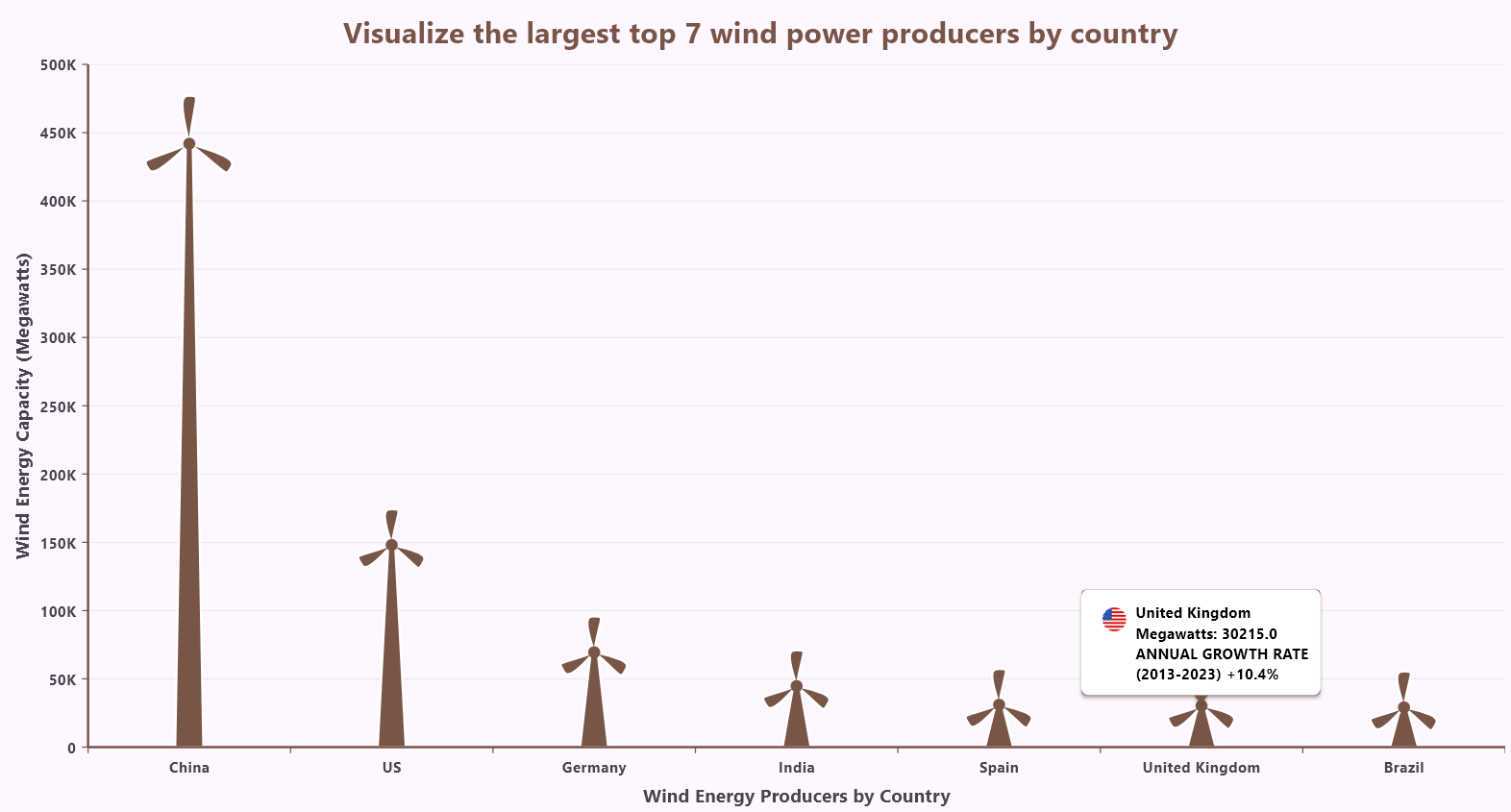
Step 8: Customizing the chart’s background
To further enhance the visual appeal of the chart, we added a background using a Container with a vertical gradient. The BoxDecoration employs a gradient, transitioning smoothly through specified colors using ARGB values. The gradient flows from the top center to the bottom center, creating a harmonious blend. This visually rich background frames the SfCartesianChart, making the data display more engaging and attractive.
@override
Widget build(BuildContext context) {
  return Scaffold(
    body: Container(
      decoration: const BoxDecoration(
        gradient: LinearGradient(
          colors: [
            Color.fromARGB(255, 236, 207, 165),
            Color.fromARGB(255, 159, 217, 244),
            Color.fromARGB(255, 204, 238, 165),
          ],
          begin: Alignment.topCenter,
          end: Alignment.bottomCenter,
        ),
      ),
      child: SfCartesianChart(
      ...
After executing the previous code examples, we’ll get an output similar to the following image.
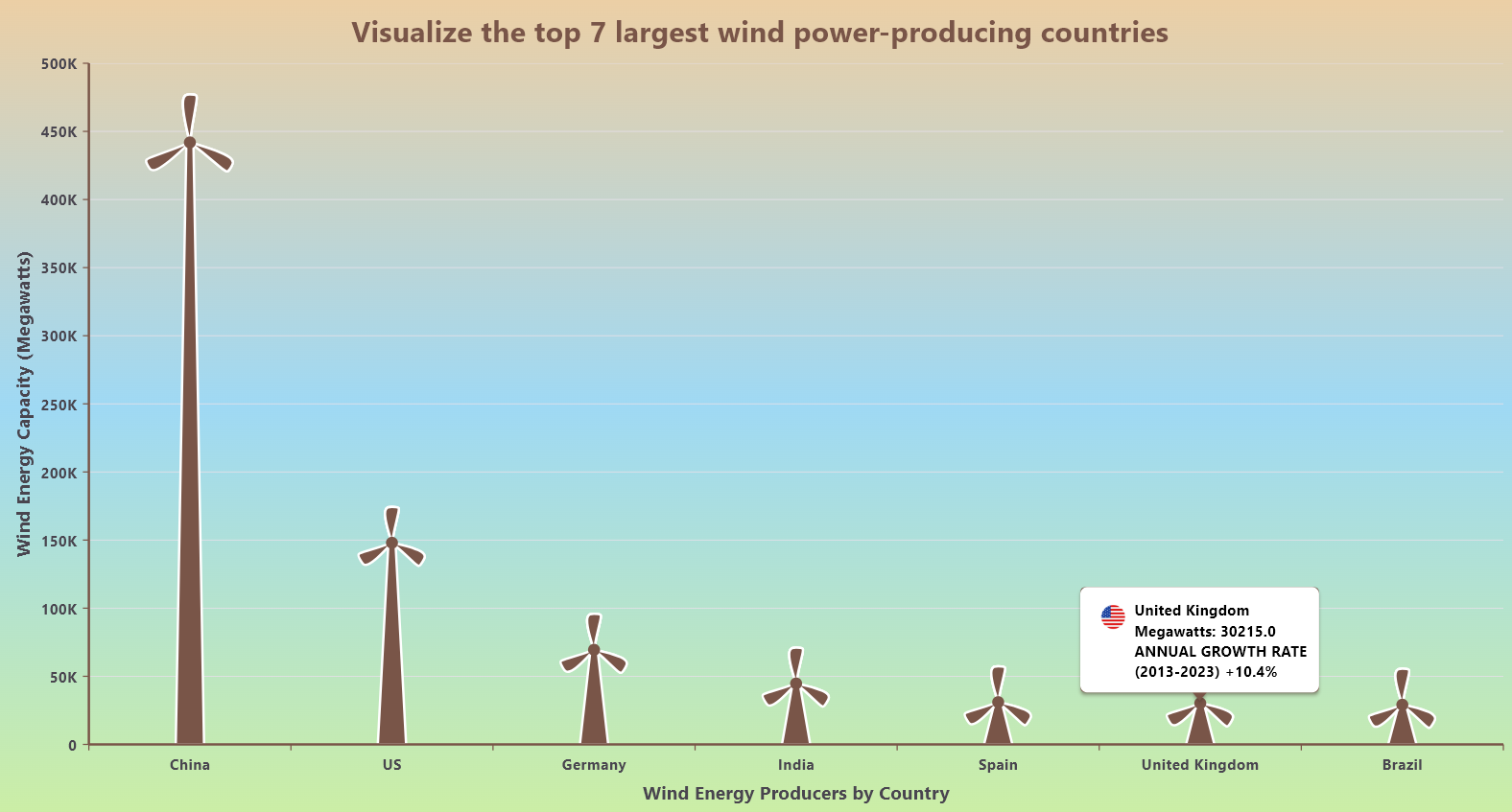
GitHub reference
For more details, refer to the Creating a Flutter Column Chart to visualize the world’s largest wind power producers GitHub demo.

Unlock the power of Syncfusion’s highly customizable Flutter widgets.
Conclusion
Thanks for reading! In this blog, we’ve seen how to visualize the data on the top 7 wind power-producing countries using the Syncfusion Flutter Column Chart. We hope you find the outlined steps helpful in achieving similar results.
If you’re an existing customer, you can download the latest version of Essential Studio® from the License and Downloads page. For those new to Syncfusion, try our 30-day free trial to explore all our features.
For queries, you can contact us through our support forum, feedback portal, or support portal. As always, we are happy to assist you!
