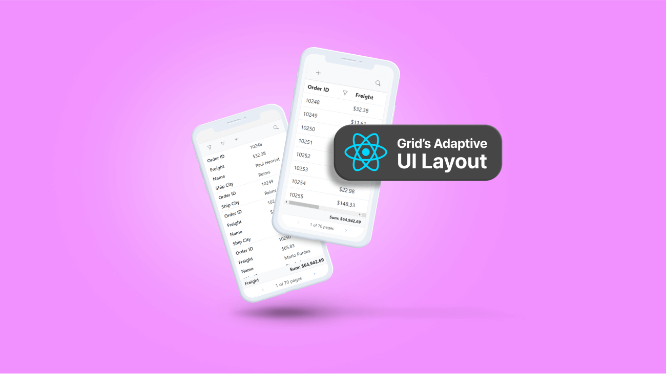

As technology advances, users’ demands also advance regarding software interfaces. One area where this is particularly evident is in the realm of data grids. To meet these demands, Syncfusion has introduced a new layout design for its grid component, specifically designed to provide an optimal viewing experience and improve usability on small screens.
This feature ensures that users can easily interact with the grid on various devices, improving the overall usability of the component.
One of the most significant features of this new layout design is the ability to render row elements in both vertical and horizontal modes. In today’s mobile-first world, vertical rendering of row elements is becoming increasingly necessary. This feature allows more rows to be shown on the screen at once and can make it easier for users to scroll and interact with the grid. This can be useful for mobile devices, tablets, and small screens.
The UI interaction-oriented features such as filtering, sorting, searching, and dialog editing were also redesigned to fit small screens.
To enable the adaptive UI layout and vertical rendering mode, developers need to set the enableAdaptiveUI property of the grid to true and the rowRenderingMode property to vertical. This will unleash the full potential of this new layout design.
We’ve included the following example to give you a better idea of this new layout.
Note: We’ve integrated the grid with a mobile layout for this example to give you a mobile experience.
import { ColumnDirective, ColumnsDirective, GridComponent, Inject } from '@syncfusion/ej2-react-grids';
import { AggregateColumnsDirective, AggregateColumnDirective, AggregateDirective, AggregatesDirective } from '@syncfusion/ej2-react-grids';
import { Filter, Sort, Edit, Toolbar, Aggregate, Page } from ‘@syncfusion/ej2-react-grids’;
import * as React from ‘react’;
import { data } from './datasource';
function App() {
    const editSettings = { allowEditing: true, allowAdding: true, allowDeleting: true, mode: ‘Dialog' };
    const toolbarOptions = ['Add', 'Edit', 'Delete', 'Update', 'Cancel', 'Search'];
    const validationRule = { required: true };
    const orderidRules = { required: true, number: true };
    const filterOptions = { type: 'Excel' };
    const renderingMode = 'Vertical';
    let grid;

    const load = () => {
        grid = document.getElementById('adaptivebrowser').ej2_instances[0];
        grid.adaptiveDlgTarget = document.getElementsByClassName('e-mobile-content')[0];
    };

    const footerSum = (props) => {
        return (<span>Total Models: {props.Count}</span>);
    };

    let menuFilter = { type: 'Menu' };
    let checkboxFilter = { type: 'CheckBox' };

    return (<div className="e-adaptive-demo e-bigger">
            <div className="e-mobile-layout">
              <div className="e-mobile-content">
                  <GridComponent id="adaptivebrowser" dataSource={data} height='100%' ref={g => grid = g} enableAdaptiveUI={true} rowRenderingMode={renderingMode} allowFiltering={true} allowSorting={true} allowPaging={true} filterSettings={filterOptions} toolbar={toolbarOptions} editSettings={editSettings} created={created}>
                    <ColumnsDirective>
                      <ColumnDirective field='SNO' headerText='S NO' width='150' isPrimaryKey={true} validationRules={orderidRules}></ColumnDirective>
                      <ColumnDirective field='Model' headerText='Model Name' width='200' editType='dropdownedit' validationRules={validationRule}/>
                      <ColumnDirective field='Developer' headerText='Developer' width='200' filter={menuFilter} validationRules={validationRule}></ColumnDirective>
                      <ColumnDirective field='ReleaseDate' headerText='Released Date' editType='datepickeredit' type='date' format='yMMM' width='200'></ColumnDirective>
                      <ColumnDirective field='AndroidVersion' headerText='Android Version' width='200' filter={checkboxFilter} validationRules={validationRule}></ColumnDirective>
                    </ColumnsDirective>

                    <Inject services={[Filter, Sort, Edit, Toolbar, Aggregate, Page]}/>
                      <AggregatesDirective>
                       <AggregateDirective>
                        <AggregateColumnsDirective>
                          <AggregateColumnDirective field='Model' type='Count' footerTemplate={footerSum}> </AggregateColumnDirective>
                        </AggregateColumnsDirective>
                      </AggregateDirective>
                    </AggregatesDirective>
                  </GridComponent>
              </div>
            </div>

            <br></br>
              <div className="datalink">Source:
                <a href="https://en.wikipedia.org/wiki/List_of_Android_smartphones" target="_blank">Wikipedia: List of Android smartphones</a>
              </div>
            </div>);
}
export default App;
The next images show the adaptive layout’s horizontal and vertical rendering modes.
| | |
Now, let’s look at the different grid features in the new layout. The following .gif demonstrates the new layout’s sorting, filtering, searching, and dialog editing features and how to interact with them.
For more details, refer to our documentation and demos.
The adaptive UI layout feature in Syncfusion’s React Data Grid offers a unique solution for grid lovers and users looking for optimal viewing and improved usability on small screens.
With the ability to render row elements in vertical mode, developers can create more user-friendly and efficient interfaces for small-screen devices.
Please try out this great feature and provide valuable feedback in the comments section.
Are you already a Syncfusion user? You can download the product setup here. If you’re not yet a Syncfusion user, you can download a free 30-day trial.
You can also contact us through our support forums, support portal, or feedback portal. We are always happy to assist you!