
 Vimala Thirumalai Kumar
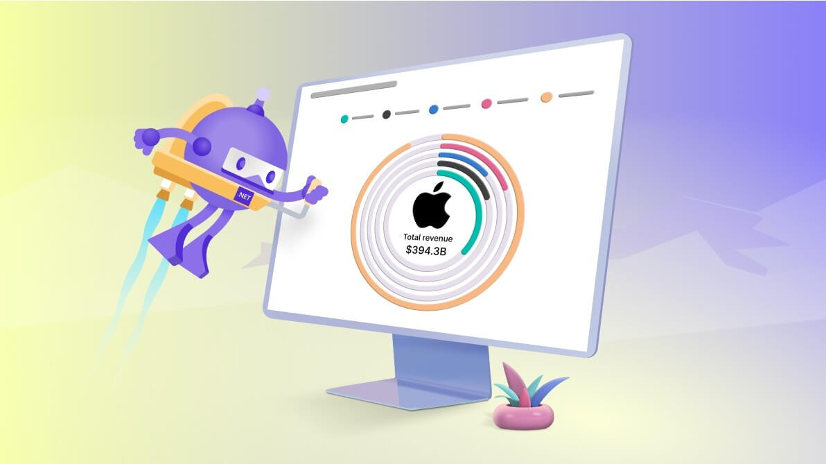
TL;DR: Let’s visualize Apple’s revenue distribution data across different products using Syncfusion .NET MAUI Radial Bar Chart. We’ll use advanced customization options for a superior data visualization experience. Read the article for complete details!
Welcome to our Chart of the Week Blog series!
Today, we’ll visualize the data on Apple’s revenue breakdown for 2022 by creating a stunning Radial Bar Chart with a customized center view using the Syncfusion .NET MAUI Circular Charts control.
Why use Radial Bar Chart?
A Radial Bar Chart is a doughnut chart representing each segment as a separate circle. This versatile chart type can be used in various scenarios to visualize categorical data in a circular format. Here are a few everyday use cases of it:
- Sales performance
- Market share analysis
- Survey results
- Performance metrics
Imagine you’re a financial analyst looking to present complex revenue data in a visually appealing way. You need a chart that not only showcases the contributions of different product categories like iPhones, Macs, and Services but also has a stunning design. The Radial Bar Chart is ideal for this purpose. It transforms detailed revenue breakdowns into an easy-to-understand and captivating visual, making data interpretation straightforward and efficient.
Center view customization
The .NET MAUI Radial Bar Chart offers extensive customization options; the center view is one such powerful feature. This feature allows you to add any view or key statistics to the center of the Radial Bar Chart, making it a valuable area for sharing additional information about the chart.
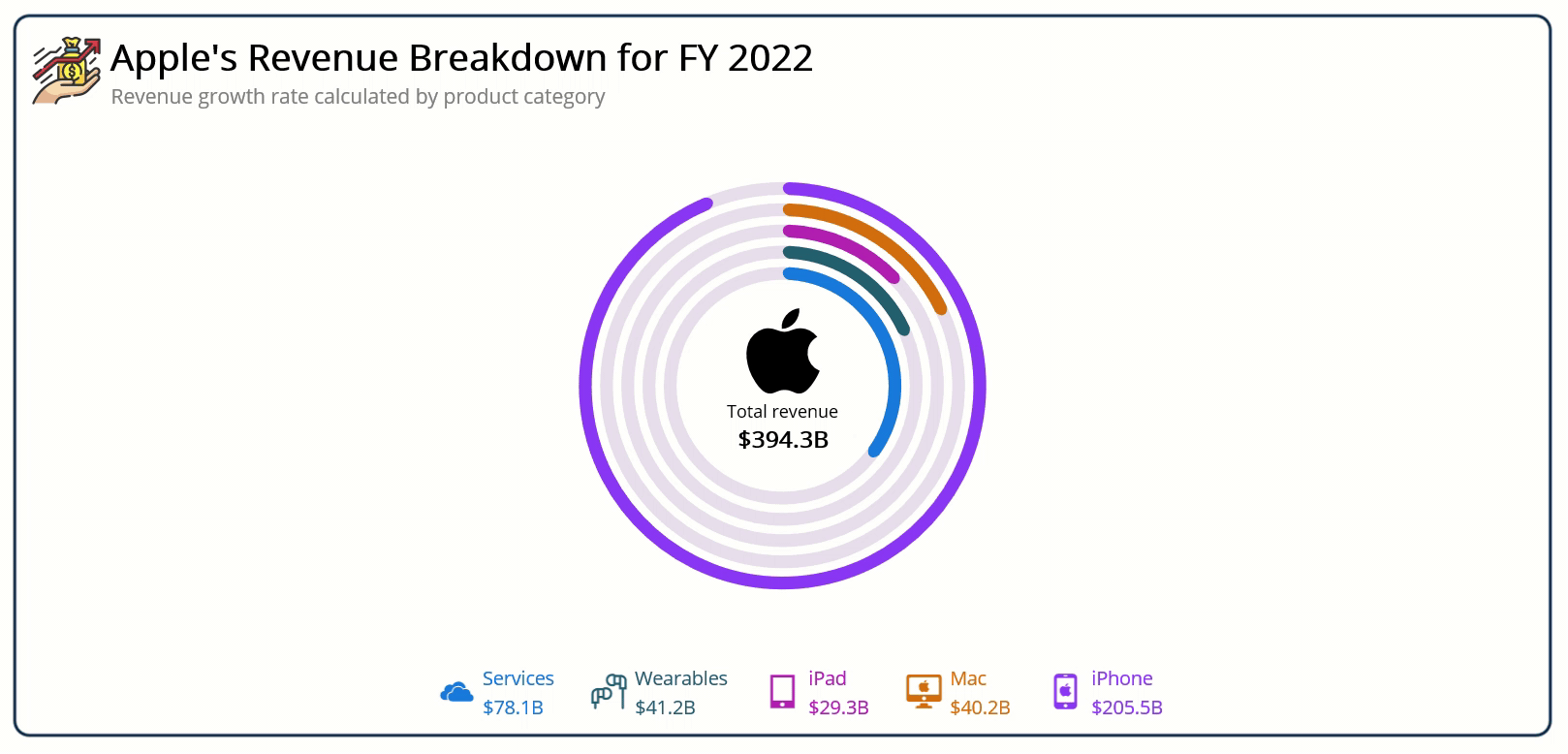
In this blog, we will visualize Apple’s revenue for 2022, placing an Apple icon and the total revenue in the center view. This central element not only adds a visual appeal but also provides a quick snapshot of the overall data.
Refer to the following image.

We’ll also explore other chart features such as the chart title, color palettes, series customization, legend, and interactive features like tooltips for further customization.
Let’s get started!
Step 1: Gathering data from the source
First, we need to gather the revenue data for different product categories from a reliable source. For this example, we are using Apple’s revenue data for the year 2022 from Apple’s annual report( page 40).
Step 2: Preparing the data for the chart
Create a Model to represent the revenue data for each product category. Refer to the following code example.
public class Model
{
    public string Category { get; set; }
    public double Revenue { get; set; }
    public string CategoryImage { get; set; }
    public SolidColorBrush Color { get; set; }

    public Model(string category, double revenue, string categoryImage, SolidColorBrush color)
    {
        Category = category;
        Revenue = revenue;
        CategoryImage = categoryImage + ".png";
        Color = color;
    }
}
Next, create a ViewModel to hold the collection of revenue data.
public class ViewModel
{
    public ObservableCollection<Model> RadialBarData { get; set; }

    public ViewModel()
    {
        var colors = new string[]
        {
            "#0B77E3",
            "#1D5B6F",
            "#BD34B7",
            "#DE7207",
            "#8E4AFC"
        };

        RadialBarData = new ObservableCollection<Model>()
        {
            new Model("Services", 78129, "service", CreateBrush(colors[0])),
            new Model("Wearables", 41241, "earphone", CreateBrush(colors[1])),
            new Model("iPad", 29292, "ipad", CreateBrush(colors[2])),
            new Model("Mac", 40177, "mac", CreateBrush(colors[3])),
            new Model("iPhone", 205489, "iphone", CreateBrush(colors[4]))
        };

    }

    private SolidColorBrush CreateBrush(string hexColor)
    {
        return new SolidColorBrush(Color.FromArgb(hexColor));
    }
}
Step 3: Configure the Syncfusion .NET MAUI Circular Charts
Let’s configure the Syncfusion .NET MAUI Circular Charts control using this documentation.
Refer to the following code example.
<?xml version="1.0" encoding="utf-8" ?>
<ContentPage ….
xmlns:chart="clr-namespace:Syncfusion.Maui.Charts;assembly=Syncfusion.Maui.Charts">

  <chart:SfCircularChart>
    …
  </chart:SfCircularChart>
</ContentPage>
Step 4: Binding data to the chart
To design the Radial Bar Chart, we’ll use the Syncfusion RadialBarSeries instances. Make sure to configure the ViewModel class to bind its properties to the chart’s BindingContext.
Refer to the following code example. Here, in the RadialBarSeries, the ItemsSource, XBindingPath, and YBindingPath properties are bound to the RadialBarData, Category, and Revenue properties, respectively.
<?xml version="1.0" encoding="utf-8" ?>
<ContentPage ….
   xmlns:local="clr-namespace:AppleRevenueRadialBarChart">

   <chart:SfCircularChart>

     <chart:SfCircularChart.BindingContext>
        <local:ViewModel x:Name="viewModel"/>
     </chart:SfCircularChart.BindingContext>

     <chart:RadialBarSeries ItemsSource="{Binding RadialBarData}"
                            YBindingPath="Revenue" XBindingPath="Category" >

     </chart:SfCircularChart>

</ContentPage>
Step 5: Customizing the Syncfusion .NET MAUI Radial Bar Chart
Let’s enhance the aesthetics and readability of the .NET MAUI Radial Bar Chart by customizing its elements such as title, series, interaction features, center view, and legends.
Chart title: Setting the stage
With the Syncfusion .NET MAUI Radial Bar Chart, adding a title is simple and intuitive. The title provides quick information about the data being plotted in the chart.
Refer to the following code example to add a title to the chart.
<chart:SfCircularChart.Title>
    <HorizontalStackLayout>
        <Image Source="revenue1.png" WidthRequest="{OnPlatform Default='50', iOS='40', MacCatalyst='70'}"/>
        <VerticalStackLayout>
            <Label Text="Apple's Revenue Breakdown for FY 2022" Margin="5,0,0,0"
                   HorizontalOptions="CenterAndExpand" HorizontalTextAlignment="Center"
                   VerticalOptions="CenterAndExpand"
                   FontSize="{OnPlatform Default='25', iOS='22', MacCatalyst='28'}" FontAttributes="Bold" />
            <Label Text="Revenue growth rate calculated by product category" Margin="5,0,0,0"
                   HorizontalOptions="StartAndExpand" HorizontalTextAlignment="Center"
                   VerticalOptions="CenterAndExpand"
                   FontSize="{OnPlatform WinUI='14', Android='12', iOS='14', MacCatalyst='18'}"
                   TextColor="Gray"/>
        </VerticalStackLayout>
    </HorizontalStackLayout>
</chart:SfCircularChart.Title>
Center view: Highlighting key information
The center view helps us to share additional information about the Radial Bar Chart. Here, we’re going to add the total revenue generated by Apple in 2022, which is $394.3B in the center view.
<chart:RadialBarSeries.CenterView>
    <VerticalStackLayout Margin="{OnPlatform WinUI='0, -20, 0, 0', Default='0, -10, 0, 0'}" >
        <Image HorizontalOptions="CenterAndExpand" VerticalOptions="StartAndExpand"  Source="apple.png"
               HeightRequest="{OnPlatform iOS=70, Android=70, WinUI=85, MacCatalyst=120}"
               WidthRequest="{OnPlatform iOS=70, Android=70, WinUI=100, MacCatalyst=120}" />
        <VerticalStackLayout Margin="{OnPlatform WinUI='0, -10, 0, 0', Default='0, -10, 0, 0'}" >
            <Label Text="Total revenue" FontSize="{OnPlatform Android=12, iOS=14, WinUI=12, MacCatalyst=18}"
                   HorizontalOptions="Center" VerticalOptions="Center" />
            <Label Text="$394.3B" FontSize="{OnPlatform Android=14, iOS=18, WinUI=16, MacCatalyst=22}"
                   FontAttributes="Bold" HorizontalOptions="Center" VerticalOptions="Center" />
        </VerticalStackLayout>
    </VerticalStackLayout>
</chart:RadialBarSeries.CenterView>
Palette: Making data pop with colors
We can customize the palette to apply distinct colors for each category, making it easier to differentiate between them. Each segment of the radial bar represents a product category, with unique colors assigned to Services, Wearables, iPad, Mac, and iPhone. Color coding helps in quick visual identification and comparison of categories.
XAML
<chart:RadialBarSeries PaletteBrushes="{Binding Palette}">
C#
public class ViewModel
{
    public ObservableCollection<Brush> Palette { get; set; }

    public ViewModel()
    {
        var colors = new string[]
        {
            …
        };

        Palette = new ObservableCollection<Brush>(colors.Select(CreateBrush));
    }
}
Customizing the series appearance
Let’s customize the chart’s series appearance to suit our data presentation needs.
- The CapStyle property adds smooth curves to the start and end of each bar.
- The Radius property changes the radial bar chart size.
- The MaximumValue represents the span of the segment-filled area in the radial bar track.
- The GapRatio defines the space between each segment.
- The TrackFill property customizes the circular bar area behind the radial bar segments.
By leveraging these properties, a visually stunning and highly customizable Radial Bar Chart can be created to communicate data insights effectively.
Refer to the following code example.
<chart:RadialBarSeries CapStyle="BothCurve"
                       Radius="{OnPlatform Android=1, iOS=1, Default=0.8}"
                       MaximumValue="218000"
                       GapRatio="0.4"
                       TrackFill="#E7E0EC">
Legend: A quick reference guide
The legends provide information about the data points being displayed in the chart. They list all categories with their respective icons, making it easy to interpret the data briefly without needing to hover over each segment.
Refer to the following code example.
<chart:SfCircularChart>
    <chart:SfCircularChart.Resources>
        <local:BrushToColorConverter x:Key="brushToColor" />
        <local:BillionConverter x:Key="billionConverter" />

        <DataTemplate x:Key="LegendTemplate">
            <Grid ColumnDefinitions="Auto,Auto" Margin="{OnPlatform Android='0, -5, 0, 10', Default='20, 0, 0, 0'}">
                <Image Grid.Column="0" Source="{Binding Item.CategoryImage}"
                       WidthRequest="{OnPlatform Default='35', iOS='40', MacCatalyst='50'}"
                       HeightRequest="{OnPlatform Default='35', iOS='40', MacCatalyst='50'}" />
                <VerticalStackLayout Grid.Column="1">
                    <Label FontSize="{OnPlatform Default='13', iOS='16', MacCatalyst='18'}"
                           VerticalTextAlignment="Center" Text="{Binding Item.Category}"
                           TextColor="{Binding IconBrush, Converter={StaticResource brushToColor}}"
                           Margin="0,2,0,0" HorizontalOptions="StartAndExpand" HorizontalTextAlignment="Center"/>
                    <Label FontSize="{OnPlatform Default='13', iOS='16', MacCatalyst='18'}"
                           VerticalTextAlignment="Center"
                           Text="{Binding Item.Revenue, Converter={StaticResource billionConverter}}"
                           TextColor="{Binding IconBrush, Converter={StaticResource brushToColor}}"
                           Margin="0,2,0,0" HorizontalOptions="StartAndExpand" HorizontalTextAlignment="Center"/>
                </VerticalStackLayout>
            </Grid>
        </DataTemplate>
    </chart:SfCircularChart.Resources>

    <chart:SfCircularChart.Legend>
        <chart:ChartLegend Placement="{OnPlatform Android=Right, iOS=Right, Default=Bottom}"
                           ItemTemplate="{StaticResource LegendTemplate}"/>
    </chart:SfCircularChart.Legend>

    <chart:RadialBarSeries LegendIcon="Circle">

    </chart:RadialBarSeries>
</chart:SfCircularChart>
Tooltip: Adding interactivity
We can enhance the chart’s interactivity with tooltips that provide detailed information when a user hovers over or taps on a segment. In this chart, the tooltip shows the category name and its percentage contribution to the total revenue. This interactivity makes the chart more engaging and informative.
Refer to the following code example.
<chart:SfCircularChart>
    <chart:SfCircularChart.Resources>
        <local:PercentageConverter x:Key="percentageConverter" />

        <DataTemplate x:Key="tooltipTemplate">
            <StackLayout Orientation="Vertical" VerticalOptions="Center" Margin="{OnPlatform MacCatalyst='3'}">
                <HorizontalStackLayout HorizontalOptions="Center">
                    <Ellipse WidthRequest="{OnPlatform Default=10, MacCatalyst=15}"
                             HeightRequest="{OnPlatform Default=10, MacCatalyst=15}"
                             Stroke="White" StrokeThickness="2"
                             Background="{Binding Item.Color, Converter={StaticResource brushToColor}}"
                             HorizontalOptions="Center" VerticalOptions="Center"/>
                    <Label Text="{Binding Item.Category, StringFormat=' {0}'}"
                           TextColor="White" FontAttributes="Bold"
                           FontSize="{OnPlatform Default='12', Android='10', iOS='10', MacCatalyst='18'}"
                           HorizontalOptions="Center" VerticalOptions="Center"/>
                </HorizontalStackLayout>
                <BoxView HeightRequest="{OnPlatform Default=0.5, MacCatalyst=1}" Color="White"/>
                <HorizontalStackLayout>
                    <Label Text="Revenue:" TextColor="White" FontAttributes="Bold"
                           FontSize="{OnPlatform Default='12', Android='10', iOS='10', MacCatalyst='18'}"
                           HorizontalOptions="Center" VerticalOptions="Center"/>
                    <Label TextColor="White" FontAttributes="Bold"
                           Text="{Binding Item.Revenue, StringFormat=' {0}', Converter={StaticResource percentageConverter}}"
                           FontSize="{OnPlatform Default='12', Android='10', iOS='10', MacCatalyst='18'}"
                           HorizontalOptions="Center" VerticalOptions="Center"/>
                </HorizontalStackLayout>
            </StackLayout>
        </DataTemplate>
    </chart:SfCircularChart.Resources>

    <chart:SfCircularChart.TooltipBehavior>
        <chart:ChartTooltipBehavior />
    </chart:SfCircularChart.TooltipBehavior>

    <chart:RadialBarSeries EnableTooltip="True" TooltipTemplate="{StaticResource tooltipTemplate}">

    </chart:RadialBarSeries>
</chart:SfCircularChart>
After executing these code examples, we will get the output that resembles the following image.

GitHub reference
For more details, refer to the demo on GitHub.
Conclusion
Thanks for reading! In this blog, we’ve seen how to visualize Apple’s revenue data using the Syncfusion .NET MAUI Radial Bar Chart. We strongly encourage you to follow the steps outlined in this blog, share your thoughts in the comments below, and implement these features in your own projects to create impactful data visualizations.
The existing customers can download the new version of Essential Studio® on the License and Downloads page. If you are not a Syncfusion customer, try our 30-day free trial to check out our incredible features.
You can also contact us through our support forums, support portal, or feedback portal. We are always happy to assist you!


 No spam, just valuable updates.