TL;DR: Let’s see how to create a Parallel Coordinate Chart using the .NET MAUI Toolkit Charts. This chart is ideal for visualizing multi-dimensional data, making it easy to compare multiple variables. We’ll cover data collection, axis setup, series customization, and visual styling.
Welcome to the latest edition of the Chart of the Week blog series!
Today, we’ll explore an exciting data visualization technique: the Parallel Coordinate Chart, using Syncfusion .NET MAUI Toolkit Cartesian Chart. This chart is ideal for analyzing high-dimensional datasets, making it a powerful tool for data scientists and developers. By the end of this tutorial, you’ll have a fully functional Parallel Coordinate Chart that you can integrate into your .NET MAUI apps to visualize complex relationships among multiple variables.
A parallel coordinate chart is a visualization technique used to plot multi-dimensional data. Unlike traditional charts that represent data in two dimensions, this chart allows you to compare multiple numerical variables simultaneously. Each variable is represented on its own vertical axis, and data points are connected across these axes to form patterns that highlight correlations and trends, making it easier to identify clusters, patterns, or outliers.
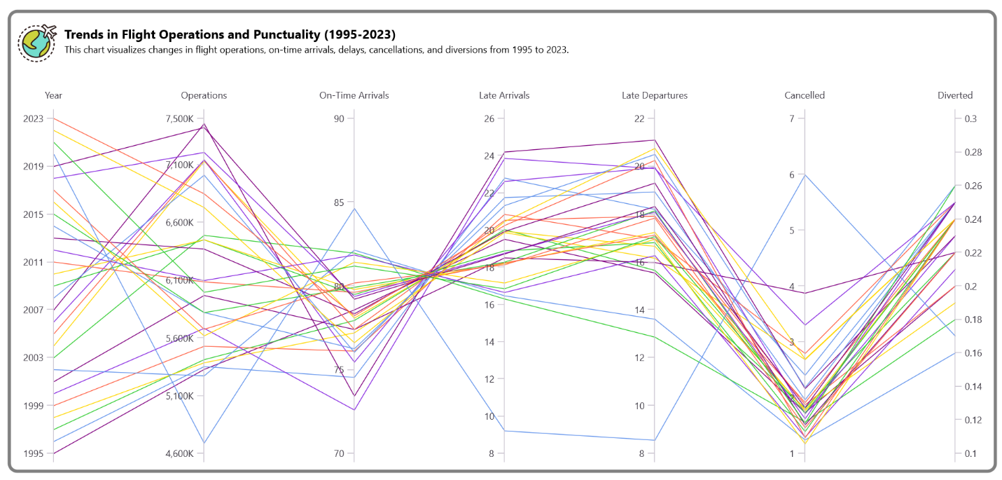
The following image shows the parallel coordinate chart that we intend to create.
Here, we’ll visualize trends in flight operations and punctuality using the .NET MAUI Parallel Coordinate Chart. For this, we’ll collect the data from Year-to-date airline on-time performance for each month report.
Now, create a custom ParallelCoordinateChart class by inheriting it from the SfCartesianChart. Initialize the chart setup using the GenerateChart method.
public class ParallelCoordinateChart : SfCartesianChart
{
    public ParallelCoordinateChart()
    {
        GenerateChart();
    }
} Define the GenerateChart() method to manage the complete chart setup, including the configuration of axes, series, and visual styles such as color palettes.
private void GenerateChart()
{
    var xAxes = GenerateXAxes();
    var yAxes = GenerateYAxesList();
    this.XAxes.Add(xAxes);
    foreach (var yaxis in yAxes)
    {
        this.YAxes.Add(yaxis);
    }

    var paletteBrushes = new List<Brush>
    {
        new SolidColorBrush(Color.FromArgb("#800080")),
        new SolidColorBrush(Color.FromArgb("#6495ED")),
        new SolidColorBrush(Color.FromArgb("#32CD32")),
        new SolidColorBrush(Color.FromArgb("#FFD700")),
        new SolidColorBrush(Color.FromArgb("#FF6347")),
        new SolidColorBrush(Color.FromArgb("#8A2BE2")),
    };
    this.PaletteBrushes = paletteBrushes;

    var seriesList = GenerateSeries(yAxes);
    foreach (var series in seriesList)
    {
        this.Series.Add(series);
    }
} To create a Parallel Coordinate Chart, we need to define both the XAxes and YAxes.
The X-axes represent different variables, while the Y-axes represent their respective values.
Refer to the following code example to generate the X-axes for the chart.
private NumericalAxis GenerateXAxes()
{
    var xAxes = new NumericalAxis()
    {
        Minimum = 0,
        Maximum = 6,
        Interval = 1,
        ShowMajorGridLines = false,
        PlotOffsetStart = 50,
        PlotOffsetEnd = 50,
        CrossesAt = double.MaxValue,
        EdgeLabelsDrawingMode = EdgeLabelsDrawingMode.Center,
        AxisLineStyle = new ChartLineStyle()
        {
            StrokeWidth = 0,
        }
    };

    xAxes.LabelCreated += (s, e) =>
    {
        e.Label = e.Position switch
        {
            0 => "Year",
            1 => "Operations",
            2 => "On-Time Arrivals",
            3 => "Late Arrivals",
            4 => "Late Departures",
            5 => "Cancelled",
            6 => "Diverted",
            _ => string.Empty
        };
    };

    return xAxes;
}
Refer to the following code example to generate Y-axes for the chart.
private List<NumericalAxis> GenerateYAxesList()
{
    var viewModelData = new ViewModel().Source;
    var firstItem = viewModelData.First();
    var properties = firstItem.GetType().GetProperties();
    var list = new List<NumericalAxis>();

    foreach (var property in properties)
    {
        var yAxis = new NumericalAxis()
        {
            ShowMajorGridLines = false,
            LabelsPosition = AxisElementPosition.Outside,
        };

        switch (property.Name)
        {
            case "Year":
                yAxis.Minimum = 0;
                yAxis.Maximum = 28;
                yAxis.Interval = 4;
                yAxis.CrossesAt = 0;
                yAxis.EdgeLabelsDrawingMode = EdgeLabelsDrawingMode.Fit;

                string[] years = Enumerable.Range(1995, 29).Select(y => y.ToString()).ToArray();

                yAxis.LabelCreated += (s, e) =>
                {
                    if (e.Position >= 0 && e.Position < years.Length)
                    {
                        e.Label = years[(int)e.Position];
                    }
                    else
                    {
                        e.Label = string.Empty;
                    }
                };
                break;

            case "Operations":
                yAxis.Minimum = 4600000;
                yAxis.Maximum = 7500000;
                yAxis.Interval = 500000;
                yAxis.CrossesAt = 1;
                yAxis.LabelStyle = new ChartAxisLabelStyle()
                {
                    LabelFormat = "#,##0,K"
                };
                yAxis.EdgeLabelsDrawingMode = EdgeLabelsDrawingMode.Fit;
                yAxis.EdgeLabelsVisibilityMode = EdgeLabelsVisibilityMode.AlwaysVisible;
                break;

            case "PercentOnTimeArrivals":
                yAxis.Minimum = 70;
                yAxis.Maximum = 90;
                yAxis.Interval = 5;
                yAxis.CrossesAt = 2;
                yAxis.EdgeLabelsDrawingMode = EdgeLabelsDrawingMode.Fit;
                yAxis.EdgeLabelsVisibilityMode = EdgeLabelsVisibilityMode.AlwaysVisible;
                break;

            case "PercentLateArrivals":
                yAxis.Minimum = 8;
                yAxis.Maximum = 26;
                yAxis.Interval = 2;
                yAxis.CrossesAt = 3;
                yAxis.EdgeLabelsDrawingMode = EdgeLabelsDrawingMode.Fit;
                yAxis.EdgeLabelsVisibilityMode = EdgeLabelsVisibilityMode.AlwaysVisible;
                break;

            case "PercentLateDepartures":
                yAxis.Minimum = 8;
                yAxis.Maximum = 22;
                yAxis.Interval = 2;
                yAxis.CrossesAt = 4;
                yAxis.EdgeLabelsDrawingMode = EdgeLabelsDrawingMode.Fit;
                yAxis.EdgeLabelsVisibilityMode = EdgeLabelsVisibilityMode.AlwaysVisible;
                break;

            case "PercentCancelled":
                yAxis.Minimum = 1;
                yAxis.Maximum = 7;
                yAxis.Interval = 1;
                yAxis.CrossesAt = 5;
                yAxis.EdgeLabelsDrawingMode = EdgeLabelsDrawingMode.Fit;
                yAxis.EdgeLabelsVisibilityMode = EdgeLabelsVisibilityMode.AlwaysVisible;
                break;

            case "PercentDiverted":
                yAxis.Minimum = 0.1;
                yAxis.Maximum = 0.3;
                yAxis.Interval = 0.02;
                yAxis.CrossesAt = 6;
                yAxis.LabelsPosition = AxisElementPosition.Inside;
                yAxis.TickPosition = AxisElementPosition.Inside;
                yAxis.EdgeLabelsDrawingMode = EdgeLabelsDrawingMode.Fit;
                yAxis.EdgeLabelsVisibilityMode = EdgeLabelsVisibilityMode.AlwaysVisible;
                break;
        }

        list.Add(yAxis);
    }
    return list;
} Then, create multiple LineSeries to represent multi-dimensional data, ensuring the values are normalized.
private List<LineSeries> GenerateSeries(List<NumericalAxis> yAxes)
{
    var viewModel = new ViewModel();
    var seriesList = new List<LineSeries>();

    foreach (var chartModel in viewModel.DataSource)
    {
        var itemSource = new ObservableCollection<SeriesModel>();

        for (int axisIndex = 0; axisIndex < yAxes.Count; axisIndex++)
        {
            double yValue = 0;

            if (chartModel.Variable.Count == 0) continue;
            var model = chartModel.Variable[0] as FlightDataModel;
            if (model == null) continue;

            switch (axisIndex)
            {
                case 0:
                    yValue = Normalize(YearIndex(model.Year), 0, 28);
                    break;
                case 1:
                    yValue = Normalize(model.Operations, 4600000, 7500000);
                    break;
                case 2:
                    yValue = Normalize(model.PercentOnTimeArrivals, 70, 90);
                    break;
                case 3:
                    yValue = Normalize(model.PercentLateArrivals, 8, 26);
                    break;
                case 4:
                    yValue = Normalize(model.PercentLateDepartures, 8, 22);
                    break;
                case 5:
                    yValue = Normalize(model.PercentCancelled, 1, 7);
                    break;
                case 6:
                    yValue = Normalize(model.PercentDiverted, 0.1, 0.3);
                    break;
            }
            itemSource.Add(new SeriesModel(axisIndex, yValue));
        }

        var series = new LineSeries()
        {
            ItemsSource = itemSource,
            XBindingPath = nameof(SeriesModel.XValues),
            YBindingPath = nameof(SeriesModel.YValues),
        };

        seriesList.Add(series);
    }

    return seriesList;
}

private double Normalize(double value, double min, double max)
{
    if (max == min) return 0;
    return (((value - min) / (max - min)) * 28);
}

private int YearIndex(string year)
{
    return int.TryParse(year, out int yearInt) ? yearInt - 1995 : -1;
} The ViewModel is responsible for generating the data used in the .NET MAUI Parallel Coordinate Chart.
public class ViewModel
{
    public ObservableCollection<ChartModel> DataSource { get; set; }

    public ObservableCollection<FlightDataModel> Source { get; set; }

    public ViewModel()
    {
        Source = new ObservableCollection<FlightDataModel>(ReadCSV());
        DataSource = new ObservableCollection<ChartModel>();
        foreach (var data in Source)
        {
            DataSource.Add(new ChartModel(new List<object> { data }));
        }
    }

    private IEnumerable<FlightDataModel> ReadCSV()
    {
        Assembly executingAssembly = typeof(App).GetTypeInfo().Assembly;
        Stream inputStream = executingAssembly.GetManifestResourceStream("ParallelCoordinateChart.Resources.Raw.data.csv");

        string line;
        List<string> lines = new List<string>();

        using StreamReader reader = new StreamReader(inputStream);
        while ((line = reader.ReadLine()) != null)
        {
            lines.Add(line);
        }

        return lines.Skip(1).Select(line =>
        {
            string[] data = line.Split(',');

            return new FlightDataModel
            {
                Year = data[0],
                Operations = Convert.ToDouble(data[1]),
                PercentOnTimeArrivals = Convert.ToDouble(data[2]),
                PercentLateArrivals = Convert.ToDouble(data[3]),
                PercentLateDepartures = Convert.ToDouble(data[4]),
                PercentCancelled = Convert.ToDouble(data[5]),
                PercentDiverted = Convert.ToDouble(data[6])
            };
        });
    }
} Finally, integrate the ParallelCoordinateChart into your XAML page to complete the setup.
<ContentPage.Content>
    <Border StrokeThickness="4" Margin="10" Stroke="Gray">
        <Border.StrokeShape>
            <RoundRectangle Fill="Black" CornerRadius="10" />
        </Border.StrokeShape>
        <local:ParallelCoordinateChart Margin="5,10,0,10">
            <local:ParallelCoordinateChart.Title>
                <Grid>
                    <Grid.RowDefinitions>
                        <RowDefinition Height="{OnPlatform Android=68,Default=80,iOS=68}"/>
                    </Grid.RowDefinitions>
                    <Grid.ColumnDefinitions>
                        <ColumnDefinition Width="55"/>
                        <ColumnDefinition Width="Auto"/>
                    </Grid.ColumnDefinitions>
                    <Image Grid.Column="0"
                       Grid.RowSpan="2"
                       Source="world.png"
                       Margin="{OnPlatform Default='0,-25,0,0', iOS='0,-15,0,0', Android='0,-15,0,0'}"
                       HeightRequest="70"
                       WidthRequest="50"/>
                    <StackLayout Grid.Column="1"
                             Grid.Row="0"
                             Margin="7,7,0,0">
                        <Label Text="Trends in Flight Operations and Punctuality (1995-2023)"
                           FontSize="{OnPlatform Android=12,Default=16,iOS=12}"
                           FontAttributes="Bold"
                           FontFamily="centurygothic"
                           TextColor="Black"/>
                        <Label Text="This chart visualizes changes in flight operations, on-time arrivals, delays, cancellations, and diversions from 1995 to 2023."
                           FontSize="{OnPlatform Android=10,Default=12,iOS=10}"
                           FontFamily="centurygothic"
                           TextColor="Black"
                           Margin="0,2,0,0"/>
                    </StackLayout>
                </Grid>
            </local:ParallelCoordinateChart.Title>
        </local:ParallelCoordinateChart>
    </Border>
</ContentPage.Content>
After executing the above code examples, we’ll get the output that resembles the following image.
For more details, refer to the visualizing multi-dimensional data with .NET MAUI Parallel Coordinate Chart GitHub demo.
Thank you for reading! We’ve explored how to create a Parallel Coordinate Chart using the Syncfusion .NET MAUI Toolkit Charts. Share your feedback in the comments, and if you need help, contact us through our support forum, support portal, or feedback portal. We are always eager to help you!