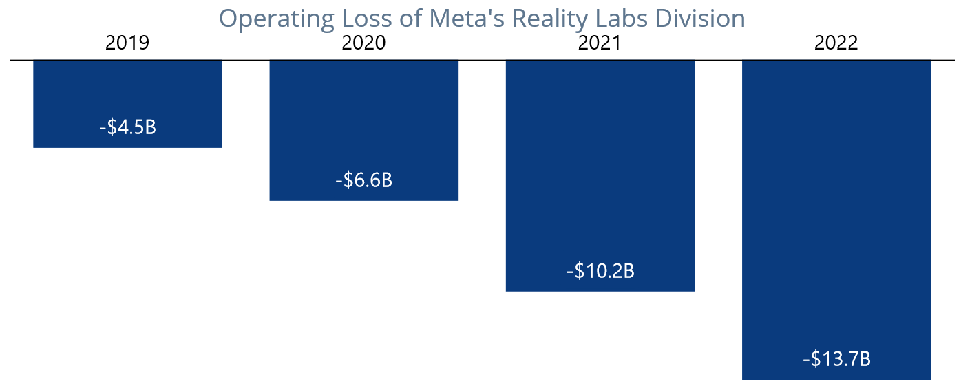
Welcome to our Chart of the Week blog series. Today, we’ll create an inverted column chart using the Syncfusion .NET MAUI Cartesian Charts control. The inverted column chart is commonly used for plotting comparative data values in reverse order. In this example, we will compare Meta Reality Labs’s yearly operating losses from 2019 to 2022.
Step 1: Gather yearly revenue loss data
Refer to the Meta’s Money Pit: Metaverse Bet Bleeds Billions article by Statista and extract data from it. We will utilize the .NET MAUI column chart to create the same user interface.
Step 2: Populate the data for the inversed column chart
Create the MetaLabLossModel class to hold the year and loss data for Meta’s Reality Labs division with the Year and Loss properties.
Refer to the following code example.
public class MetaLabLossModel

{
   public double Year { get; set; }
   public double Loss { get; set; }
}
Then, generate a collection of Reality Labs division’s operating details with the help of the MetaLabLossDetails class.
public class MetaLabLossDetails

{
   public MetaLabLossDetails()
   {
      LossDetails = new List<MetaLabLossModel>()
      {
         new MetaLabLossModel {Year = 2019, Loss = -4.5},
         new MetaLabLossModel {Year = 2020, Loss = -6.6},
         new MetaLabLossModel {Year = 2021, Loss = -10.2},
         new MetaLabLossModel {Year = 2022, Loss = -13.7}
      };
   }
   public List< MetaLabLossModel > LossDetails { get; set; }
}
Step 3: Configure the Syncfusion .NET MAUI Cartesian Charts control
Now, configure the Syncfusion .NET MAUI Cartesian Charts control by following this documentation.
Refer to the following code example.
<Chart:SfCartesianChart x:Name="chart">
 <Chart:SfCartesianChart.XAxes>
  <Chart:NumericalAxis>
  </Chart:NumericalAxis>
 </Chart:SfCartesianChart.XAxes>
 <Chart:SfCartesianChart.YAxes>
  <Chart:NumericalAxis>
  </Chart:NumericalAxis>
 </Chart:SfCartesianChart.YAxes>
</Chart:SfCartesianChart>
Step 4: Bind data to the chart
Use Syncfusion’s ColumnSeries instance to bind the Meta Reality Labs’s operating loss data into the chart.
Refer to the following code example.
<Chart:ColumnSeries XBindingPath="Year" YBindingPath="Loss" ItemsSource="{Binding LossDetails}">
</Chart:ColumnSeries>
In this example, we’ve bound the LossDetails with the ItemSource property. We’ve also specified the XBindingPath and YBindingPath with the Year and Loss properties, respectively.
Step 5: Position the chart axis
To design the inversed column chart, position the chart axis using the CrossesAt and Name properties of the chart axis.
<Chart:SfCartesianChart.XAxes>
 <Chart:NumericalAxis CrossesAt="-1" Name="primary">
 </Chart:NumericalAxis>
</Chart:SfCartesianChart.XAxes>
To assign the crossing axis to the chart series, use the XAxisName property.
<Chart:ColumnSeries XAxisName="primary">
</Chart:ColumnSeries>
Step 6: Customize the chart appearance
Let’s enhance the appearance of the column chart by customizing the axis elements, data labels, column colors, and titles.
Refer to the following code example to add a title to the chart.
<Chart:SfCartesianChart.Title>
 <Label Text="Operating Loss of Meta's Reality Labs Division" HorizontalTextAlignment="Center" FontSize="Title" TextColor="#FF5E768E"/>
</Chart:SfCartesianChart.Title>
Then, configure the axis and modify the axis elements as shown in the following code example.
<Chart:SfCartesianChart.XAxes>
 <Chart:NumericalAxis Interval="1" ShowMajorGridLines="False" >
  <Chart:NumericalAxis.LabelStyle>
   <Chart:ChartAxisLabelStyle FontSize="20" Margin="-40" TextColor="Black"/>
  </Chart:NumericalAxis.LabelStyle>
  <Chart:NumericalAxis.MajorTickStyle>
   <Chart:ChartAxisTickStyle StrokeWidth="0"/>
  </Chart:NumericalAxis.MajorTickStyle>
  <Chart:NumericalAxis.AxisLineStyle>
   <Chart:ChartLineStyle Stroke="Black"/>
  </Chart:NumericalAxis.AxisLineStyle>
 </Chart:NumericalAxis>
</Chart:SfCartesianChart.XAxes>
<Chart:SfCartesianChart.YAxes>
 <Chart:NumericalAxis Maximum="0" IsVisible="False" ShowMajorGridLines="False"/>
</Chart:SfCartesianChart.YAxes>
Then, customize the column colors and enable data labels with the desired label formats.
<Chart:ColumnSeries XBindingPath="Year"
                    Fill="#FF0A3B7E"
                    YBindingPath="Loss"
                    ItemsSource="{Binding LossDetails}"
                    ShowDataLabels="True">
 <Chart:ColumnSeries.DataLabelSettings>
  <Chart:CartesianDataLabelSettings>
   <Chart:CartesianDataLabelSettings.LabelStyle>
    <Chart:ChartDataLabelStyle FontSize="20" LabelFormat="$0.0B"/>
   </Chart:CartesianDataLabelSettings.LabelStyle>
  </Chart:CartesianDataLabelSettings>
 </Chart:ColumnSeries.DataLabelSettings>
</Chart:ColumnSeries>
After executing these code examples, we will get output like in the following image.

GitHub reference
For more information, refer to the project on GitHub.
Conclusion
Thanks for reading! In this blog, we’ve created an inversed column chart to visualize the net revenue loss of Meta’s Reality Labs over time using the Syncfusion .NET MAUI Cartesian Chart. We encourage you to try these steps to visualize your desired data and share your feedback in the comments section below.
You can also reach us through our support forum, support portal, or feedback portal. We are always happy to assist you!
See you in our next blog!


