
The Syncfusion WinUI Radial Gauge control is a multi-purpose data visualization control that displays numerical values on a circular scale. Its rich feature set includes axes, ranges, pointers, and annotations that are fully customizable and extendable.
In this blog, we will see how to design a sleep tracker application by customizing the vivid features of the WinUI Radial Gauge control.


To create a sleep tracker, we need the following features in the WinUI Radial Gauge control:
Follow these steps to design a sleep tracker with the Syncfusion WinUI Radial Gauge:
Refer to the WinUI Radial Gauge documentation to get started.
<gauge:SfRadialGauge>
 <gauge:SfRadialGauge.Axes>
  <gauge:RadialAxis>
  </gauge:RadialAxis>
 </gauge:SfRadialGauge.Axes>
</gauge:SfRadialGauge>
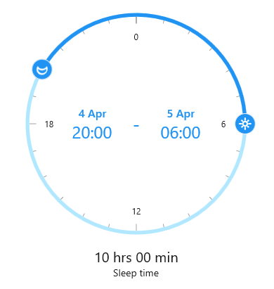
In the process of designing the sleep tracker, the very first step is to design a tracker scale to display the 24-hour time range.
To achieve this, we have to initialize a radial axis and add it to the Axes collection.
The radial axis allows you to display scale values that represent hours in the axis labels from the desired minimum to maximum values with predefined intervals.
You can use the Minimum and Maximum properties of the radial axis to define the start and end hour values of the tracker scale. The Interval property of the radial axis is used to control the scale interval.
To display the tracker scale as a full circle, use the StartAngle and EndAngle properties of the radial axis. Refer to the following code example.
<gauge:RadialAxis x:Name="radialAxis"
                   StartAngle="270"
                   EndAngle="270"
                   Minimum="0"
                   Maximum="24"
                   Interval="6"
                   MinorTicksPerInterval="5"
                   ShowLastLabel="False"
                   AxisLineFill="#B1E8FF"
                   AxisLineWidthUnit="Factor"
                   AxisLineWidth="0.03">
 </gauge:RadialAxis>
</gauge:SfRadialGauge.Axes> The major elements present in the tracker scale are labels, an axis line, and major and minor ticks.
In this demo, we have used the following properties of the radial axis to design this tracker scale.
Note: For more details, refer to the axis support in the WinUI Radial Gauge
Once the tracker scale design is complete, add a ContentPointer to the Pointers collection of the radial axis to indicate the start and end values.
In ContentPointer, you can host views as Content. In this demo, we have used the sun and moon font icons to show the start and end values.
<gauge:RadialAxis.Pointers>
<gauge:ContentPointer x:Name="startPointer"
Value="20"
IsInteractive="True">
<gauge:ContentPointer.Content>
<Grid>
<Ellipse x:Name="StartPtrContentView"
Height="30"
Width="30"
Fill="#2194f3"
Stroke="WhiteSmoke"
StrokeThickness="1" />
<FontIcon HorizontalAlignment="Center"
VerticalAlignment="Center"
FontFamily="Segoe MDL2 Assets"
FontWeight="ExtraBold"
Glyph=""
FontSize="20"
Foreground="White"
RenderTransformOrigin="0.5,0.5">
<FontIcon.RenderTransform>
<ScaleTransform ScaleX="-1" />
</FontIcon.RenderTransform>
</FontIcon>
</Grid>
</gauge:ContentPointer.Content>
</gauge:ContentPointer>
<gauge:ContentPointer x:Name="EndPointer"
IsInteractive="True"
Value="6">
<gauge:ContentPointer.Content>
<Grid>
<Ellipse x:Name="EndPtrContentView"
Height="30"
Width="30"
Fill="#2194f3"
Stroke="WhiteSmoke"
StrokeThickness="1" />
<Path Data="M15.993965,24.811008C16.546965,…"
Stretch="Uniform"
Stroke="#FFFFFFFF"
Fill="#FFFFFFFF"
Width="18"
Height="18">
</Path>
</Grid>
</gauge:ContentPointer.Content>
</gauge:ContentPointer>
</gauge:RadialAxis.Pointers> Note: For more details, refer to the Pointers in WinUI Radial Gauge documentation
Now, let’s add a range to display the total sleep hours. A range is a visual element that helps you see where a value falls on a radial axis. It contains a collection of a range of elements. You can add any number of ranges inside the axis.
In our application, we are going to use a single range on the axis to indicate the total sleep hours.
Use the StartValue and EndValue properties to specify the start and end values of the range. Also, you can customize the width of a range using the StartWidth and EndWidth properties.
Refer to the following code example.
<gauge:RadialAxis.Ranges>
 <gauge:GaugeRange x:Name="range"
                   StartValue="20"
                   EndValue="6"
                   Background="#2194f3"
                   WidthUnit="Factor"
                   StartWidth="0.03"
                   EndWidth="0.03" />
</gauge:RadialAxis.Ranges> Note: For more details, refer to the Ranges in WinUI Radial Gauge documentation.
Here, we are going to use gauge annotation to indicate the sleep start and end times.
The text block displays the current start and end hours. Set the text to the TextBlock’s Text property and place it in the desired location using the PositionFactor, DirectionUnit, and DirectionValue properties of the gauge annotation.
<gauge:RadialAxis.Annotations>
 <gauge:GaugeAnnotation x:Name="StartValueAnnotation"
                        DirectionUnit="Angle"
                        DirectionValue="180"
                        PositionFactor="0.4">
   <gauge:GaugeAnnotation.Content>
     <StackPanel Orientation="Vertical">
       <TextBlock Text="4 Apr"
                  FontSize="16"
                  FontWeight="Medium"
                  Foreground="#2194f3"
                  HorizontalAlignment="Center" />
         <TextBlock x:Name="SleepTime"
                    Text="20:00"
                    FontSize="24"
                    Foreground="#2194f3" />
     </StackPanel>
   </gauge:GaugeAnnotation.Content>
 </gauge:GaugeAnnotation>

 <gauge:GaugeAnnotation x:Name="IntermediateAnnotation">
  <gauge:GaugeAnnotation.Content>
   <TextBlock Text="-"
              Foreground="#2194f3"
              VerticalAlignment="Center"
              FontSize="24"
              FontWeight="SemiBold"
              Margin="20,0,20,0" />
  </gauge:GaugeAnnotation.Content>
 </gauge:GaugeAnnotation>

 <gauge:GaugeAnnotation x:Name="EndValueAnnotation"
                        DirectionUnit="Angle"
                        DirectionValue="0"
                        PositionFactor="0.4">
  <gauge:GaugeAnnotation.Content>
   <StackPanel Orientation="Vertical">
    <TextBlock x:Name="EndValueAnnotationDate"
               Text="5 Apr"
               FontWeight="Medium"
               FontSize="16"
               Foreground="#2194f3"
               HorizontalAlignment="Center" />
    <TextBlock x:Name="WakeUpTime"
               Text="06:00"
               FontSize="24"
               Foreground="#2194f3" />
   </StackPanel>
  </gauge:GaugeAnnotation.Content>
 </gauge:GaugeAnnotation>
</gauge:RadialAxis.Annotations> Note: For more details, refer to the documentation on annotations support in WinUI Radial Gauge
At the app level, you can add a storyboard to animate the content pointers and annotation while interacting with them using the ValueChangeStarted, ValueChanging, and ValueChangeCompleted events of the pointer.
Note: For more details, refer to the example for pointer and annotation animation in WinUI Radial Gauge on GitHub.
For more details, refer to the complete code example for Designing a Sleep Tracker using WinUI Radial Gauge on GitHub.
Thanks for reading! In this blog, we have learned how easy it is to design and update a sleep tracker using the Syncfusion WinUI Radial Gauge control. So, try out the instructions provided in this blog and tell us about your experience in the comments section below.
The Syncfusion Radial Gauge control is also available in our Blazor, ASP.NET (Core, MVC, Web Forms), JavaScript, Angular, React, Vue, .NET MAUI, Xamarin, Flutter, UWP, WinForms, and WPF platforms.
Additionally, you can check out our demo app in the App Center and examples on GitHub.
If you aren’t a customer yet, you can try our 30-day free trial to check out these features.
You can also contact us through our support forums, support portal, or feedback portal. We are always happy to assist you!