
Syncfusion’s WPF chart control has been built to deliver very high performance. Performance is an important criterion in the following two scenarios:
Please consider the following suggestions for fine-tuning Syncfusion’s chart to provide good performance.
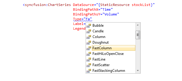
Syncfusion offers around 35+ chart types. For more popular charts, you could find FastCharts like “FastLine”, “FastScatter”, etc. For better performance, use these FastCharts.


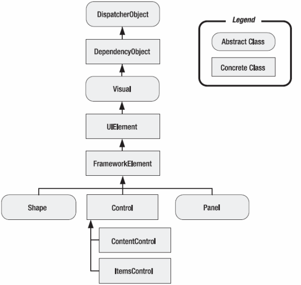
In FastCharts, the most efficient WPF rendering ways are used. For example, in the default column charts, Rectangle shape (WPF’s Shape-derived class) is used to draw the column charts; whereas in the FastColumn, DrawingVisual is used to draw the rectangles. FastLine uses one PolyLine instead of multiple Line shapes when compared to regular line charts. Please refer to the following WPF class hierarchy diagram:

DrawingVisual, which is derived from Visual, is the lowest-level rendering object in the WPF. Whereas Shapes sits three levels on top of the class hierarchy, adding all the higher-level WPF essentials like layout, events, data-bindings, animations, etc. So, with a column type plotting 1000 points, the chart creates 1000 WPF rectangle shapes; whereas FastColumn creates visuals instead and manages the layout and hit-testing. With only a few points, you may not notice any differences, but with thousands of points, using FastChart types would yield around 10 times an improvement in load time with less memory foot-prints.
Using the FastChart types instead of a regular chart has some limitations since the chart uses low-level DrawingVisual objects. With the FastChart types, animations and custom templates are not possible. All the other common features like changing the chart’s color, mouse-events support and ToolTips are available.
The other scenario where performance comes into the picture is with real- time data charts. When new points are added to the underlying data source, a chart has to refresh very fast to render the new points.
With Syncfusion’s chart, when new points are added, only a partial rendering happens; just the new point will be appended to the existing chart.
Say, for example, in “FastLine”, when a new point is added, a new line will be appended to the existing PolyLine – no redrawing. But when the added points reach the maximum x-axis range, the chart has to recalculate the x-axis range again and redraw the graph.
To handle this scenario, you could make use of the ChartSeries.AutoDiscard property. When new values are added at run time, AutoDiscard can be set to following options:
When set to ExtendRange, the x-axis range is extended when the added points reach the maximum x-axis range. Say initially that the x-axis has 0-50, when the 50th point is added, the x-axis range will update to 0-100. In this case, the whole chart rendering takes place only once when the maximum range is reached. If new points are appended until they reach the 100th value, then the range will change to 0-200 and so on. This reduces the frequent redrawing of the chart series.
With ResetRange, old values are discarded and only the new range is shown. Say from 0-50 initially, and when the 50th point is added, the x-axis range changes to 50-100, then to 100-150 and so on.
If data points are updated in a batch—for example, 100 points every second, then it doesn’t make sense to update the chart area after each point addition. In that case, you could freeze the ChartArea rendering until all the points are added and redraw the ChartArea just once. For that you could use the ChartArea.BeginInt() and ChartArea.EndInt() methods as below.
chartArea.BeginInit();
 //updating 100 points per second
 for (int i = 0; i < 100; i++)
 {
     DataList.Add(new Data { X = rnd.Next(0, 6000), Y = rnd.Next(0, 100) });
 }
 chartArea.EndInit();
I hope you find these tips help you to fine-tune your chart’s performance.
Thanks!