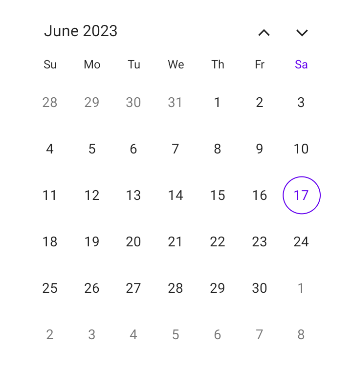

Syncfusion .NET MAUI Calendar control is used to display and select dates. It also handles and considers different types of dates, offering various customization options. Users can create versatile and user-friendly date selection experiences that cater to various app scenarios by understanding these multiple date types.


In this blog, we’ll explore the different types of dates and their customization options available in the .NET MAUI Calendar control.
Note: If you are new to this control, please refer to the .NET MAUI Calendar getting started documentation before proceeding.
Current month dates fall within the current month displayed in the .NET MAUI Calendar. These dates represent the days of the current month, ranging from the first day to the last day of the month. You can customize the default first day of the week (Sunday) based on your needs using the FirstDayOfWeekproperty in the Calendar.
You can also customize the current month date’s text and background using the TextStyle and Background properties of the MonthView.
Refer to the following code example.
SfCalendar calendar = new SfCalendar();
calendar.MonthView.TextStyle = new CalendarTextStyle()
{
    TextColor = Colors.Red
};
this. Content = calendar; The neighbor month dates denote the dates from the trailing (inclusion of the past) and leading (extension into the future) month dates displayed alongside the current month dates in the Calendar. The previous and next month’s dates will vary based on the specified first day of the week in the calendar.
The visibility of the neighbor month dates can be customized by using the ShowTrailingAndLeadingDates property. Including the neighbor month dates improves usability and provides a broader view of the current month. By default, the .NET MAUI Calendar displays the neighbor month dates with a faded style to differentiate them from the current month dates.
You can customize the neighbor month dates text and background using the TrailingLeadingDatesTextStyle and TrailingLeadingDatesBackground properties of the MonthView.
Refer to the following code example.
SfCalendar calendar = new SfCalendar();
calendar.MonthView.TrailingLeadingDatesTextStyle = new CalendarTextStyle()
{
   TextColor = Colors.Red
};
this. Content = calendar; Weekend dates fall on Saturdays and Sundays within a shown month of the calendar. The .NET MAUI Calendar supports changing the default weekend days using the WeekendDays property of the MonthView.
The Calendar also supports highlighting or customizing the month weekend dates text and background using the WeekendDatesTextStyle and WeekendDatesBackground properties of the MonthView.
Note: If the user does not provide the custom text style and background for the weekend dates, the Calendar control will render the weekend dates based on the current and neighbor month dates styles.
Refer to the following code example.
SfCalendar calendar = new SfCalendar();
calendar.MonthView.WeekendDatesTextStyle = new CalendarTextStyle()
{
    TextColor = Colors.Red
};

calendar.MonthView.WeekendDays = new List<DayOfWeek> { DayOfWeek.Sunday, DayOfWeek.Saturday };
this. Content = calendar; Today’s month date provides a point of reference for users. The date is highlighted by a border based on the selection shape in the calendar to distinguish today’s date from other dates. You can change the default color of today using the TodayHighlightBrush property.
You can also customize the text and background of today’s date using the TodayTextStyle and TodayBackground properties of MonthView.
Refer to the following code example.
SfCalendar calendar = new SfCalendar();
calendar.MonthView.TodayTextStyle = new CalendarTextStyle()
{
    TextColor = Colors.Red
};
calendar.TodayHighlightBrush = Brush.Red;
this. Content = calendar; Disabled dates refer to the dates that are not considered valid because the dates fall before the minimum supported date or after the maximum supported date of the calendar. These dates restrict user interaction for the selection. By default, the calendar displays the disabled dates in a faded style to differentiate them from valid month dates.
You can customize the valid date range using the MinimumDate and MaximumDate properties.
The .NET MAUI Calendar also supports customizing the disabled month dates text and background using the DisabledDatesTextStyle and DisabledDatesBackground properties of the MonthView.
Refer to the following code example.
SfCalendar calendar = new SfCalendar();
calendar.MonthView.DisabledDatesTextStyle = new CalendarTextStyle()
{
    TextColor = Colors.Red
};
calendar.MinimumDate = DateTime.Now;
this. Content = calendar; Blackout dates refer to the dates that are unavailable or restricted for selection. They are commonly used in apps such as event booking systems, reservation platforms, and scheduling tools to restrict booking or scheduling.
The .NET MAUI Calendar supports specifying the blackout dates by using the SelectableDayPredicate property. By default, the Calendar displays the blackout dates similarly to disabled dates.
You can also customize the blackout month dates text and background using the DisabledDatesTextStyle and DisabledDatesBackground properties of the MonthView.
Refer to the following code example. Here, the dates 19 and 20 of June 2023 are marked as blackout dates.
SfCalendar calendar = new SfCalendar();
calendar.MonthView.DisabledDatesTextStyle = new CalendarTextStyle()
{
    TextColor = Colors.Red
};
calendar.SelectableDayPredicate = (date) =>
{
    if (date.Date == DateTime.Now.AddDays(2).Date || date.Date == DateTime.Now.AddDays(3).Date)
        return false;
        return true;
};
this. Content = calendar; Special dates refer to dates that need to be highlighted for special occasions such as birthdays, anniversaries, and other important events. They are used to enhance the user experience by providing recognition for essential occasions.
The .NET MAUI Calendar control supports specifying special dates using the SpecialDayPredicate property. Also, it offers options to specify icon shapes—such as Bell, Diamond, Dot, Heart, Square, Star, and Triangle icons—and the color of the icons.
You can customize the text of special month dates and backgrounds using the SpecialDatesTextStyle and SpecialDatesBackground properties of MonthView.
Note: If the user does not wish to add an icon for special dates, they need to set the icon details color as transparent in the SpecialDayPredicateproperty.
Refer to the following code example. Here, the date 21 of June 2023 is marked as a special day.
SfCalendar calendar = new SfCalendar();
calendar.MonthView.SpecialDatesTextStyle = new CalendarTextStyle()
{
   TextColor = Colors.Red
};

calendar.MonthView.SpecialDayPredicate = (date) =>
{
   if (date.Date == DateTime.Now.AddDays(4).Date)
      return new CalendarIconDetails() { Icon = CalendarIcon.Dot };
   else if (date.Date == DateTime.Now.AddDays(5).Date)
      return new CalendarIconDetails() { Fill = Brush.Transparent };
   return null;
};
this. Content = calendar; A selected date on the calendar refers to a specific date a user has chosen or highlighted as their desired date of selection. The selected date is shown as a single date, multiple dates, or a range of dates based on the selection mode of the calendar. These dates are marked with a filled highlight. You can customize the text and highlight the selected month dates using the following properties:
Refer to the following code example.
SfCalendar calendar = new SfCalendar();
calendar.MonthView.SelectionTextStyle = new CalendarTextStyle()
{
   TextColor = Colors.Yellow,
};
calendar.SelectionBackground = Brush.Red;
this. Content = calendar; Thanks for reading! In this blog, we’ve seen the different types of dates and their customization options available in the .NET MAUI Calendar. You can also explore other features in the Calendar control in its documentation. Please try the .NET MAUI demos on GitHub and share your feedback or ask questions in the comments section.
If you are not a Syncfusion customer, try our 30-day free trial to see how our components can enhance your projects. You can also contact us through our support forum, support portal, or feedback portal. We are always happy to assist you!