TL;DR: Implementing pagination in Flutter’s DataGrid widget enables efficient data handling for large datasets. This guide provides a step-by-step setup for paginated views in a Flutter app.
The Syncfusion Flutter DataGrid widget, or the Flutter DataTable, enables users to display and manage data in a tabular format. It offers a rich set of features, such as row selection, sorting, column resizing, row height adjustments, swiping, and more.
The DataGrid allows for interactive data manipulation through the DataPager widget, which supports loading data in segments. This makes it ideal for handling large datasets. The DataPager can be positioned above or below the DataGrid, allowing for efficient data paging.
In this guide, we’ll see how to enable the pagination feature in Flutter DataGrid and explore its various options with practical code examples.
Steps to enable the pagination in the Flutter DataGrid
Follow these steps to add the pagination feature to your Flutter app.
Step 1: Create a DataPager widget
Start by creating a new DataPager widget. It is used to handle data paging, which is especially useful for managing large datasets. To enable paging, assign the DataSource of your DataGrid to the delegate property of the DataPager. This setup allows the DataPager to manage the paging and data loading for the DataGrid.
Refer to the following code example.
@override
Widget build(BuildContext context) {
  return Scaffold(
    appBar: AppBar(
      title: const Center(child: Text('Order Details')),
    ),
    body: LayoutBuilder(builder: (context, constraint) {
      return Column(
        children: [
          SizedBox(
            height: constraint.maxHeight - _dataPagerHeight,
            width: constraint.maxWidth,
            child: _buildDataGrid(constraint),
          ),
          SizedBox(
            height: _dataPagerHeight,
            child: SfDataPager(
              delegate: _orderDataSource,
            ),
          ),
        ],
      );
    }),
  );
}
Step 2: Set the pageCount property
Next, set the pageCount property of the DataPager. This property defines how many pages should be displayed in the pager. By configuring the pageCount property, you allow users to navigate through the data more efficiently. This is particularly useful for large datasets, as it breaks the data into manageable segments, improving both performance and usability.
Refer to the following code example.
@override
Widget build(BuildContext context) {
  return Scaffold(
    appBar: AppBar(
      title: const Center(child: Text('Order Details')),
    ),
    body: LayoutBuilder(builder: (context, constraint) {
      return Column(
        children: [
          SizedBox(
            height: constraint.maxHeight - _dataPagerHeight,
            width: constraint.maxWidth,
            child: _buildDataGrid(constraint),
          ),
          SizedBox(
            height: _dataPagerHeight,
            child: SfDataPager(
              delegate: _orderDataSource,
              pageCount: (_orders.length / _rowsPerPage).ceil().toDouble(),
            ),
          ),
        ],
      );
    }),
  );
}
Step 3: Implement the logic to load data for specific pages
To load data dynamically for each page, implement the handlePageChange method. This method is triggered whenever a user navigates to a new page via the DataPager. Within handlePageChange, define the logic to retrieve and display only the data corresponding to the selected page. By overriding this method, you ensure that the correct data loads seamlessly as the user navigates through different pages, optimizing the display and performance for large datasets.
@override
Future<bool> handlePageChange(int oldPageIndex, int newPageIndex) async {
  int startIndex = newPageIndex * _rowsPerPage;
  int endIndex = startIndex + _rowsPerPage;

  if (endIndex > orders.length) {
    endIndex = orders.length;
  }

  if (startIndex < orders.length && endIndex <= orders.length) {
    _paginatedOrders = orders.getRange(startIndex, endIndex).toList(growable: false);
    _buildDataGridRows(_paginatedOrders);
    notifyListeners();
  } else {
    dataGridRows = [];
  }

  return true;
}
Step 4: Defining data
Here, we are going to define data regarding shipment details of orders. In this step, each order is generated with a randomly assigned shipment price and allocated to a specific city. Each order entry includes details such as product name, price, city, shipment cost, and the total price.
List<Orders> _fetchOrders() {
  List<Order> orderData = [];
  final Random random = Random();

  // Cities list
  List<String> city = [
    'New York',
    'Los Angeles',
    'Chicago',
    'Houston',
    'Phoenix',
    'San Francisco',
    'Dallas',
    'Miami',
    'Atlanta',
    'Seattle',
  ];

  // Mapping of products to their market prices.
  Map<string, double=""> productPrices = {
    'Laptop': 1200.0,
    'Smartphone': 800.0,
    'Tablet': 500.0,
    'Headphones': 150.0,
    'Smartwatch': 200.0,
    'Desktop PC': 1000.0,
    'Gaming Console': 400.0,
    'Fitness Tracker': 100.0,
    'Router': 75.0,
    'Smart TV': 900.0,
    'Drone': 600.0,
    'VR Headset': 350.0,
    'Graphics Card': 800.0,
    'Power Bank': 50.0,
    'Projector': 450.0,
    'Microphone': 80.0,
    'Webcam': 60.0,
    'E-reader': 120.0,
  };

  List<String> products = productPrices.keys.toList();

  // Build exactly 100 records.
  for (int i = 0; i < 100; i++) {
    // Get product name.
    String product = products[i % products.length];

    // Get the price of the product from the productPrices map.
    double price = productPrices[product]!;

    // Generate random shipment price.
    double shipmentPrice = random.nextInt(100) + random.nextDouble();

    // Create an Order object with product and price details.
    orderData.add(Order(
      orderId: 1000 + i,
      customerId: 1700 + i,
      product: product,
      orderPrice: price,
      city: city[i % city.length],
      shippementPrice: shipmentPrice,
      totalPrice: price + shipmentPrice,
    ));
  }
  return orderData;
}</string,>
Step 5: Configure data display layout
Begin by setting up the DataGrid widget and configuring its essential properties to effectively display and manage your data. Based on your paging requirements, decide where to position the DataPager, either above or below the DataGrid.
For a defined size, wrap the DataGrid within a SizedBox. Similarly, control the DataPager’s appearance by placing it within a Container. To create a vertical layout, organize these widgets in a Column, with the DataPager positioned beneath the DataGrid for easy navigation.
Refer to the following code example.
@override
Widget build(BuildContext context) {
  return Scaffold(
    appBar: AppBar(
      title: const Center(child: Text('Order Details')),
    ),
    body: LayoutBuilder(builder: (context, constraint) {
      return Column(
        children: [
          SizedBox(
            height: constraint.maxHeight - _dataPagerHeight,
            width: constraint.maxWidth,
            child: _buildDataGrid(constraint),
          ),
          SizedBox(
            height: _dataPagerHeight,
            child: SfDataPager(
              delegate: _orderDataSource,
              pageCount: (_orders.length / _rowsPerPage).ceil().toDouble(),
              availableRowsPerPage: const [15, 20, 25],
              onRowsPerPageChanged: (value) {
                setState(() {
                  if (value != null) {
                    _rowsPerPage = value;
                  }
                });
              },
            ),
          ),
        ],
      );
    }),
  );
}

Widget _buildDataGrid(BoxConstraints constraint) {
  return SfDataGrid(
    source: _orderDataSource,
    columnWidthMode: ColumnWidthMode.fill,
    columns: <GridColumn>[
      GridColumn(
        columnName: 'orderId',
        label: Container(
          padding: const EdgeInsets.all(8),
          alignment: Alignment.centerLeft,
          child: const Text(
            'Order ID',
            overflow: TextOverflow.ellipsis,
          ),
        ),
      ),
      ------
      GridColumn(
        columnName: 'totalPrice',
        label: Container(
          padding: const EdgeInsets.all(8),
          alignment: Alignment.centerLeft,
          child: const Text(
            'Total Price',
            overflow: TextOverflow.ellipsis,
          ),
        ),
      ),
    ],
  );
}
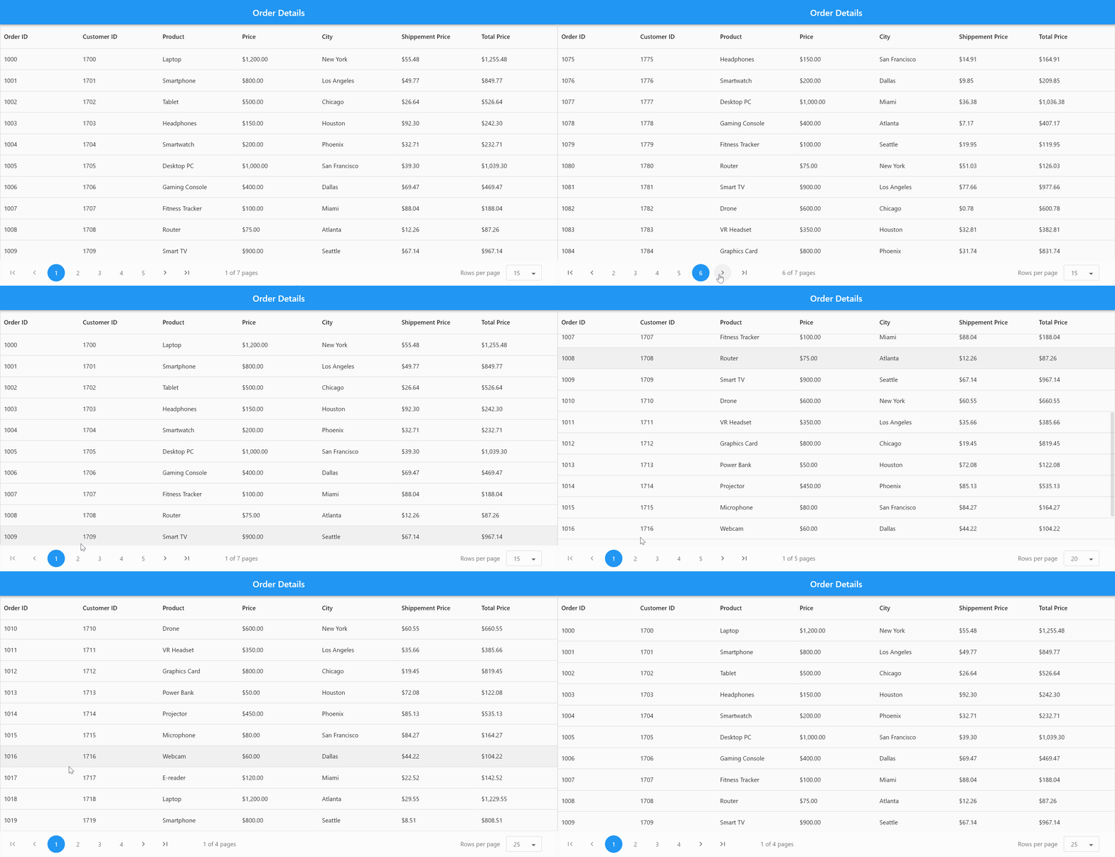
Refer to the following image.

GitHub reference
For more details, refer to the pagination in Flutter Datagrid GitHub demo.

Unlock the power of Syncfusion’s highly customizable Flutter widgets.
Conclusion
Thanks for reading! In this blog, we’ve seen how to effectively implement pagination in the Syncfusion Flutter DataGrid widget to manage large datasets. We hope you find the outlined steps helpful in achieving similar results.
If you’re an existing customer, you can download the latest version of Essential Studio® from the License and Downloads page. For those new to Syncfusion, try our 30-day free trial to explore all our features.
If you have questions, contact us through our support forum, support portal, or feedback portal. As always, we are happy to assist you!


