
Howdy! In this article, we will be talking about a very interesting topic: grid controls and how we can use them to replicate interfaces in Xamarin.Forms.
Sometimes, especially for beginners, it’s normal to run away from the grid and prefer something else to arrange a layout. But the truth is, once we understand key points about the grid, we end up loving it!
By using a grid control, we are working with a layout that offers the best performance and is ideal when working with an adaptive design.
Important: If you do not have any knowledge about grids in Xamarin.Forms, I recommend you to read this article for a better understanding.
Let ‘s start!
One of the biggest hurdles to using a grid is to be afraid of it because you don’t understand it well.
We know that a grid control is equal to a matrix, but sometimes we shy away from using it for our layout if our intended design doesn’t look like a matrix. For example, we wouldn’t hesitate to use a grid if we were designing a calculator. It has clearly defined rows and columns.
However, it’s important to remember that we can have a matrix as small as 1×1. This allows us to create any design with the Grid, making our design a lot thriftier with code and providing better performance.
To implement the Grid, the first thing I recommend you do is be certain about how many rows and columns the screen you are going to create has. That way, we can know from the beginning about how we are going to position the controls and the dimensions required.


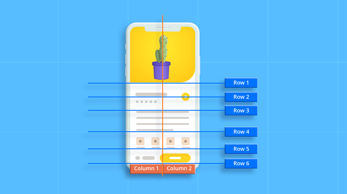
If you want more information about how to replicate the design of the above image , you can read this blog.
While using a grid control, you might think, “Wouldn’t it be possible to achieve this with fewer lines of code?” Or, you may get confused when the grid’s structure is too big.
Do I have good news for you!
You can work with a simplified grid structure and achieve the same results with a single line of code. This will allow you to create the initial structure in just a single line. See the following example.
Example:
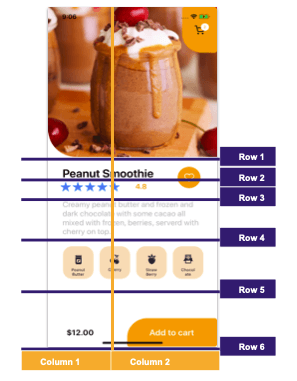
Let’s create a grid that resembles the structure of the sample UI shown in the previous tip. It has two columns and six rows.
<Grid ColumnDefinitions = “*,*" RowDefinitions = "Auto,Auto,Auto,Auto,Auto,Auto” >
 </Grid>
How?
Let’s analyze the image above. As you can see in the top-right corner, there is a section for the shopping cart, which has an orange background and a counter. There is also a main header image. You can see that all of these controls are in the same row.
Defining the UI in more detail, we can superimpose one control over another by adding them to the same column. This can be done without any problems, and depending on the goal, we may manage the positioning of these controls by adding some properties such as margin or padding.
It’s very important to know that we can even add negative values to the margin. This helps a given control protrude a little from the base layout position. For example, the margin could be set to “0, -10, 0, 0”.
The best way to understand anything is to practice! There are many portals that help us do it. One such portal is Dribble, where a lot of designers contribute wonderful designs that can then replicate to practice and improve our skills with the grid!
I also invite you to take a look at the Syncfusion Xamarin.Forms DataGrid control. It is a high-performance grid control that helps you efficiently display and manipulate large amounts of data in a tabular format. With this control, you will find some great features like sorting, grouping, editing, filtering, swiping, dragging, and support to export the entire grid or selected items to Excel and PDF file formats.
Now, sadly, our post is finished! I hope you’re able to apply the grid control in your next Xamarin projects!
Syncfusion’s Xamarin suite offers over 150 UI controls, from basic editors to powerful, advanced controls like DataGrid, Charts, ListView, and RTE. Try them out and let us know what you think in the comments below.
You can also contact us through our support forums, Direct-Trac, or feedback portal. We are always happy to assist you!
See you next time! Thanks for reading!