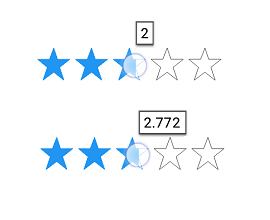
The WPF Rating control allows users to select rating values from a group of visual symbols like stars.
The WPF Rating control provides flexible precision to handle full, half, or exact values.

Provides whole values for rating.

Allows selection to the nearest half-value for rating.

Provides precise values for rating selection.
The WPF Rating control can also be used in a read-only state that allows users to view only the control. In this mode, users cannot interact with the control.

The WPF Rating control provides tooltips that indicate the selected value when the user interacts with the control.

Place tooltips either at the bottom or top of the control. You can also view the rating control without tooltips.

Precision in the tooltip values allows users to know the exact degree to which the control is filled.
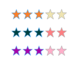
The WPF Rating control supports customizing item colors, item border colors, selection colors, and more enabling the items to fit your application theme.

You can customize the border thickness and border color of the rating control.

You can make the control more accessible and also enhance its accuracy by customizing the item size.

The item count can be specified so that users can rate up to whatever value they desire.

Customize the fill color for the selected and normal states.
Easily get started with the WPF Rating using a few simple lines of XAML and C# code example as demonstrated below. Also explore our WPF Rating Example that shows you how to render and configure the Rating in WPF.
- <Grid>
- <syncfusion:SfRating ItemsCount="5" Precision="Exact" Width="150"/>
- </Grid>
- public MainWindow()
- {
- InitializeComponent();
- Grid grid = new Grid();
- SfRating sfRating = new SfRating();
- sfRating.ItemsCount = 5;
- sfRating.Precision = Precision.Exact;
- sfRating.Width = 150;
- grid.Children.Add(sfRating);
- this.Content = grid;
- }
 Documentation
Greatness—it’s one thing to say you have it, but it means more when others recognize it. Syncfusion® is proud to hold the following industry awards.