We use cookies to give you the best experience on our website. If you continue to browse, then you agree to our privacy policy and cookie policy. Image for the cookie policy date
Syncfusion Feedback

Trusted by the world’s leading companies

Syncfusion Trusted Companies

Overview

The WPF Radial Slider control (circular slider) provides an intuitive interface for selecting a numeric value on a circular display. You can specify the display range and change the number of intermediate ticks on the slider that shows values.


Range and value

Click on the surface of a slider to choose a required value between the min and max values. A hint will be shown on mouse move, which makes selection easy.

Select a value within a specified limit.


Angle and interval

Visualize the range as a full circle, half circle, or sector using start and end angles.

View Radial Slider as a full or half circle.


Direction

Arrange the range of values in clockwise or counterclockwise directions.

Slider values in clockwise or counterclockwise directions.


Appearance

The Radial Slider’s rim, ticks, labels, and pointers are completely customizable.
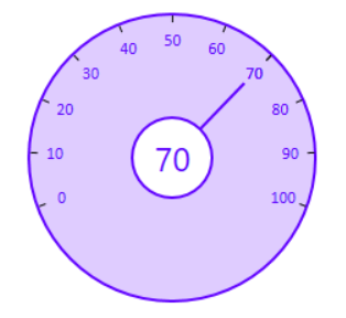
Customize appearance of Radial Slider control.


95+ WPF CONTROLS

Our Customers Love Us

Having an excellent set of tools and a great support team, Syncfusion reduces customers’ development time.
Here are some of their experiences.

Rated by users across the globe

Transform your applications today by downloading our free evaluation version
Download Free Trial No credit card required.

Syncfusion WPF Resources

Awards

Greatness—it’s one thing to say you have it, but it means more when others recognize it. Syncfusion is proud to hold the following industry awards.

Up arrow icon