
The WPF Radial Gauge, also known as a circular gauge, is a data visualization component that helps display numerical values on a circular scale. It has highly customizable features, such as scales, pointers, and ranges. Also, it offers the creation of speedometers, temperature monitors, dashboards, meter gauges, multi-axis clocks, modern activity gauges, direction compasses, etc.
The scale of the WPF Radial Gauge control is an easily customizable circular arc in which a set of values can be plotted based on business logic.

Customize the look and feel of the default labels using the font style, size, and color properties. You can also add prefix or suffix text to a label.
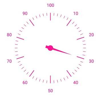
Define your own style for minor and major ticks with the help of the size, color, and thickness properties.
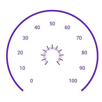
To enhance readability, change the default scale position by setting the offset value for labels, ticks, and the rim.
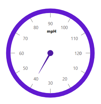
The rim is used to add a circular border to a gauge. You can change the default rim’s look to your own style.

Add multiple scales to the gauge to design it like a clock, dashboard, speedometer, etc.
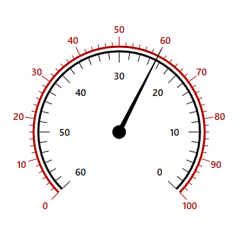
Change the scale direction to clockwise or counterclockwise.
A range of the WPF Radial Gauge is a visual element that helps you quickly visualize where a value falls on a circular scale.
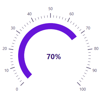
Change the range position to any place inside the gauge.
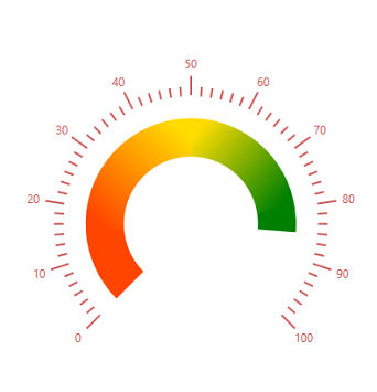
Range colors vary gradually based on values, and give you a smooth color transition effect.

To enhance gauge usage and readability, range thickness can vary based on values.

The WPF Radial Gauge control allows you to add multiple ranges inside a scale to indicate color variation.
Indicate a current value by using the highly customizable needle-type element.
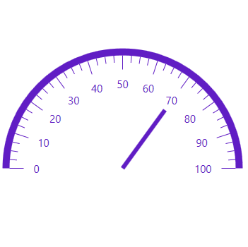
Change the needle pointer type to a rectangle or arrow to indicate or highlight values.
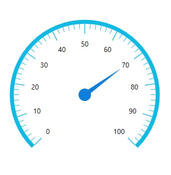
A pointer cap is a rounded ball at the end of an arrow pointer that can be customized to enhance a pointer’s look.
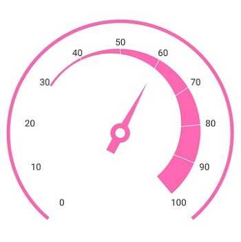
A tail can be added to the knob for an extra element of style.
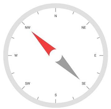
Add more than one needle pointer to a scale to indicate multiple values.
A range pointer is used to indicate the current value relative to the start value of a circular scale.
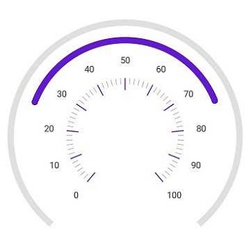
A range pointer can be changed or moved to any place inside the gauge.
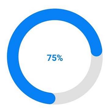
You can add a rounded range cap to the start, end, and both sides of the pointer. This support provides a rich styling experience for data visualization.

Multiple range pointers can be added inside the scale to indicate multiple progress activities.
The current value can be pointed out by using different types of marker pointers.
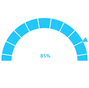
The symbol pointer type can be changed to built-in shapes such as a triangle, inverted triangle, square, or diamond to highlight the values.

Symbol pointers can be changed or moved to any place inside the gauge.
Circular gauge provides an option to drag the pointer from one place to another. This support allows you to control the pointer by swipe gesture and change the value at runtime.

Annotations display metadata about a circular gauge at any specific location in the plotting area.

Annotations provide options to add any image over the gauge control with respect to its offset position. You can add multiple images in a single control.
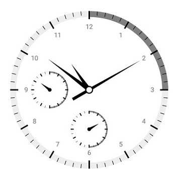
You can add different views to the gauge control with respect to its offset position. You can also add multiple views in a single control.
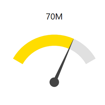
You can add any text over the gauge control to enhance the readability. You can also add multiple text instances in a single control.
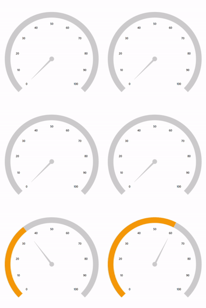
The WPF Radial Gauge control provides a visually appealing way to view pointers with animated transitions for a certain time span. You can see smooth pointer transitions by moving the pointer from one place to another.
 Documentation
Greatness—it’s one thing to say you have it, but it means more when others recognize it. Syncfusion® is proud to hold the following industry awards.