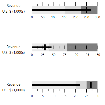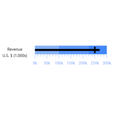
A WPF bullet graph is a variation of the bar graph, which was developed as a complement for the dashboard gauges and meters. The bullet graph features a single, primary measure (for example, current year-to-date revenue), and compares that measure to one or more other measures to enrich its meaning (for example, compared to a target). It also has the ability to display the measures in the context of a qualitative range of performance such as poor, satisfactory, and good.

The view of a bullet graph can be changed, allowing users to force the application into a particular screen orientation.

Change the WPF Bullet Graph control orientation to vertical.

Change the WPF Bullet Graph control orientation to horizontal.
Bullet Graph’s elements are simple and easy to use in various business scenarios. The ticks, labels, and ranges inside the bullet graphs can be customized.

You can change the tick position to above, across, or below.

Define your own style for minor and major ticks using the size, color, and thickness properties.

You can change the label position to above or below.

Customize the look and feel of the default labels using size, format, and color properties

Feature and comparative are two types of measures available to compare the data. Customizing the bar stroke and thickness makes it easy to measure the progress or status of the development.

Using the range settings, it is easy to integrate the control and better visualize application data.
You can customize the caption color and size of the caption property.

You can change the scale direction to backward (inversed) or forward.

WPF Bullet Graph provides tooltips that displays brief descriptions of the qualitative ranges as well as the values of the quantitative measures.

The progress or status of growth can be easily measured by using featured measure and comparative measure data values and other customizable elements.

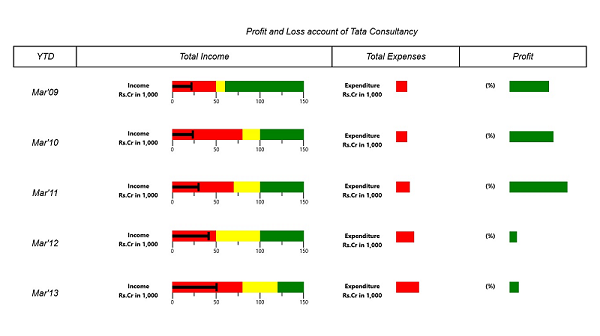
Integrating in the grid view allows users to present large amounts of data in a way that is easy to understand.

 Documentation
Greatness—it’s one thing to say you have it, but it means more when others recognize it. Syncfusion® is proud to hold the following industry awards.