
The WPF OLAP Grid control organizes and summarizes business data and displays results in a cross-table format.


The WPF OLAP Grid control enables you to retrieve multidimensional data (OLAP) from SSAS or any XML/A provider. The data sources supported are SSAS, Mondrian, ActivePivot, and Oracle.
With the slice and dice feature, you can create a new view for end users by selecting dimensions and measures from the OLAP cube and filtering them.

Drill down (expand) and drill up (collapse) to visualize the grid information in both abstract and detailed views.
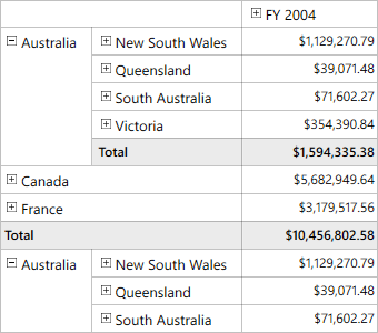
This option delivers a detailed view of any selected level member while drilling down and shows an abstract view after drilling up.
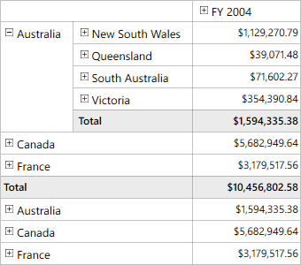
You can drill only the current position of a selected level member.
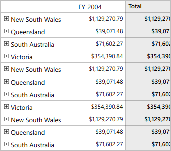
This option replaces an existing node with its child nodes into which the end user has drilled.

KPIs are collections of calculations associated with a measure group that evaluates business success. Typically, these calculations are a combination of multidimensional expressions (MDX) or calculated members. Four different types of KPI indicators available are:
Named sets are MDX expressions that return a set of dimension members, which can be defined and saved as a part of the OLAP cube definition. Named sets simplify MDX queries and provide useful aliases for complex, typically used, set expressions.
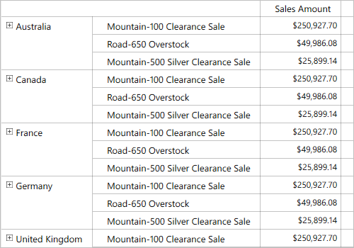

You can create and display your own dimensions and measures in reports through code behind.
Member properties provide basic information about each member in each tuple, including member name, parent level, and number of children. These member properties are available for all members at any given level and can be enabled in reports through their code behind.

With built-in filtering options, you can easily filter and visualize data. It is also possible to filter programmatically.

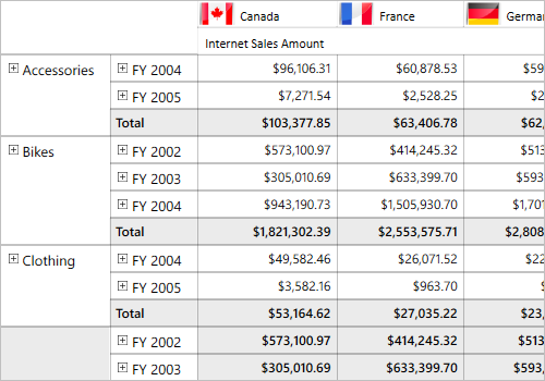
You can filter the headers in rows and columns based on hierarchy members to selectively display records.You can filter the headers in rows and columns based on hierarchy members to selectively display records.
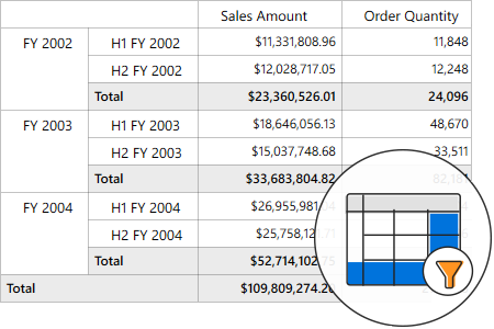
You can filter the results in rows and columns based on active measures to selectively display records.

Order the columns and rows based on measure values. You can do this only through reports in code behind.
Load and render a large amount of data without any performance constraints through paging.


The drill-through feature obtains a list of raw items for a particular value cell or summary cell.
Define conditions that, when met, format the font, color, and border settings of values and summary cells.

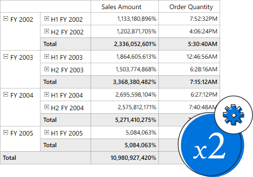
Format the column header, row header, summary cell, and value cell of the control.
Number formatting and date formatting help to transform the appearance of the actual cell value.
Users can visualize the control as a pivot table, similar to Excel. Users can also position summaries at the top or hide the summaries.
The normal layout looks like the pivot table in earlier Excel versions, allowing end users to view the parent and child members adjacent to each other.

The summary layout easily switches the summary position to either the top or bottom beside each member in the control.

The Excel-like layout simulates the pivot table look and feel of Excel with child members positioned below their parent member with some indent space.

The no-summaries layout hides the subtotal and grand total and shows only header and value cells.


Subtotals and grand totals are calculated automatically by the engine inside the control and displayed in the grid. This helps users make decisions based on the totals.
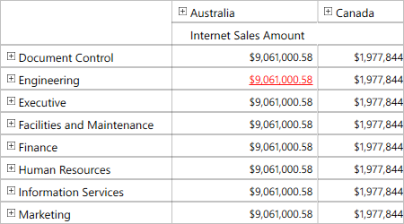
Clicking a hyperlink cell helps users retrieve information about that particular cell. This feature allows you to perform custom operations through code.

Tooltip provide basic information about a value cell while the pointer hovers over it.
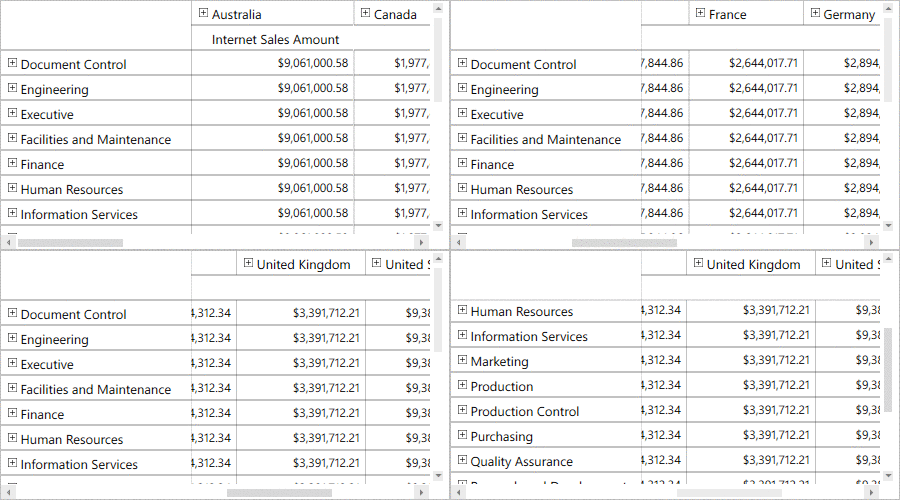
Users can freeze row and column headers while performing scroll operations to have a precise view of the content.
Settings in the WPF OLAP grid control can be serialized to an XML format and saved. The saved report can be loaded back through the built-in deserialization options.


Export data to Excel, Word, PDF, and CSV formats. You can customize the exporting operations.

Ships with built-in themes like Blend, Office 2010, Office 2013, Office 2016, Office 365, Visual Studio 2013, Visual Studio 2015, and Metro.

You can customize the control’s appearance to any extent in code behind.

Easily customize all aspects of the control’s appearance using the Theme studio utility.
For a great developer experience, flexible built-in APIs are available to define and customize the WPF OLAP Grid control. Developers can optimize the data bound to the control and customize the user interface (UI) completely using code with ease.

Users from different locales can use the control by applying appropriate date formats, currency formats, and number formats.

The text direction and layout of the control can be displayed in from right-to-left(RTL).
 Documentation
Greatness—it’s one thing to say you have it, but it means more when others recognize it. Syncfusion® is proud to hold the following industry awards.