
The WPF OLAP Gauge control is ideal for highlighting business-critical key performance indicator (KPI) information in an intuitive manner.


The WPF OLAP Gauge control enables you to retrieve multidimensional data from SSAS or any XML/A provider. Following is the list of data sources our OLAP controls widely support:
KPIs are a collection of calculations associated with a measure group that evaluates business success. Typically, these calculations are a combination of multidimensional expressions (MDX) or calculated members. There are four different types of available KPI indicators:


WPF OLAP Gauge supports full-circle, half-circle, circular-center-gradient, circular-with-dark-outer-frames, circular-with-inner-left-gradient, circular-with-inner-top-gradient, counterclockwise-half-circle, left-half-circle, and right-half-circle gauges to visualize data in a compact area by modifying the start and end angles.
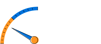
The scale of the gauge is a circular arc that supports a range of numbers bound by minimum and maximum values.

The pointer is a needle-type element indicating the current value on the scale.
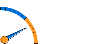
Ticks mark the values that are present on the scale.

Highlight a range of values. Ranges can show with different colors that help you quickly visualize where a value falls on a scale.

Indicators let the user view status and trends, showing progress toward a goal.

Markers help to signify the current value or goal on the scale.
Easily arrange multiple gauges in a structured layout by specifying row and column count. Based on the specification, gauges will be arranged in the available space.

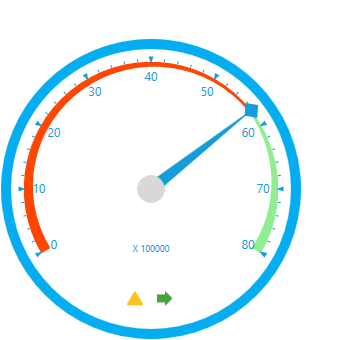
Allows users to view detailed information about the measure values specified in the control.
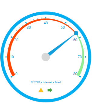
The gauge figures out the category by combining the descriptions of series and category axes members.

Provides basic information while the mouse hovers over each individual gauge.
Users can change the scale direction to either clockwise or counterclockwise.


Ships with built-in themes like Blend, Office 2010, Office 2013, Office 2016, Office 365, Visual Studio 2013, Visual Studio 2015, and Metro.

Customize the appearance of the control by changing the styles of the pointer, pointer cap, scales, ticks, labels, and state indicators.

Users from different locales can use the control by applying date formats, currency formats, and number formats to suit local preferences.
The text direction and layout of the control can be displayed in the right-to-left (RTL) direction.
For a great developer experience, flexible built-in APIs are available to define and customize the WPF OLAP Gauge control. Developers can optimize the data bound to the control and customize the user interface (UI) completely using code with ease.
 Documentation
Greatness—it’s one thing to say you have it, but it means more when others recognize it. Syncfusion® is proud to hold the following industry awards.