
TL;DR: The new Syncfusion Blazor TextArea component is a game-changer for multiline text input. This blog delves into its unique attributes and advantages and provides a guide on how to seamlessly incorporate it into your projects.
Have you ever found yourself wrestling with restrictive text input fields? Have you yearned for a more versatile and feature-rich multiline text experience? If these challenges resonate with you, we have some exciting news! We are thrilled to unveil the Syncfusion Blazor TextArea component, a standout feature of the Essential Studio 2024 Volume 2 release.
The Blazor TextArea component is meticulously crafted to revolutionize the multiline text input experience for developers and end-users.
In this blog, we’ll delve into its unique features and guide you on seamlessly incorporating it into your projects.
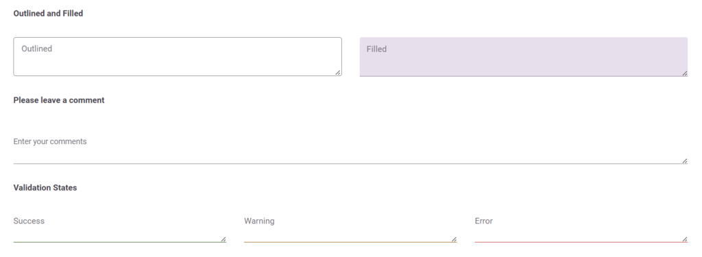
Blazor TextArea component: An overview
The TextArea component is a new addition to the suite of input controls available in our Blazor framework. It provides a user-friendly way to handle multiline text input and offers a range of features to improve usability and accessibility. This component is beneficial for scenarios where users must input large amounts of text, such as comments, descriptions, or messages.
Refer to the following image.
Key features
The key features of the Blazor TextArea component are as follows:
Floating labels
Floating labels are a modern UI/UX feature that enhances the user experience by providing a clear and intuitive way to understand the input field’s purpose. When the user focuses on the TextArea or starts typing, the placeholder text transforms into a floating label above the field. This ensures the label is always visible, helping users remember their input.
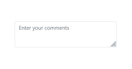
Resize
Another standout feature of the Blazor TextArea component is its auto-resizing capability. It can be resized vertically, horizontally, or in both directions by selecting the corresponding ResizeMode option.
Rows and columns
You can specify the number of rows and columns, giving you precise control over the size of the text area. This is particularly useful for forms where you need to fit multiple input fields into a limited space. By defining the rows and columns, you can ensure that your text areas are appropriately sized for the content they are expected to hold.
Maximum length
Managing text input length is crucial in many apps. The Blazor TextArea component includes a built-in feature to set a maximum character limit. This feature helps you control the length of the input, ensuring users do not exceed the specified number of characters. It is useful for inputs like descriptions, comments, or any field where text length is restricted.
Accessibility
The Blazor TextArea component is designed with accessibility in mind. It supports ARIA attributes and keyboard navigation to ensure a smooth experience for all users, including those relying on assistive technologies.
How to use the Blazor TextArea component?
Getting started with the Blazor TextArea component is quick and easy. You can configure the component’s properties and customize its appearance and behavior according to your requirements. You can learn more about it, in this documentation.
Add the Blazor TextArea component to your app
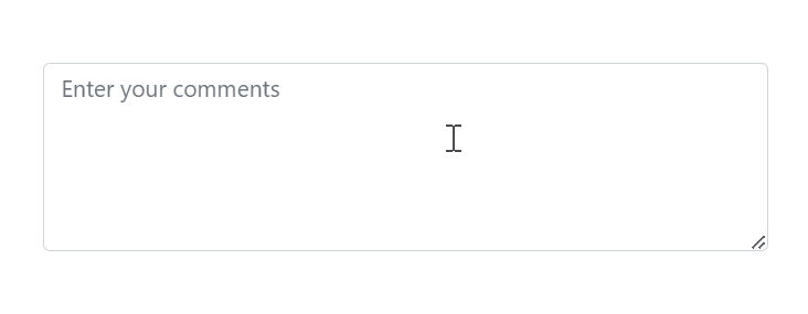
Once you’ve installed the NuGet packages and configured the basic imports in your app, add the following code in the Blazor component (.razor) file to add the Blazor TextArea component.
<SfTextArea Placeholder="Enter your comments" @bind-Value="userInput" RowCount="5" ColumnCount="150" FloatLabelType="FloatLabelType.Auto"></SfTextArea>
@code {
   private string userInput = string.Empty;
}
Refer to the following output image.
Conclusion
Thanks for reading! The new Syncfusion Blazor TextArea component is a powerful addition to the Blazor framework, providing an enhanced multiline text input experience. With these features, it addresses the common challenges developers face when working with text areas. By integrating this component into your Blazor apps, you can improve usability and deliver a better user experience.
We hope this introduction to the Blazor TextArea component has been helpful. Start exploring its features today and see how it can benefit your projects!
For a detailed overview of all the exciting updates in this release, we invite you to visit our Release Notes and What’s New pages.
For our existing customers, the new version of Essential Studio is now available on the License and Downloads page. If you’re new to Syncfusion, sign up for a 30-day free trial to try our controls yourself.
If you have any questions, you can reach us through our support forum, support portal, or feedback portal. We’re always happy to assist you!


